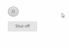
itsa-react-togglebutton
Lightweight, focussable, responses to keypresses and will act quicker than the HTMLButtonElement. Meaning, that the onClick-event gets fired on a mouseDown or keyDown event (native HTMLButtonElement emits on mouseUp).
How to use:
const ReactDOM = require("react-dom"),
      ToggleButton = require("itsa-react-togglebutton");

let props = {
    checked: true
};

const handleChange = () => {
    props.checked = !props.checked;
    renderToggleButton();
};

const renderToggleButton = () => {
    ReactDOM.render(
        <ToggleButton {...props} onChange={handleChange} />,
        document.getElementById("container")
    );
};

renderToggleButton();
About the css
You need the right css in order to make use of itsa-react-togglebutton. There are 2 options:
- You can include the files inside the css-folder of the module:
itsa-react-button, which is a dependency. - You can use:
Component = require("itsa-react-togglebutton/lib/component-styled.jsx");and build your project withwebpack. This is needed, because you need the right plugin to handle a requirement of thescss-file.