react-modern-datepicker
A modern date picker for react library.
Installation
The package can be installed via NPM:
npm install react-modern-datepicker --save
This package doesn't come with any dependency other than Moment.js & styled-components. Threfore, You’ll need to install React, PropTypes separately since those dependencies aren’t included in the package. Below is a simple example of how to use the ModernDatepicker in a React view.
import React from 'react';
import ModernDatepicker from 'react-modern-datepicker';
import moment from 'moment';
class Example extends React.Component {
constructor (props) {
super(props)
this.state = {
startDate: moment()
};
this.handleChange = this.handleChange.bind(this);
}
handleChange(date) {
this.setState({
startDate: date
});
}
render() {
return <ModernDatepicker
date={this.state.startDate}
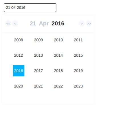
format={'DD-MM-YYYY'}
showBorder
onChange={(date) => this.handleChange(date)}
placeholder={'Select a date'}
/>
}
}
You can also pass your own css to style the input element.The following example shows how to style the input element using your own css.
./App.css
//Please  note that, for this class to take the precedence over the
//default css, we should repeat the class name like below (instead of .color, we are
// using .color.color)
.color.color {
    border-radius: 0;
    -moz-border-radius: 0;
    -webkit-border-radius: 0;
    font-size: 15px;
    font-weight: 600;
    padding: 10px 10px 10px 5px;
    border-bottom: 1px solid #ebebeb!important;
    border: none;
    box-sizing: border-box;
    margin-top: 22px;
    box-shadow: none;
    font-family: Open Sans,sans-serif;
  }
import React from 'react';
import ModernDatepicker from 'react-modern-datepicker';
import moment from 'moment';
import './App.css';
import icon from '../assets/icon.png'; // if you want to show an icon


class Example extends React.Component {
  constructor (props) {
    super(props)
    this.state = {
      startDate: moment()
    };
    this.handleChange = this.handleChange.bind(this);
  }

  handleChange(date) {
    this.setState({
      startDate: date
    });
  }

  render() {
    return <ModernDatepicker
          date={this.state.startDate}
          format={'DD-MM-YYYY'}
          showBorder
          className='color'
          icon={icon}
          onChange={(date) => this.handleChange(date)}
          placeholder={'Select a date'}
        />
  }
}
Configuration
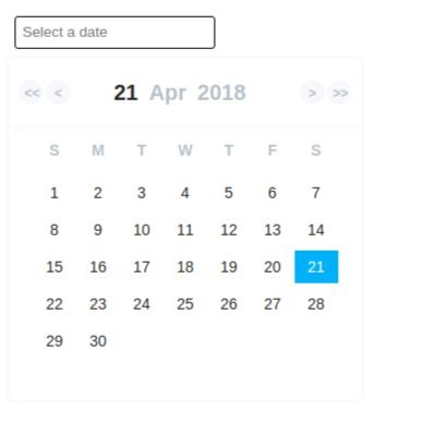
The most basic use of the ModernDatepicker can be described with:
<ModernDatepicker date={this.state.date} onChange={this.handleChange} showBorder />
The default format prop is DD-MM-YYYY if not specified.
Options
The following are the props that you can pass to ModernDatepicker Component :
| props | Default | Optional | Description |
|---|---|---|---|
| date | null | true | This prop takes the date that you want to show |
| format | 'DD-MM-YYYY' | true | This prop takes the format you want to set for your date |
| showBorder | false | true | This prop takes a boolean to show or not to show borders around the input |
| onChange | null | false | This props takes a function, with the date passed to its parameters |
| placeholder | null | true | This props takes a string to show when no date is selected |
| className | null | true | This props takes any external css/scss you want to use to override the default one. |
| icon | null | true | This props takes an image you want to add as an icon. |
Compatibility
React
Compatible with the latest version of react i.e v16.3.2
Latest compatible versions:
- React 15.5 or newer: All above React-datepicker v.0.2.0
Browser Support
The date picker is compatible with the latest versions of Chrome, Firefox, and IE10+.