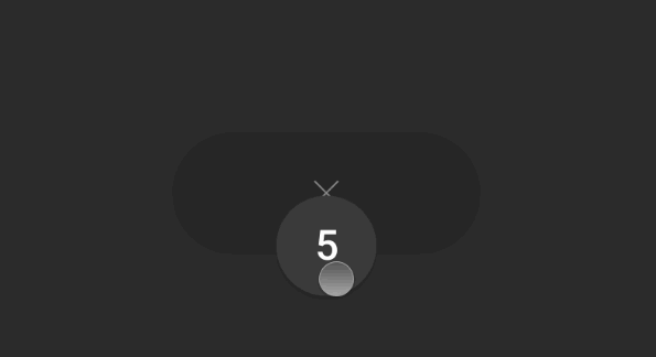

numeric-stepper
A numeric stepper component for React. Inspired by Ehsan Rahimi’s Tally Counter Micro-Interaction Dribbble shot.


? Getting Started
? Jump Start
npm install @anatoliygatt/numeric-stepper @emotion/react @emotion/styled framer-motion
import { useState } from 'react';
import { NumericStepper } from '@anatoliygatt/numeric-stepper';

function Example() {
  const INITIAL_VALUE = 20;
  const [value, setValue] = useState(INITIAL_VALUE);
  return (
    <NumericStepper
      minimumValue={10}
      maximumValue={100}
      stepValue={10}
      initialValue={INITIAL_VALUE}
      size="lg"
      inactiveTrackColor="#fed7aa"
      activeTrackColor="#fddec0"
      activeButtonColor="#ffedd5"
      inactiveIconColor="#fb923c"
      hoveredIconColor="#ea580c"
      activeIconColor="#9a3412"
      disabledIconColor="#fdba74"
      thumbColor="#f97316"
      thumbShadowAnimationOnTrackHoverEnabled={false}
      focusRingColor="#fff7ed"
      onChange={(value) => {
        setValue(value);
      }}
    />
  );
}
? Live Demo

⚙️ Configuration
NumericStepper supports the following props:
| Prop | Type | Default value | Description |
|---|---|---|---|
| minimumValue | number | 0 |
The minimum value. |
| maximumValue | number | Number.MAX_SAFE_INTEGER |
The maximum value. |
| stepValue | number | 1 |
The step increment value. |
| initialValue | number | minimumValue |
The initial value. |
| onChange | Function | undefined |
The callback invoked when the value changes. |
| size | string | sm |
The size of the numeric stepper. There are 3 available sizes:
|
| inactiveTrackColor | string | #2b2b2b |
The color of the track while the thumb is not being horizontally dragged. |
| activeTrackColor | string | #1f1f1f |
The color of the track while the thumb is being horizontally dragged and is at the maximum trackable distance from the track’s center. |
| hoverButtonColor | string | transparent |
The color of the decrement/increment button in a hover state. |
| activeButtonColor | string | #ececec |
The color of the decrement/increment button in an active state. |
| inactiveIconColor | string | #858585 |
The color of the decrement/increment button icon in an inactive state. |
| hoverIconColor | string | #ffffff |
The color of the decrement/increment button icon in a hover state. |
| activeIconColor | string | #000000 |
The color of the decrement/increment button icon in an active state. |
| disabledIconColor | string | #383838 |
The color of the decrement/increment button icon in a disabled state. |
| thumbColor | string | #444444 |
The color of the thumb. |
| thumbLabelColor | string | #ffffff |
The color of the thumb’s label. |
| thumbShadowAnimationOnTrackHoverEnabled | boolean | true |
If true, the thumb’s shadow will animate when hovering over the track. |
| focusRingColor | string | #ececec |
The color of the focus ring of the interactive elements. |
In order to customise the thumb’s font settings, we can use CSS, like so:
[data-testid='numeric-stepper-thumb'] {
  font-family: 'Times New Roman', Times, serif;
  font-style: italic;
  font-weight: 800;
}
♿️ Accessibility
In order to comply with the web accessibility standards, we must make use of the decrementButtonAriaLabel and incrementButtonAriaLabel props, like so:
function AccessibleExample() {
  return (
    <NumericStepper
      decrementButtonAriaLabel="Decrement"
      incrementButtonAriaLabel="Increment"
    />
  );
}
Also, we can use a thumbAriaLabel prop to provide a description for the value rendered inside a thumb, like so:
function EnhancedThumbAccessibilityExample() {
  const [value, setValue] = useState(0);
  return (
    <NumericStepper
      thumbAriaLabel={`${value} items`}
      onChange={(value) => {
        setValue(value);
      }}
    />
  );
}