react-whirligig
A carousel/slider-like component for sequentially displaying slides or sets of slides.
Basic Usage
const Slider = ({ slideIndex }) => (
<div>
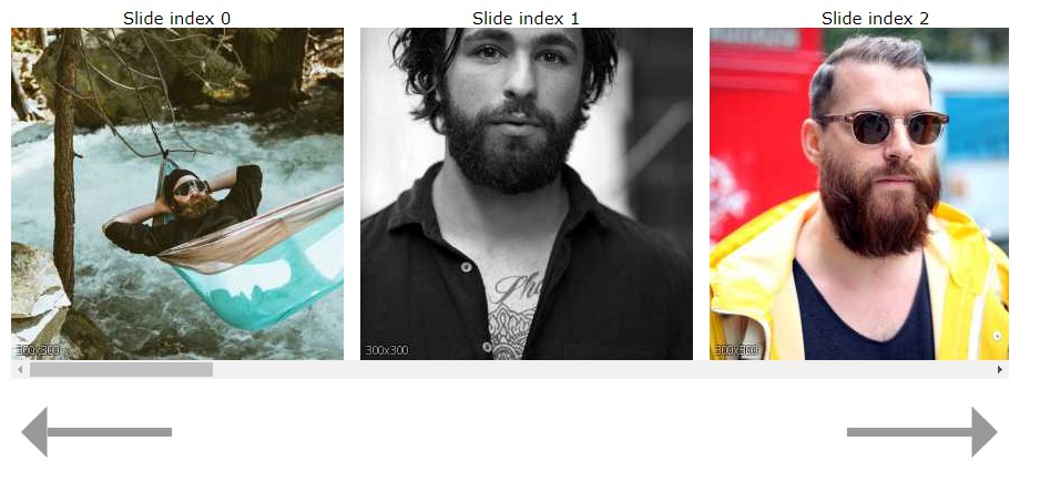
<Whirligig visibleSlides={3} gutter="1em" slideTo={slideIndex}>
<img src="http://www.fillmurray.com/400/300" />
<img src="http://www.fillmurray.com/300/400" />
<img src="http://www.fillmurray.com/400/200" />
<img src="http://www.fillmurray.com/200/400" />
<img src="http://www.fillmurray.com/500/300" />
</Whirligig>
</div>
)
react-whirligig exposes next and prev functions for moving the whirligig forward and
backward the number of visible slides. These functions can be accessed using the
ref prop callback to get a reference to the Whirligig instance.
import React from 'react'
import Whirligig from 'react-whirligig'

const Slider = () => {
  let whirligig
  const next = () => whirligig.next()
  const prev = () => whirligig.prev()

  return (
    <div>
      <button onClick={prev}>Prev</button>
      <Whirligig
        visibleSlides={3}
        gutter="1em"
        ref={(_whirligigInstance) => { whirligig = _whirligigInstance}}
      >
        <img src="http://www.fillmurray.com/400/300" />
        <img src="http://www.fillmurray.com/300/400" />
        <img src="http://www.fillmurray.com/400/200" />
        <img src="http://www.fillmurray.com/200/400" />
        <img src="http://www.fillmurray.com/500/300" />
      </Whirligig>
      <button onClick={next}>Next</button>
    </div>
  )
}
See the demo code
for advanced usage.
Whirligig
The Whirligig component is a horizontally oriented container of Slides.
Props
Each of these is written in the form propName: type = default. So,
foo: (string) => bool = noop is a prop called foo which is expected to be a
function that takes a string and returns a boolean, and it defaults to a noop.
afterSlide: (number) => void = noop
A function to be called after the whirligig transitions to a new "active" slide. The
function is passed the new "active" slide index.
animationDuration: number = 500
The number of milliseconds the slide animation should take.
beforeSlide: (number) => void = noop
A function to be called before the whirligig transitions to a new "active" slide.
The function is passed what the new "active" slide index will be.
className: string = ''
A className applied to the Whirligig.
easing: (number) => number = easeOutQuint
A function which takes a float representing the percentage of time that has
passed for a given animation and returns a float representing the relative
progress of the element being animated. See
https://gist.github.com/gre/1650294 for examples.
infinte: bool = false
A boolean flag that determines whether the whirligig should wrap to the
beginning/end when sliding beyond the slide index bounds.
gutter: string = '1em'
A css length string
that represents the space between each Slide in the Whirligig
nextKeys: string[] = [ 'ArrowRight' ]
An array of valid "Key" values from a
KeyboardEvent
indicating what "Key" values, when pressed, should move the whirligig forward.
onSlideClick: (SyntheticMouseEvent<*>) => void = noop
Function that takes a SyntheticMouseEvent.
prevKeys: string[] = [ 'ArrowLeft' ]
An array of valid "Key" values from a
KeyboardEvent
indicating what "Key" values, when pressed, should move the whirligig backward
preventScroll: bool = false
A boolean flag that turns off/on the ability to natively scroll through the
Whirligig
preventSwipe: bool = false
A boolean flag that turns off/on the ability to swipe through the Whirligig
slideBy: number = visibleSlides || 1
The number of slides that should advance on a next, prev, or swipe action.
If not specified, will reflect the visibleSlides prop value or 1.
slideClass: string = ''
A className to apply to the Slide container.
slideTo: number = 0
The index to which the whirligig should transition if it is not already there. This
is distinct from startAt in that startAt is only effective when the
component mounts and does not transition, but moves immediately to the given
slide. The slideTo prop is meant to be used as a mechanism for the consuming
component to directly control when and where the whirligig transitions to.
snapToSlide: bool = false
A boolean flag that turns on/off the snap-to-slide feature. If set, the
Whirligig will animate the final bit of scrolling to stop at a slide.
startAt: number = 0
The Slide index that will be the "active" slide when the Whirligig mounts. The value
will be normalized to be within the range of the length of the Whirligig's children.
visibleSlides: number = 1
The number of slides that should be visible at a time for the Whirligig
Instance methods
next: () => Promise<*>
Advances the whirligig to the next set of visible slides. If there are not enough
remaining slides to transition the full number of visible slides, it will
transition to the end of the whirligig If already at the end of the whirligig, calling
next will transition the whirligig to index 0.
prev: () => Promise<*>
Recedes the whirligig to the previous set of visible slides. If there are not enough
remaining slides to transition the full number of visible slides, it will
transition to the beginning of the whirligig If already at the beginning of the
whirligig, calling prev will transition the whirligig to last full set of visible
slides in the whirligig.