react-collapsed (useCollapse)
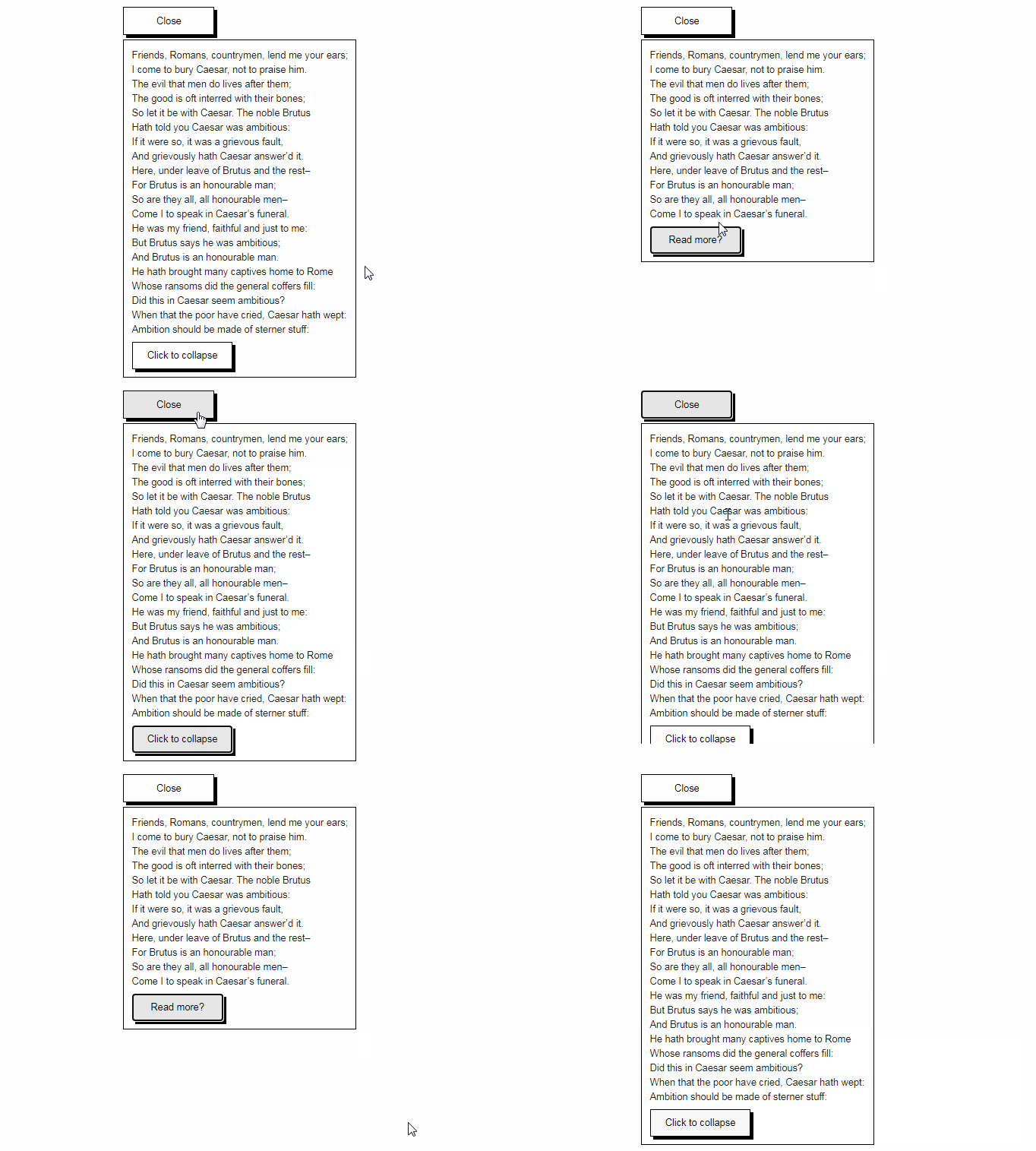
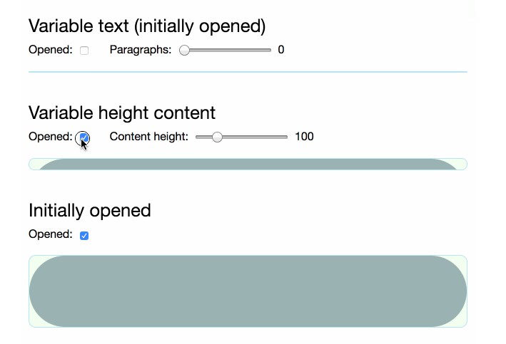
A custom hook for creating accessible expand/collapse components in React. Animates the height using CSS transitions from 0 to auto.
Features
- Handles the height of animations of your elements,
autoincluded! - You control the UI -
useCollapseprovides the necessary props, you control the styles and the elements. - Accessible out of the box - no need to worry if your collapse/expand component is accessible, since this takes care of it for you!
- No animation framework required! Simply powered by CSS animations
- Written in TypeScript
Installation
$ yarn add react-collapsed
# or
$ npm i react-collapsed
Usage
Simple Usage
import React from 'react';
import useCollapse from 'react-collapsed';

function Demo() {
  const { getCollapseProps, getToggleProps, isExpanded } = useCollapse();

  return (
    <div>
      <button {...getToggleProps()}>
        {isExpanded ? 'Collapse' : 'Expand'}
      </button>
      <section {...getCollapseProps()}>Collapsed content ?</section>
    </div>
  );
}
Control it yourself
import React, { useState } from 'react';
import useCollapse from 'react-collapsed';

function Demo() {
  const [isExpanded, setExpanded] = useState(false);
  const { getCollapseProps, getToggleProps } = useCollapse({ isExpanded });

  return (
    <div>
      <button
        {...getToggleProps({
          onClick: () => setExpanded((prevExpanded) => !prevExpanded),
        })}
      >
        {isExpanded ? 'Collapse' : 'Expand'}
      </button>
      <section {...getCollapseProps()}>Collapsed content ?</section>
    </div>
  );
}
API
const {
  getCollapseProps,
  getToggleProps,
  isExpanded,
  setExpanded,
} = useCollapse({
  isExpanded: boolean,
  defaultExpanded: boolean,
  expandStyles: {},
  collapseStyles: {},
  collapsedHeight: 0,
  easing: string,
  duration: number,
  onCollapseStart: func,
  onCollapseEnd: func,
  onExpandStart: func,
  onExpandEnd: func,
});
useCollapse Config
The following are optional properties passed into useCollapse({ }):
| Prop | Type | Default | Description |
|---|---|---|---|
| isExpanded | boolean | undefined |
If true, the Collapse is expanded |
| defaultExpanded | boolean | false |
If true, the Collapse will be expanded when mounted |
| expandStyles | object | {} |
Style object applied to the collapse panel when it expands |
| collapseStyles | object | {} |
Style object applied to the collapse panel when it collapses |
| collapsedHeight | number | 0 |
The height of the content when collapsed |
| easing | string | cubic-bezier(0.4, 0, 0.2, 1) |
The transition timing function for the animation |
| duration | number | undefined |
The duration of the animation in milliseconds. By default, the duration is programmatically calculated based on the height of the collapsed element |
| onCollapseStart | function | no-op | Handler called when the collapse animation begins |
| onCollapseEnd | function | no-op | Handler called when the collapse animation ends |
| onExpandStart | function | no-op | Handler called when the expand animation begins |
| onExpandEnd | function | no-op | Handler called when the expand animation ends |
What you get
| Name | Description |
|---|---|
| getCollapseProps | Function that returns a prop object, which should be spread onto the collapse element |
| getToggleProps | Function that returns a prop object, which should be spread onto an element that toggles the collapse panel |
| isExpanded | Whether or not the collapse is expanded (if not controlled) |
| setExpanded | Sets the hook's internal isExpanded state |
Alternative Solutions
- react-spring - JavaScript animation based library that can potentially have smoother animations. Requires a bit more work to create an accessible collapse component.
- react-animate-height - Another library that uses CSS transitions to animate to any height. It provides components, not a hook.


