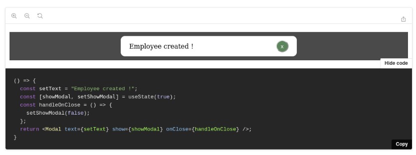
useModal
This is a react hook which can open the modal easily.
Usage
import React, { useState, useCallback } from 'react';
import { render } from 'react-dom';
import { useModal } from 'react-hooks-use-modal';
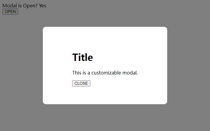
const App = () => {
const [Modal, open, close, isOpen] = useModal('root', {
preventScroll: true,
closeOnOverlayClick: false
});
return (
<div>
<p>Modal is Open? {isOpen ? 'Yes' : 'No'}</p>
<button onClick={open}>OPEN</button>
<Modal>
<div>
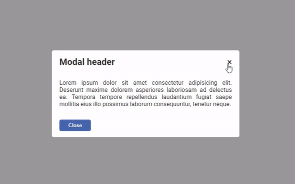
<h1>Title</h1>
<p>This is a customizable modal.</p>
<button onClick={close}>CLOSE</button>
</div>
</Modal>
</div>
);
};
render(<App />, document.getElementById('root'));
Syntax
[ModalComponent, openFunc, closeFunc, isOpenBool] = useModal(domNode?, { preventScroll?, closeOnOverlayClick? })
ModalComponent
Modal component that displays children in the screen center.
openFunc
A function to open modal.
closeFunc
A function to close modal.
isOpenBool
A boolean to know the state whether modal is open or not.
domNode
Optional.
Default value is 'root'.
Modal component uses React-Portal.
You can specify the output destination domNode with this argument
preventScroll
Optional to prevent scrolling while modal is open.
Default value is false.
closeOnOverlayClick
Optional to close modal when click the overlay.
Default value is true.
How To Develop
Setup
$ npm install
Build src
$ npm run build
Watch src
$ npm run watch
Build examples
$ npm run build:demo
Start examples
$ npm start
ttp://localhost:3001
License
MIT