react-gears
react-gears is a React implementation of Appfolio UI components, using React, Bootstrap 4, and reactstrap.
Goals
- Portable - Components should be self-contained and not require any server-generated markup, Ajax, or a running Appfolio product application in order to function.
- Modern - Components should use modern, off the shelf solutions and avoid legacy approaches such as wrapping jQuery components.
- Mobile Friendly - Components should be responsive and work on mobile and desktop computers
- Themeable - Colors, fonts, borders, sizing are separate from components so that multiple apps and products can use with their look and feel.
- Flux-agnostic - Users should be able to use with any Flux implementation they choose.
Getting Started
npm install @appfolio/react-gears
Example
import React from 'react';
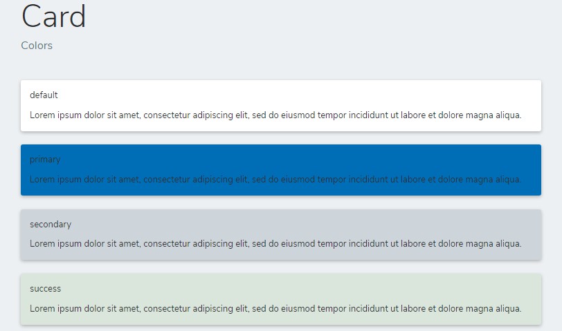
import { Button } from '@appfolio/react-gears';
export default (props) => {
return (
<Button color="danger">Danger!</Button>
);
};
Development
Install dependencies:
npm install
Run storybook examples:
npm start
Open http://localhost:6006 in browser
Run tests & coverage report:
npm test
If using Cypress for integration testing, you can use react-gears-cypress for testing react-gears components.
Run Linter
npm run lint
- Runs ESLint using appfolio-react as the base configuration
Publishing
npm version (major|minor|patch)
npm publish
-
Release notes are generated in the postpublish script using Github Release Notes. Instructions for installation and setup here. (Latest version has a breaking bug, so we should use the latest working version
0.17.1)npm install -g [email protected]