react-text-search-input
This is a React input component that provides a text search functionality in pages.
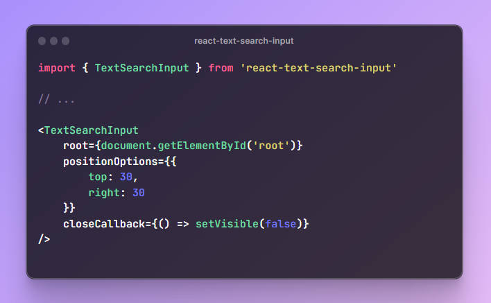
Code:
import { TextSearchInput } from 'react-text-search-input'

// ...

<TextSearchInput
    root={document.getElementById('root')}
    positionOptions={{
        top: 30,
        right: 30
    }}
    closeCallback={() => setVisible(false)}
/>
This component provides three props:
-
optional
root: An element. It is the root of the tree where the search will start, usuallydocument.getElementById('root')in React. -
optional
positionOptions: An object with propstopandright. It is the absolute position of the search input.topandrightcan be numbers for pixels or strings for percentages. -
optional
closeCallback: A function that will be called when the close button is clicked. You can use it to control visibility of the search input.
Below is a complete example:
import React, { useEffect } from 'react';
import { TextSearchInput } from 'react-text-search-input';

function App() {
  const [visible, setVisible] = React.useState(false)

  useEffect(() => {
    const handleKeyDown = (event: KeyboardEvent) => {
      if (event.key === 'f' && event.ctrlKey) {
        setVisible(true)
      }
    }
    window.addEventListener('keydown', handleKeyDown)
    return () => {
      window.removeEventListener('keydown', handleKeyDown)
    }
  }, [])

  return (
    <div>
      {
        visible ? (
          <TextSearchInput
            root={document.getElementById('root')}
            positionOptions={{
              top: '5%',
              right: 20
            }}
            closeCallback={() => setVisible(false)}
          />
        ) : <></>
      }
    </div>
  );
}

export default App;
All styles are not adjustable, and perhaps an interface will be provided in the future to implement user-defined input box styles.