react-full-page-scroller
A react module for full page scroll.
Install
npm install --save react-full-page-scroller
Usage
import React, { Component } from 'react'

import MyComponent from 'react-full-page-scroller'
import 'react-full-page-scroller/dist/index.css'

class Example extends Component {
  render() {
    return (
      <MyComponent>
        <div>
          <h1>1</h1>
        </div>
        <div>
          <h1>2</h1>
        </div>
        <div>
          <h1>3</h1>
        </div>
      </MyComponent>
    )
  }
}
Props
| Prop Name | Type |
|---|---|
| pageNav | Object |
| pageClasses | array |
| indicatorStyle | object |
| indicatorStyleActive | object |
Page Nav Object
You can customize every button in the nav page
| Name | Type | Required | Description |
|---|---|---|---|
| id | number | Yes | id for the object. |
| title | string | Yes | title of the nav button. |
| className | string | No | the className of the page nav button. |
| style | object | No | A custom style for the page nav button. |
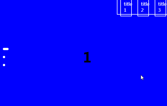
Exemple
import React, { Component } from 'react'

import MyComponent from 'react-full-page-scroller'
import 'react-full-page-scroller/dist/index.css'

const PageNavExample  {

    const navExample={[{
                      id: 1,
                      title: 'title 1',
                      className: 'page-nav-button',
                      style: { width: '1rem' }
                    },
                    {
                      id: 2,
                      title: 'title 2',
                      className: 'page-nav-button',
                      style: { width: '1rem' }
                    },
                    {
                      id: 3,
                      title: 'title 3',
                      className: 'page-nav-button',
                      style: { width: '1rem' }
                    }
                  ]};

    return (
      <MyComponent pageNav={navExample}>
        <div>
          <h1 className='page-number'>1</h1>
        </div>
        <div>
          <h1 className='page-number'>2</h1>
        </div>
        <div>
          <h1 className='page-number'>3</h1>
        </div>
      </MyComponent>
    )
}
Page Classes
You can add a class name for every page
| Name | Type | Required | Description |
|---|---|---|---|
| id | number | Yes | id for the object. |
| className | string | Yes | the className. |
Exemple
import React, { Component } from 'react'

import MyComponent from 'react-full-page-scroller'
import 'react-full-page-scroller/dist/index.css'

const PageNavExample  {

  const pageClasses = [
    {
      id: 0,
      className: 'bg-blue'
    },
    {
      id: 1,
      className: 'bg-red'
    }
  ]

    return (
      <MyComponent pageClasses={pageClasses}>
        <div>
          <h1 className='page-number'>1</h1>
        </div>
        <div>
          <h1 className='page-number'>2</h1>
        </div>
        <div>
          <h1 className='page-number'>3</h1>
        </div>
      </MyComponent>
    )
}
Indicator Style
You can add an indicator by adding the two props indicatorStyle and indicatorStyleActive
| Name | Type | Required | Description |
|---|---|---|---|
| indicatorStyle | object | Yes | the indicator default style is required to show the indicator. |
| indicatorStyleActive | object | No | the style of the active indicator. |
Exemple
import React, { Component } from 'react'

import MyComponent from 'react-full-page-scroller'
import 'react-full-page-scroller/dist/index.css'

const PageNavExample  {

 const  indicatorStyle = {
    height: '8px',
    width: '8px',
    margin: '10px',
    borderRadius: '4px',
    backgroundColor: 'white',
    transition: 'width 500ms ease'
  }
  const indicatorStyleActive= { width: '20px' }

    return (
      <MyComponent indicatorStyle={indicatorStyle} indicatorStyleActive={indicatorStyleActive}>
        <div>
          <h1 className='page-number'>1</h1>
        </div>
        <div>
          <h1 className='page-number'>2</h1>
        </div>
        <div>
          <h1 className='page-number'>3</h1>
        </div>
      </MyComponent>
    )
}