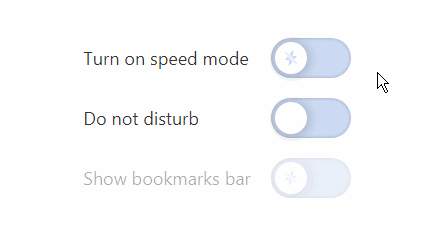
React switch
A switch component represents a boolean state, true/false, on/off. Perfect for functionality that requires immediate feedback. It differs from a checkbox in that a checkbox has a third, indefinite state.
Use cases include changing settings, toggling between themes, etc.
Warning: I'm doing this to train my frontend skills. Although it seems to be working fine for me, I didn't have the time to test things exhaustively and cannot guarantee that it will work as expected.
Also, note that I did not test its usage within forms. For that, you should probably use checkboxes as they are best suited for functionality that doesn't require immediate feedback.
Usage
Make sure you have styled-components and prop-types installed. Copy the /Switch folder and import Switch into your project.
import Switch from 'path/to/Switch'
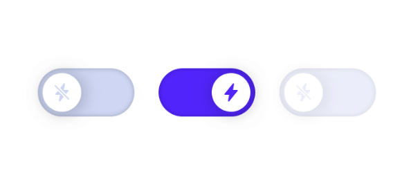
import { ReactComponent as OnIcon } from 'path/to/on-icon.svg'
import { ReactComponent as OffIcon } from 'path/to/off-icon.svg'
<Switch
label='Show bookmarks bar'
activeStateIcon={<OnIcon />}
inactiveStateIcon={<OffIcon />}
onChange={(isActive) => console.log(`I'm ${isActive ? 'truthy' : 'falsy'}.`)}
/>
For example usage see: /src/Demo.
Props
| Name | Type | Description |
|---|---|---|
defaultActive |
boolean | Controls whether the switch starts with an active state. Defaults to false. |
disabled |
boolean | Controls whether the switch is non-interactive. Defaults to false. |
inline |
boolean | Controls whether the switch occupies only the necessary width. Defaults to false. |
justifyContent |
string | Controls the spacing between switch and label. Defaults to 'space-between'. |
activeStateIcon |
SVG element | Icon to be shown when the switch is in an active state. |
inactiveStateIcon |
SVG element | Icon to be shown when the switch is in an inactive state. |
label |
string | Text to be shown next to the switch. |
labelAlignment |
'left' or 'right' | Controls the alignment of the label. Defaults to 'left'. |
ariaLabel |
string | Text for accessibility devices. You should use it if no label is provided. |
onChange |
function | A callback function that is invoked on every state change with true or false. |
Styling
You can pass an object with the following shape to ThemeProvider:
const theme = {
  switch: {
    background: '#ccdaf4',
    backgroundAccent: '#1f6eff',
    height: '4rem',
    width: '8rem',
    indicatorBackground: '#ffffff',
    indicatorSize: '3.2rem',
    indicatorMargin: '0 0.4rem',
    svgSize: '1.6rem'
  }
}
For more details and example usage, see: /src/Demo.