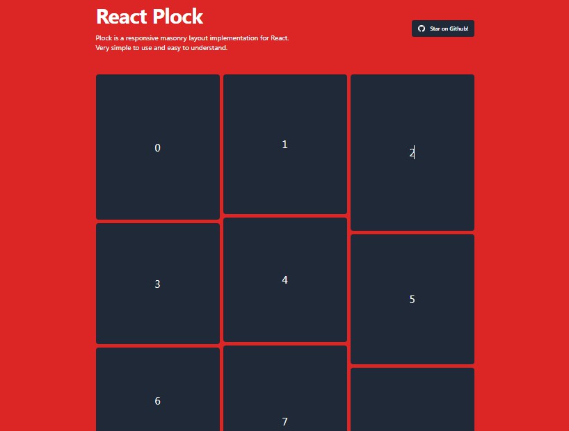
masonic
A React virtualized, autosizing masonry component based upon Brian Vaughn's react-virtualized and further inspired by react-window.
Requirements
React >16.8 is a minimum requirement because
this package relies on and provides React hooks.
Motivation
Brian's Masonry component is great in its
performance and versatility, but I wanted something more directly suited
to my growing needs for scalable masonry layout. I also desired something
with an API that more closely matched react-window's awesome API.
API
<Masonry>
An autosizing virtualized masonry component which only renders items
currently visible in the window.
import {Masonry} from 'masonic'

const items = []
for (let i = 0; i < 1000; i++) {
  items.push({id: i})
}

const EasyMasonryComponent = props => (
  <Masonry items={items}>
    {({index, data, width}) => (
      <div>
        <div>Index: {index}</div>
        <pre>{JSON.stringify(data)}</pre>
        <div>Column width: {width}</div>
      </div>
    )}
  </Masonry>
)
Prop types
Column rendering
columnWidth<number>required- default
240 - This is the minimum column width.
Masonicwill automatically
size your columns to fill its container based on your provided
columnWidthandcolumnGuttervalues. It will never render
anything smaller than this defined width unless its container
is smaller than its value.
columnGutter<number>- default
0 - This defines the amount of vertical and horizontal space in pixels to
display between the rendered items
columnCount<number>- By default,
Masonicderives the column count from the provided
minimum column width. However, in some situations it is nice to be
able to override that behavior (e.g. when creating a<List>)
Item rendering
render<React.Component|function>required- alias
children - This is the component which is rendered for each item in
items
below. It receives 3 properties fromMasonic:index- `
- The index of the item in the
itemsarray below
- `
data<any>- The data provided by
items[index]from theitemsarray below
width- The width of the column containing this component. This is highly
useful for better estimating the sizes of things like images.
- The width of the column containing this component. This is highly
items<array>required- An array of items to render. The data contained here is used for
creating thedataproperty passed to yourrendercomponent. It
is also used for theonRendercallback and theitemKeygenerator.
Its length is used for determining the estimated height of the
container.
itemHeightEstimate<number>- default
300 - This value is used for estimating the initial height of the
Masonry container element. Though unimportant at face value, it is
vital to the UX of the scrolling behavior and in determining how
manyitemsto initially render.
itemAs<React.Component|string|function>- default
div - This determines the element type created by React when creating
the position wrappers for the rendered items. A common use case
would be changing this toliand theasprop toul.
itemStyle<object>- This appends additional inline styles to the position wrappers for
rendered items.
itemKey(item: any, index: number)<function>- The value returned by this function must be unique to its item.
- By default, an item's index will be used as its key. This is okay if:
- Your collections of items is never modified
- Your
rendercomponent is not stateful and does not extendPureComponent
- e.g.
itemKey={data => data.id}
Customizing the container element
as<React.Component|function|string>- default
div - This is useful if for example you'd like the container element to be
of the node typeul
id<string>- An custom ID to apply to the container
className<string>- A custom class name to apply to the container
style<object>- Additional inline styles to apply to the container
role<string>- default
grid - An accessibility role to apply to the container
tabIndex<number>- default
0 - A
tabindexvalue to apply to the container. Used for accessibility.
Window properties
initialWidth<number>- default
1280 - An initial width to provide to the window scroller when the
windowis not defined, i.e. in SSR.
initialHeight<number>- default
720 - An initial height to provide to the window scroller when the
windowis not defined, i.e. in SSR.
overscanBy<number>- default
2 - This is used for determining the number of elements outside of the
visible window to pre-render- This value is multiplied by the height of the window. By defining
2you're saying 'render enough elements to fill two windows'. - Overscanning allows the tab key to focus on the next (not yet visible)
item - Overscanning can slightly reduce or prevent a flash of empty space
when a user first starts scrolling.
- This value is multiplied by the height of the window. By defining
windowScroller<object>- An object which defines option for the underlying window scroll position
and size tracker. Its properties are: scroll<object>fps<number>- default
8 - The frames per second to throttle the window scroll position
updates to. The default of8effectively means the scroll
position will only update8times in 1 second, or once every
125ms.
size<object>wait<number>- default
120 - Window resize events are debounced to avoid doing wayyyy too
much reflow work when the window size changes. This value
specifies the amount of time to wait until those resize events
stop firing before the event is actually allowed to trigger,
and the size is measured.120is a sane default, as it feels
instantaneous when you stop resizing and it doesn't do too
much work in the interim.
Callbacks
onRender(startIndex: number, stopIndex: number, items: array)<function>- This callback fires any time the items rendered in the visible
window change. startIndex<number>- The index of the first item most recently rendered.
stopIndex<number>- The index of the last item most recently rendered.
items- The array of items provided in the
itemsprop
- The array of items provided in the
Methods
When a ref is provided to this component, you'll have access to its
following methods:
clearPositions(): void- Clears the position cache of the component. This is primarily used
for resetting the position state when you want to render a completely
different array ofitems. You could also provide a uniquekey
property to the<Masonry>component to achieve similar.
- Clears the position cache of the component. This is primarily used
<List>
An autosizing virtualized list component which only renders items currently
visible in the window. This is just a single-column Masonry component.
Prop types
This component inherits all of the props listed in <Masonry> with exception
to columnWidth, columnCount, and columnGutter which are discarded.
rowGutter<number>- This defines the amount of vertical space in pixels to display between the
rendered items
useInfiniteLoader(loadMoreItems: function, opt: object): onRenderCallback
A React hook for seamlessly creating an infinite scrolling Masonry or List
component.
import {Masonry, useInfiniteLoader} from 'masonic'

const fetchMoreItems = memoize((startIndex, stopIndex) =>
  fetch(
    `/api/get-more?after=${startIndex}&limit=${startIndex + stopIndex}`
  ).then(items => {
    // do something to add the new items to your state
  })
)

const InfiniteMasonry = props => {
  const maybeLoadMore = useInfiniteLoader(fetchMoreItems)
  return <Masonry {...props} onRender={maybeLoadMore} />
}
Arguments
loadMoreItems<function>required- This callback will be invoked when more items must be loaded.
- It should implement the following signature:
(startIndex: number, stopIndex: number, items: array): Promise
- The returned Promise should be resolved once row data has finished loading.
- It will be used to determine when to refresh the list with the newly-loaded data.
- This callback may be called multiple times in reaction to a single scroll event.
As such, you are expected to memoize/track whether or not you've already
received thestartIndex,stopIndex,itemsvalues to prevent
loading data more than once.
opt<object>isItemLoaded<function>- default
(index, items) => items[index] !== undefined - Function responsible for determining the loaded state of each item.
- It should implement the following signature:
(index: number, items: array): boolean
minimumBatchSize<number>- default
16 - Minimum number of items to be loaded at a time. This property is
used to batch requests to reduce HTTP requests.
threshold<number>- default
16 - A threshold at which to pre-fetch data.
- The default value of
16means that data will start loading when
a user scrolls within16items.
totalItems<number>- default
9E9 - The total number of items you'll need to eventually load (if known).
This can be arbitrarily high if not known (as such, the default value).
Differences from react-virtualized/Masonry
There are actually quite a few differences between these components and
the originals, despite the overall design being highly inspired by them.
-
The original component requires a
<CellMeasurer>,
cellPositioner, andcellMeasurerCache. InMasonicthis
functionality is built in and usesresize-observer-polyfill
for tracking cell size changes. -
This component will auto-calculate the number of columns to render based
upon the definedcolumnWidthproperty. The column count will update
any time it changes. -
The implementation for updating cell positions and sizes is also much more
efficient in this component because only specific cells and columns are
updated when cell sizes change, whereas in the original a complete reflow
is triggered. -
The Masonry component only renders relative to its parent container's width
and the browser window's height. The original component is tuned for
rendering inside a parent container and not the window. You can import
FreeMasonryto customize this behavior. -
The API is a complete rewrite and because of much of what is mentioned
above, is much easier to use in my opinion.