React Masonry
An easy to use and simple masonry layout for React Js based on flexbox column.
Basic Usage
Masonry Layout
<Masonry
    dataArray={images}
    columnCount={column}
    ChildsElement={ImageElement}
/>
- dataArray is array that will be rendered as child
- columnCount is number that representated how many column will rendered
- ChildsElement is Child Component and will be render and receive each of dataArray
Child Element
Example of create a ChildElement component
ChildElement component receive props.value that representated each of dataArray that passed at Masonry Layout
const ImageElement = memo(({ value }) => (
    <div style={{ borderRadius: '10px', margin: '5px' }}>
        <img src={value} style={{ width: '100%', borderRadius: '10px' }} />
    </div>
))
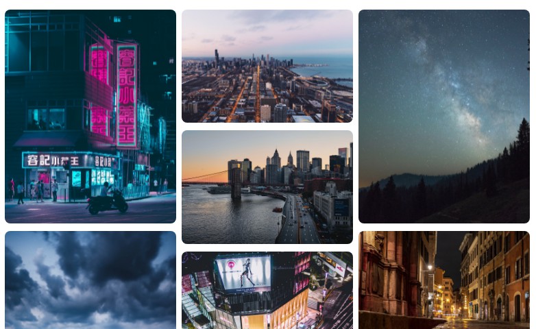
Examples
import { useState, memo, useCallback, useEffect } from 'react'
import Masonry from '@bakunya/react-masonry'

/**
 * Initial images that will render as value on child, each item will passed on ChildsElement as props.value
 */
const initialImages = [
    "https://images.unsplash.com/photo-1533003505519-6a9b92ed4911?crop=entropy&cs=tinysrgb&fit=max&fm=jpg&ixid=MnwxfDB8MXxyYW5kb218MHx8Y2l0eSxuaWdodHx8fHx8fDE2NDI3NTE4MDA&ixlib=rb-1.2.1&q=80&utm_campaign=api-credit&utm_medium=referral&utm_source=unsplash_source&w=1080",
    "https://images.unsplash.com/photo-1504883303951-581cbf120aa4?crop=entropy&cs=tinysrgb&fit=max&fm=jpg&ixid=MnwxfDB8MXxyYW5kb218MHx8Y2l0eSxuaWdodHx8fHx8fDE2NDI3NTIyOTY&ixlib=rb-1.2.1&q=80&utm_campaign=api-credit&utm_medium=referral&utm_source=unsplash_source&w=1080",
    "https://images.unsplash.com/photo-1517328894681-0f5dfabd463c?crop=entropy&cs=tinysrgb&fit=max&fm=jpg&ixid=MnwxfDB8MXxyYW5kb218MHx8Y2l0eSxuaWdodHx8fHx8fDE2NDI3NTIzMDU&ixlib=rb-1.2.1&q=80&utm_campaign=api-credit&utm_medium=referral&utm_source=unsplash_source&w=1080",
]

/**
 * Child element that pass at Masonry component as ChildsElement.
 * The props.value is representated as each of dataArray that passed at Masonry component, in here is initialImages
 */
const ImageElement = memo(({ value }) => (
    <div style={{ borderRadius: '10px', margin: '5px' }}>
        <img src={value} style={{ width: '100%', borderRadius: '10px' }} />
    </div>
))

const App = () => {
    /**
     * initialImages set at useState hooks, so you can manipulate as state hooks
     */
    const [images, setImages] = useState(initialImages)

    const handleImages = useCallback(() => setImages(prev => [...prev, ...initialImages]), [setImages])

    /**
     * this code is example of responsive column, how many columns will be rendered if width of screen reach a certain value
     */

    const settingColumns = useCallback(() => {
        if(window.innerWidth >= 1400) return 4
        if(window.innerWidth >= 800) return 3
        if(window.innerWidth >= 500) return 2
        return 1
    }, [])

    const [column, setColumn] = useState(() => settingColumns())

    useEffect(() => {
        window.addEventListener('resize', () => setColumn(() => settingColumns()))

        return window.removeEventListener('resize', () => setColumn(() => settingColumns()))
    }, [setColumn, settingColumns])

    /**
     * end of responsive column example
     */

    return (
        <div className="App">
            <div style={{ padding: '5px' }}>
                <Masonry
                    dataArray={images}
                    columnCount={column}
                    ChildsElement={ImageElement}
                />
            </div>
            <button onClick={handleImages} style={{ cursor: 'pointer', padding: '20px', display: 'block', margin: '30px auto' }}>Load More Text</button>
        </div>
    )
}

export default memo(App)