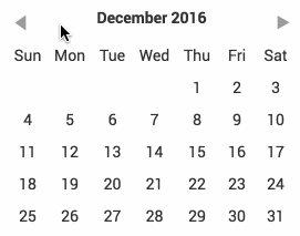
react-daypicker
A simple datepicker inspired by Pikaday.
Installation
yarn
yarn add react-daypicker
npm
npm install --save react-daypicker
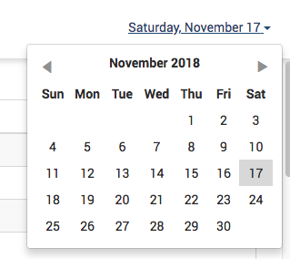
Agnostic building block
Note that this component does not draw any border around itself or handle popping
up. That is up to you and your framework. I am using it with react-bootstrap v3
and it my usage looks like this:
Usage
import 'react-daypicker/lib/DayPicker.css';
import DayPicker from 'react-daypicker';
The only required property is onDayClick which is called when a day is clicked.
<DayPicker onDayClick={(day) => this.setState({ day })} />
An optional property active can be added in order to mark a day as active:
<DayPicker
  active={moment().add(1, 'day')}
  onDayClick={(day) => this.setState({ day })}
/>
Note that active is expected to be an instance of moment from Moment.js.
Options on styling
You can import the Sass stylesheet instead:
import 'react-daypicker/src/DayPicker.scss';
The root element is .react-daypicker-root. The default styling is
intentionally monochrome and basic so that you can drop it into your project
without having to fiddle with styles right away.
Dependencies
Peer
- React
- moment
- classnames
Developing
See package.json for details but simply run:
npm run build