mono-stacked-bar
A simple mono stacked bar in React.
Install
npm install --save mono-stacked-bar
# or using yarn
yarn add mono-stacked-bar
Do not forget to include the css file !
-
Using ES6 with a module bundler like Webpack
import "mono-stacked-bar/dist/index.css"
-
With good old reliable HTML tag
    <head>
      <link href="node_modules/mono-stacked-bar/dist/index.css" rel="stylesheet" />
    </head>
Usage
import React from "react"
import MonoStackedBar from "mono-stacked-bar"
import "mono-stacked-bar/dist/index.css"
const App = () => {
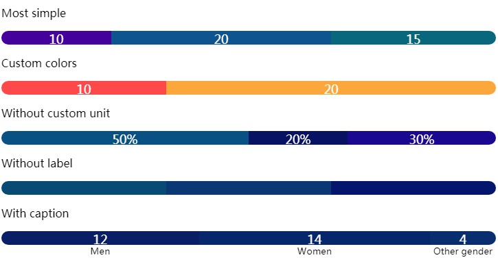
return <MonoStackedBar data={[10, 20, 15]} />
}
Required props
The data "props" can have two forms.
Note : caption are shown underneath the bar.
| props | type | properties | sample |
|---|---|---|---|
| data | number[] | [10, 20, 25] | |
| data | BarData[] | value: number (required)color: string (optional)caption: string (optional) | [{ value: 10, color: "red", caption: "Some text" }, { value: 15, color: "orange" }] |
Optional props
| props | type | default | description |
|---|---|---|---|
| color | string | blue | A default set of colors picked thanks to the randomcolor package |
| luminosity | "bright" or "light" or "dark" | dark | Default luminosity applied to randomcolor |
| displayLabels | boolean | true | Should data values be displayed inside bar sections |
| unit | string | "" | The unit to be displayed after labels (%, $, etc) |
| width | number (px) | Max width of the stacked bar (full-width by default) | |
| height | number (px) | 20 | The height of the stacked bar |
| radius | number (px) | 10 | The border radius applied to the edges |