React Ok Tooltip
React Ok Tooltip is a simple and easy to use tooltip component for React.

Usage
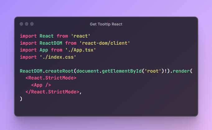
Inside App.tsx:
import { Tooltip } from '@deepdub/react-ok-tooltip';
import '@deepdub/react-ok-tooltip/dist/tooltip.css';

function App() {
  return (
    <>
      {/* insert app here... */}
      <Tooltip arrowSize={5} />
    </>
  );
}
Then, inside Component.tsx:
import { tooltip } from '@deepdub/react-ok-tooltip';

function Component() {
  return (
    <button {...tooltip('I am a tooltip!')}>Hover me!</button>
  );
}
Options
Tooltip Options
tooltip() method accepts two parameters: title (a string) and options (an object of shape TooltipProps).
TooltipProps may include any of the follwing:
- subtitle:
string– A subtitle that will appear, well, below the title. - maxWidth:
string– A string, passed to the tooltip’sstyle.maxWidth.
All are optional.
Global Tooltip Options
Customize the tooltip by passing any of these to <Tooltip>:
- arrowSize:
number– The size of the arrow. - backgroundColor:
string– The background color of the tooltip. - borderColor:
string– The border color of the tooltip.
All are optional.
Tooltip Group
React Ok Tooltip also supports a concept we’ve called “tooltip group”.
A tooltip group is a group of tooltips that are displayed at the same position, anchored to the same element.
Usage
import { tooltip } from '@deepdub/react-ok-tooltip';

function Component() {
  return (
    <div {...tooltipGroup()}>
      <button {...tooltip('Cut Selection')}>Cut</button>
      <button {...tooltip('Copy Selection')}>Copy</button>
      <button {...tooltip('Paste')}>Paste</button>
    </div>
  );
}