React Social Login Buttons
A simple package to display social login buttons using React.
Buttons do not provide any social logic. They are only visual components listening to some events triggered by the user.
Install
npm
npm install --save react-social-login-buttons
yarn
yarn add react-social-login-buttons
Importing
ES6 imports:
import { FacebookLoginButton } from "react-social-login-buttons";
ES6 imports optimized:
import FacebookLoginButton from "react-social-login-buttons/lib/buttons/FacebookLoginButton";
Usage
Default button content - "Login with Facebook"
<FacebookLoginButton onClick={() => alert("Hello")} />
Custom button content
<FacebookLoginButton onClick={() => alert("Hello")}>
  <span>Custom text</span>
</FacebookLoginButton>
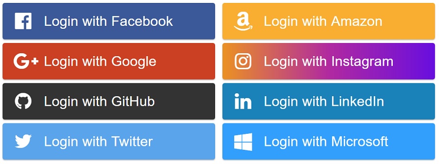
Social Button Types
We currently support just a few login buttons. Others will be implemented later.
FacebookLoginButton
<FacebookLoginButton onClick={() => alert("Hello")} />
GoogleLoginButton
<GoogleLoginButton onClick={() => alert("Hello")} />
GithubLoginButton
<GithubLoginButton onClick={() => alert("Hello")} />
TwitterLoginButton
<TwitterLoginButton onClick={() => alert("Hello")} />
AmazonLoginButton
<AmazonLoginButton onClick={() => alert("Hello")} />
InstagramLoginButton
<InstagramLoginButton onClick={() => alert("Hello")} />
LinkedInLoginButton
<LinkedInLoginButton onClick={() => alert("Hello")} />
MicrosoftLoginButton
<MicrosoftLoginButton onClick={() => alert("Hello")} />
Create your own button
You can create your own button.
You do not have to wait for us to implement all of them.
You can also use your own icons, let's say from font-awesome.
You can also pass a component to the icon prop.
import React from "react";
import createButton from "react-social-login-buttons/lib/buttons/create-button";

const config = {
  text: "Login with Facebook",
  icon: "facebook",
  iconFormat: name => `fa fa-${name}`,
  style: { background: "#3b5998" },
  activeStyle: { background: "#293e69" }
};
/** My Facebook login button. */
const MyFacebookLoginButton = createButton(config);

export default MyFacebookLoginButton;
Props
Props for every Button
onClick {function} (optional)
Will be triggered when clicked on the button.
style {Object} (optional)
Custom button styles
children {React.children} (optional)
You can pass any children to our buttons.
activeStyle {Object} (optional)
activeStyle styles will be applied instead of style when mouse hovers above the element
icon {String|Node} (optional)
This icon will be displayed.
If you pass a string, <i className={format(name)}/> will be rendered.
iconSize {String} (optional)
Icon will have this size. Eg. "26px"
size {String} (optional)
Box will have this size. Eg. "150px"
iconFormat {function} (optional)
Format icon className. Eg. (name) => "fa-icon fa-icon-" + name
align {"left" | "right" | "center"} (optional)
Align the text on the button (default is left).
preventActiveStyles {Boolean} (optional) default: false
If set to true, activeStyles won't be used and will be used styles from the style prop.
Events
onClickonMouseEnteronMouseLeave
Why react-social-login-buttons ?
react-social-login-buttons is focused on speed and simplicity.