react-search
react-search is a simple search autocomplete component using react.js.
Install
yarn add react-search
Usage basic
Pass in your items as a prop to react-search. The items must be an array of objects with value and id, and any other props you may need, which will not be displayed. Check out the example for more info.
import Search from 'react-search'
import ReactDOM from 'react-dom'
import React, { Component, PropTypes } from 'react'
class TestComponent extends Component {
HiItems(items) {
console.log(items)
}
render () {
let items = [
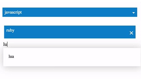
{ id: 0, value: 'ruby' },
{ id: 1, value: 'javascript' },
{ id: 2, value: 'lua' },
{ id: 3, value: 'go' },
{ id: 4, value: 'julia' }
]
return (
<div>
<Search items={items} />
<Search items={items}
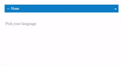
placeholder='Pick your language'
maxSelected={3}
multiple={true}
onItemsChanged={this.HiItems.bind(this)} />
</div>
)
}
}
ReactDOM.render( <TestComponent />, document.getElementById('root'))
Usage async
To load items async before running the search to filter results you can pass a function to the getItemsAsync prop which will be triggered to load the results each key change. An example below using the github api to search for repos. Check out the example for more info.
import Search from 'react-search'
import ReactDOM from 'react-dom'
import React, { Component, PropTypes } from 'react'

class TestComponent extends Component {

  constructor (props) {
    super(props)
    this.state = { repos: [] }
  }

  getItemsAsync(searchValue, cb) {
    let url = `https://api.github.com/search/repositories?q=${searchValue}&language=javascript`
    fetch(url).then( (response) => {
      return response.json();
    }).then((results) => {
      if(results.items != undefined){
        let items = results.items.map( (res, i) => { return { id: i, value: res.full_name } })
        this.setState({ repos: items })
        cb(searchValue)
      }
    });
  }

  render () {
    return (
      <div>
        <Search items={this.state.repos}
                multiple={true}
                getItemsAsync={this.getItemsAsync.bind(this)}
                onItemsChanged={this.HiItems.bind(this)} />
      </div>
    )
  }
}

ReactDOM.render( <TestComponent />, document.getElementById('root'))
Props
items (required)
List of Items to filter through, an array of items with value and id, and any other props. value is displayed. let items = [{ id: 0, value: 'ruby' }, { id: 1, value: 'lua' }
multiple (optional)
Defaults to false, set as true if you want multiple items in the list, false for a single selection dropdown.
maxSelected (optional)
Defaults to 100, a maximum number of items allowed to be selected
placeholder (optional)
placeholder for the input
NotFoundPlaceholder (optional)
The placeholder shown when no results are found
onItemsChanged (optional)
Handler returns the items from the Search autocomplete component when items are added or removed from the list.
onKeyChange (optional)
Handler returns the search value on key change.
getItemsAsync (optional)
A function to load items async before running the autocomplete filter.
Styles
Uses styled-components ? for the base styling.
Development
yarn
npm run dev
Build
yarn
npm run build
npm login
npm version patch
git add -A
git push origin master
npm publish