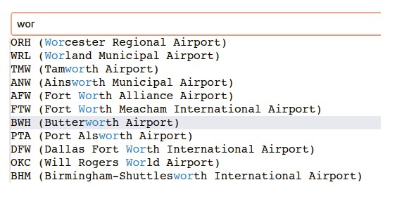
ReactSearchAutocomplete
A <ReactSearchAutocomplete> is a fully customizable search box where the user can type text and filter the results. It relies on Fuse.js v6.4.4 for the fuzzy search. Check out their website to see the options (you can pass them to this component).
Release 5.1.0
- added
onHoverprop that returns the result the user is hovering - added
clearIconprop to display a clear icon in the search box - it's now possible to style the search icon and the clear icon margins by using the styling prop if the default values are not optimal:
  styling={{
    searchIconMargin: "10px 12px 0 11px",
    clearIconMargin: "10px 0 8px 0"
  }}
Multiple search boxes on the same website
If you are using multiple search boxes set useCaching to false (default is false); the implementation for multiple cached search boxes is work in progress.
Installing
$ npm install react-search-autocomplete
With React 17
$ npm install react-search-autocomplete --legacy-peer-deps
Exports
The default export is <ReactSearchAutocomplete>.
To use it:
import { ReactSearchAutocomplete } from 'react-search-autocomplete'
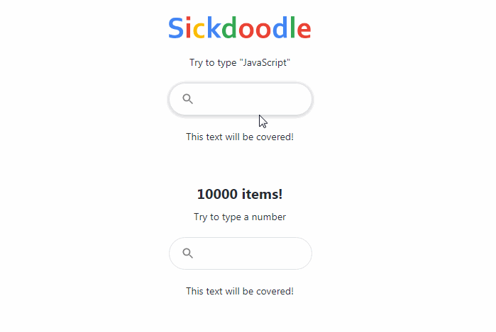
React Search Autocomplete Usage
import React from 'react'
import './App.css'
import { ReactSearchAutocomplete } from 'react-search-autocomplete'
function App() {
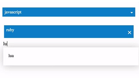
const items = [
{
id: 0,
name: 'Cobol'
},
{
id: 1,
name: 'JavaScript'
},
{
id: 2,
name: 'Basic'
},
{
id: 3,
name: 'PHP'
},
{
id: 4,
name: 'Java'
}
]
const handleOnSearch = (string, results) => {
// onSearch will have as the first callback parameter
// the string searched and for the second the results.
console.log(string, results)
}
const handleOnHover = (result) => {
// the item hovered
console.log(result)
}
const handleOnSelect = (item) => {
// the item selected
console.log(item)
}
const handleOnFocus = () => {
console.log('Focused')
}
return (
<div className="App">
<header className="App-header">
<div style={{ width: 400 }}>
<ReactSearchAutocomplete
items={items}
onSearch={handleOnSearch}
onHover={handleOnHover}
onSelect={handleOnSelect}
onFocus={handleOnFocus}
autoFocus
/>
</div>
</header>
</div>
)
}
export default App
<ReactSearchAutocomplete> Props:
{
  items,
    // The list of items that can be filtered, it can be an array of
    // any type of object. By default the search will be done on the
    // property "name", to change this behaviour, change the `fuseOptions`
    // prop. Remember that the component uses the key "name" in your
    // items list to display the result. If your list of items does not
    // have a "name" key, use `resultStringKeyName` to tell what key
    // (string) to use to display in the results.
    fuseOptions,
    // To know more about fuse params, visit https://fusejs.io/
    //
    // By default set to:
    // {
    //   shouldSort: true,
    //   threshold: 0.6,
    //   location: 0,
    //   distance: 100,
    //   maxPatternLength: 32,
    //   minMatchCharLength: 1,
    //   keys: [
    //     "name",
    //   ]
    // }
    //
    // `keys` represent the keys in `items` where the search will be
    // performed.
    //
    // Imagine for example that I want to search in `items` by `title`
    // and `description` in the following items, and display the `title`;
    // this is how to do it:
    //
    //   const items = [
    //     {
    //       id: 0,
    //       title: 'Titanic',
    //       description: 'A movie about love'
    //     },
    //     {
    //       id: 1,
    //       title: 'Dead Poets Society',
    //       description: 'A movie about poetry and the meaning of life'
    //     }
    //   ]
    //
    // I can pass the fuseOptions prop as follows:
    //
    //   <ReactSearchAutocomplete
    //     items={items}
    //     fuseOptions={{ keys: ["title", "description"] }}
    //     // necessary, otherwise the results will be blank
    //     resultStringKeyName="title"
    //   />
    //
    resultStringKeyName,
    // The key in `items` that contains the string to display in the
    // results
    inputDebounce,
    // Default value: 200. When the user is typing, before
    // calling onSearch wait this amount of ms.
    onSearch,
    // The callback function called when the user is searching
    onHover,
    // THe callback function called when the user hovers a result
    onSelect,
    // The callback function called when the user selects an item
    // from the filtered list.
    onFocus,
    // The callback function called when the user focuses the input.
    showIcon,
    // Default value: true. If set to false, the icon is hidden.
    showClear,
    // Default value: true. If set to false, the clear icon is hidden.
    maxResults,
    // Default value: 10. The max number of results to show at once.
    placeholder,
    // Default value: "". The placeholder of the search box.
    autoFocus,
    // Default value: false. If set to true, automatically
    // set focus on the input.
    styling,
    // The styling prop allows you to customize the
    // look of the searchbox
    // Default values:
    // {
    //   height: "44px",
    //   border: "1px solid #dfe1e5",
    //   borderRadius: "24px",
    //   backgroundColor: "white",
    //   boxShadow: "rgba(32, 33, 36, 0.28) 0px 1px 6px 0px",
    //   hoverBackgroundColor: "#eee",
    //   color: "#212121",
    //   fontSize: "16px",
    //   fontFamily: "Arial",
    //   iconColor: "grey",
    //   lineColor: "rgb(232, 234, 237)",
    //   placeholderColor: "grey",
    //   clearIconMargin: '3px 14px 0 0',
    //   searchIconMargin: '0 0 0 16px'
    // };
    //
    // For example, if you want to change the background
    // color you can pass it in the props:
    // styling={
    //   {
    //     backgroundColor: "black"
    //   }
    // }
}