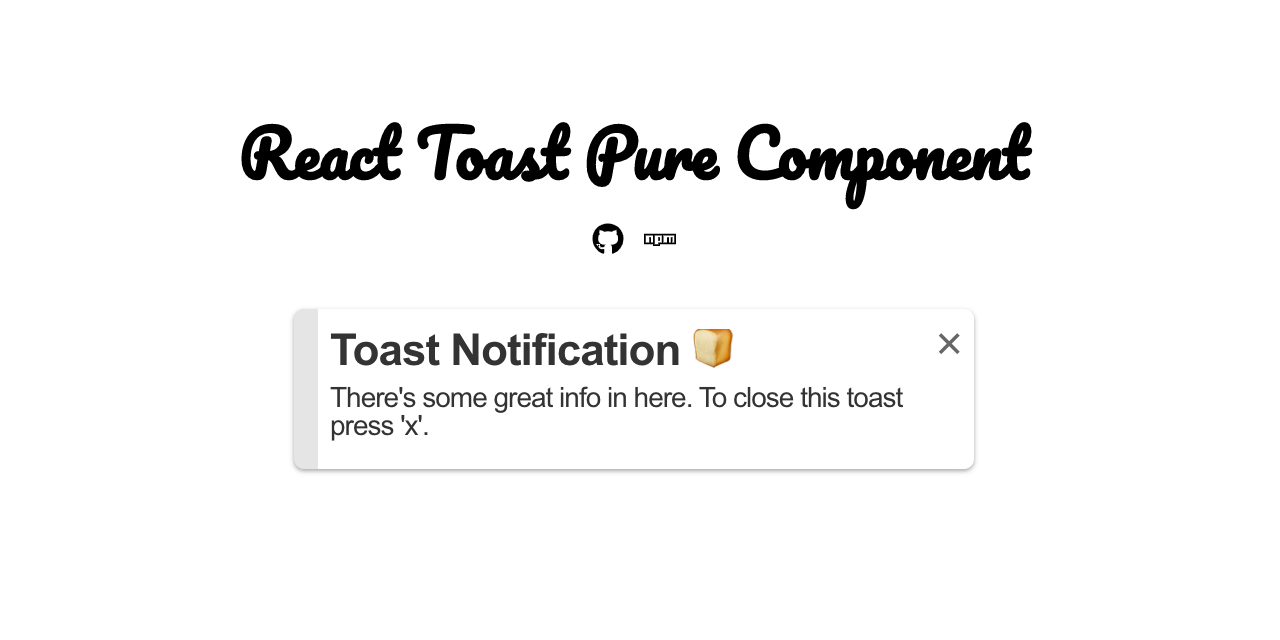
React Toast Component
A lightweight react toast notification component. 11 kb ~
Installation


Prerequisite: React version 16.8+
npm i react-toast-component
Options
| Prop | Default | Type | Description |
|---|---|---|---|
isOpen |
false |
boolean |
Triggers the notification to open. |
hasCloseBtn |
false |
boolean |
Adds/hides close button from toast. |
hasAutoDismiss |
true |
boolean |
Auto dismisses/keeps toast in view. |
closeCallback |
null |
function |
Triggers after toast closes. |
duration |
2000 |
number |
Duration of toast before it's dismissed. |
title |
string |
Toast header. | |
description |
string |
Toast description. | |
children |
node |
Custom elements to add inside toast. | |
classNames |
[] |
array |
Class names to add to the toast. |
Usage
import React, { useState } from 'react';
import Toast from 'react-toast-component';

function App() {
  const [isOpen, setToast] = useState(true);
  return (
    <div className="App">
      <Toast
        isOpen={isOpen}
        hasAutoDismiss={false}
        hasCloseBtn
        closeCallback={() => setToast(false)}
        description="There's some great info here."
        title="App Notification!!"
        duration={5000}
        classNames={['info']}  // 'success', 'info', 'warning', 'error'
      />
    </div>
  );
}

export default App;
Optional custom elements:
<Toast
  isOpen={isOpen}
  closeCallback={() => setToast(false)}
  hasCloseBtn
  description="There's some great info here."
  title="App Notification!!"
>
  <h1>Add your own custom elements in here.</h1>
</Toast>