react-accessible-accordion
Accessible Accordion component for React. Inspired by rc-collapse and react-sanfona.
If you like accessible components, feel free to check this other repo react-accessible-modal.
Usage
First, grab the package from npm:
npm install --save react-accessible-accordion react react-dom
Then, import the editor and use it in your code. Here is a basic example:
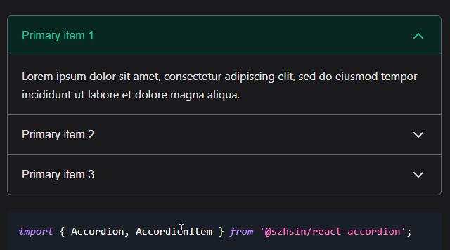
import React from 'react';
import ReactDOM from 'react-dom';

import {
    Accordion,
    AccordionItem,
    AccordionItemTitle,
    AccordionItemBody,
} from 'react-accessible-accordion';

// Demo styles, see 'Styles' section below for some notes on use.
import 'react-accessible-accordion/dist/fancy-example.css';

const Example = () => (
    <Accordion>
        <AccordionItem>
            <AccordionItemTitle>
                <h3>Simple title</h3>
            </AccordionItemTitle>
            <AccordionItemBody>
                <p>Body content</p>
            </AccordionItemBody>
        </AccordionItem>
        <AccordionItem>
            <AccordionItemTitle>
                <h3>Complex title</h3>
                <div>With a bit of description</div>
            </AccordionItemTitle>
            <AccordionItemBody>
                <p>Body content</p>
            </AccordionItemBody>
        </AccordionItem>
    </Accordion>
);

ReactDOM.render(<Example />, document.querySelector('[data-mount]'));
Styles
We strongly encourage you to write your own styles for your accordions, but we've published these two starter stylesheets to help you get up and running:
// 'Minimal' theme - hide/show the AccordionBody component:
import 'react-accessible-accordion/dist/minimal-example.css';

// 'Fancy' theme - boilerplate styles for all components, as seen on our demo:
import 'react-accessible-accordion/dist/fancy-example.css';
We recommend that you copy them into your own app and modify them to suit your needs, particularly if you're using your own classNames.
API
Accordion
props:
| name | type | default | description |
|---|---|---|---|
| accordion | Boolean | true | Open only one item at a time or not |
| onChange | Function(keys) | noop | Triggered on change (open/close items) |
| className | String | accordion | CSS class(es) applied to the component |
AccordionItem
props:
| name | type | default | description |
|---|---|---|---|
| expanded | Boolean | false | Expands this item on first render |
| className | String | accordion__item | CSS class(es) applied to the component |
| hideBodyClassName | String | null | Class name for hidden body state |
AccordionItemTitle
props:
| name | type | default | description |
|---|---|---|---|
| className | String | accordion__title | CSS class(es) applied to the component |
| hideBodyClassName | String | null | Class name for hidden body state |
AccordionItemBody
props:
| name | type | default | description |
|---|---|---|---|
| className | String | accordion__body | CSS class(es) applied to the component |
| hideBodyClassName | String | accordion__body--hidden | Class name for hidden body state |
resetNextUuid
| Function(void) |
| Resets the internal counter for Accordion items' identifiers (including `id` attributes). For use in test suites and isomorphic frameworks. |
Accessibility
What this project is doing accessibility-wise?
This project manages two types of Accordions, with single or multiple items open.
Single item
Use this with with props
accordionset totrueonAccordion.
For this type of Accordion, you will get the following role set up on your elements:
- Accordion:
tablist - AccordionItem: no specific role
- AccordionItemTitle:
tab - AccordionItemBody:
tabpanel
Multiple items
For this type of Accordion, you will get the following role set up on your elements:
Use this with with props
accordionset tofalseonAccordion.
- Accordion: no specific role
- AccordionItem: no specific role
- AccordionItemTitle:
button - AccordionItemBody: no specific role
Development
Install
Clone the project on your computer, and install Node. This project also uses nvm.
nvm install
# Then, install all project dependencies.
npm install
# Install the git hooks.
./.githooks/deploy
# Set up a `.env` file with the appropriate secrets.
touch .env
Working on the project
Everything mentioned in the installation process should already be done.
# Make sure you use the right node version.
nvm use
# Start the the development tools in watch mode.
npm run start
# Runs linting.
npm run lint
# Runs tests.
npm run test
# View other available commands with:
npm run
Run the demo
Everything mentioned in the installation process should already be done.
# Make sure you use the right node version.
nvm use
# Start the server and the development tools.
npm run start-demo
Publish
npm version [TYPE]
git push origin master --tags
npm publish
Browser support
Supported browser / device versions:
| Browser | Device/OS | Version | Notes |
|---|---|---|---|
| Mobile Safari | iOS | latest | |
| Chrome | Android | latest | |
| IE | Windows | 11 | |
| MS Edge | Windows | latest | |
| Chrome | Desktop | latest | |
| Firefox | Desktop | latest | |
| Safari | OSX | latest |