Style Variants
The style-variants is a powerful and easy-to-use solution for creating dynamic and reusable styles in your React Native applications. It helps you to build consistent UI components with predefined styles and variants that are easy to maintain and update.

Features
- ? Dynamic styling created from easy-to-use style variant definitions
- ? Create reusable, maintainable styles for your custom components
- ? Group your styling variations based on usage like size, color theme, and component states
- ? Effortlessly apply component styles based on the given set of props
- ? TypeScript ready, providing powerful autocompletion and type checking
- ? Allowing for additional customization
- ⚡️ Boost your development speed and improve maintainability with organized styles
Installation
To install the package, use the following command:
npm install style-variants
or
yarn add style-variants
Usage
This library allows you to define style variants for your custom components and apply them dynamically based on their desired behavior.
Creating style variants
First, we have to create style variants for our custom components. Here is an example of creating style variants for a Button component with multiple size and color variants, and a disabled state:
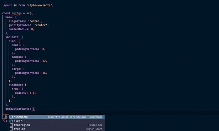
import sv from 'style-variants';

const button = sv({
  base: {
    // Your base styles for the component
  },
  variants: {
    // Group your variants based on their usage,
    // such as size, color, and state
  },
  defaultVariants: {
    // Define the default variants
  },
});
Creating the Button component
Next, we create our Button component using the style variants we just defined:
import { Text, TouchableOpacity, TouchableOpacityProps } from 'react-native';
import React from 'react';
import sv, { VariantProps } from 'style-variants';

type ButtonVariantsProps = VariantProps<typeof button>;

type ButtonProps = ButtonVariantsProps &
  TouchableOpacityProps & {
    children: string,
  };

const button = sv({
  base: {
    borderWidth: 3,
    borderColor: 'transparent',
    alignItems: 'center',
    justifyContent: 'center',
    borderRadius: 8,
  },
  variants: {
    size: {
      small: {
        paddingVertical: 8,
        paddingHorizontal: 16,
      },
      medium: {
        paddingVertical: 12,
        paddingHorizontal: 24,
      },
      large: {
        paddingVertical: 16,
        paddingHorizontal: 32,
      },
    },
    variant: {
      primary: {
        backgroundColor: 'blue',
        borderColor: 'dodgerblue',
      },
      secondary: {
        backgroundColor: 'red',
        borderColor: 'lightpink',
      },
    },
    disabled: {
      true: {
        opacity: 0.5,
      },
    },
  },
  defaultVariants: {
    size: 'medium',
    variant: 'primary',
    disabled: false,
  },
});

const text = sv({
  base: {
    color: 'white',
    fontWeight: '500',
  },
});

const textStyles = text();

const Button = ({
  style,
  children,
  disabled,
  size,
  variant,
  ...props
}: ButtonProps) => {
  const buttonStyles = button({
    disabled,
    size,
    variant,
    style,
  });

  return (
    <TouchableOpacity
      style={buttonStyles}
      activeOpacity={0.8}
      disabled={disabled}
      {...props}
    >
      <Text style={textStyles}>{children}</Text>
    </TouchableOpacity>
  );
};

export default Button;
Using the Button component
Now you can use the Button component in your application, and easily change its appearance by modifying its style variants:
import Button from './Button';

// ...

// Use a primary button with large size
<Button size="large" variant="primary">
  Primary Button
</Button>

// Use a secondary button with small size
<Button size="small" variant="secondary">
  Secondary Button
</Button>

// Use a disabled button
<Button disabled>
  Disabled Button
</Button>
Acknowledgements
Contributing
See the contributing guide to learn how to contribute to the repository and the development workflow.