react-configured
Configure react components with default props and styles
Installation
Using npm
npm install react-configured
Using yarn
yarn add react-configured
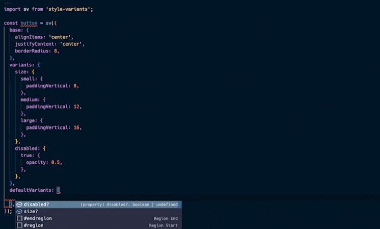
Usage example (React Native)
import { ElementType } from 'react';
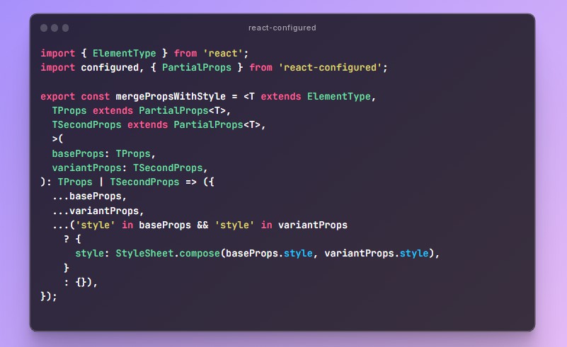
import configured, { PartialProps } from 'react-configured';
export const mergePropsWithStyle = <T extends ElementType,
TProps extends PartialProps<T>,
TSecondProps extends PartialProps<T>,
>(
baseProps: TProps,
variantProps: TSecondProps,
): TProps | TSecondProps => ({
...baseProps,
...variantProps,
...('style' in baseProps && 'style' in variantProps
? {
style: StyleSheet.compose(baseProps.style, variantProps.style),
}
: {}),
});
export type ButtonConfig = ComponentConfig<typeof BaseButton>;
export type FuncButtonConfig = FuncComponentConfig<typeof BaseButton, ButtonConfig>;
export const Button = configured(BaseButton, (props): ButtonConfig => {
const theme = useUIKitTheme();
const { disabled, variant } = props;
const styles = StyleSheet.create({
baseStyle: {
height: 54,
paddingHorizontal: 16,
borderRadius: 12,
justifyContent: 'center',
alignItems: 'center',
flexDirection: 'row',
borderStyle: 'solid',
borderWidth: 0,
},
disabled: {
backgroundColor: theme.colors.gray['5'],
},
disabled__text: {
color: theme.colors.gray['3'],
},
'variant:primary': {
backgroundColor: theme.colors.primary,
},
'variant:primary__text': {
color: theme.colors.white,
},
'variant:secondary': {
backgroundColor: theme.colors.white,
borderWidth: 1,
borderColor: theme.colors.gray['5'],
},
'variant:secondary__text': {
color: theme.colors.black['2'],
},
});
return {
style: StyleSheet.flatten([
styles.baseStyle,
variant === 'primary' ? styles['variant:primary'] : styles['variant:secondary'],
disabled && styles.disabled,
]),
loaderColor: theme.colors.white,
activeOpacity: 0.85,
labelProps: {
variant: 'p3',
style: [styles['variant:primary__text'], disabled && styles.disabled__text],
},
};
}, { mergeProps: mergePropsWithStyle });