react-windowed-select
An integration of react-window with react-select to efficiently render large lists.
Installation and Usage
The easiest way to use react-windowed-select is to install it from npm:
npm install react-windowed-select
Then use it in your app:
import React from "react";
import WindowedSelect from "react-windowed-select";

const options = [];

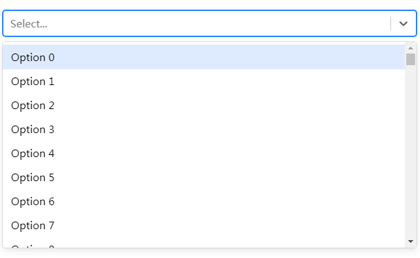
for (let i = 0; i < 10000; i += 1) {
  options.push({
    label: `Option ${i}`,
    value: i
  });
}

function App () {
  return <WindowedSelect options={options} />;
}
Props
react-windowed-select is just a wrapper around react-select.
All props passed to the WindowedSelect component are forwarded to the default exported Select component
from react-select.
windowThreshold | default = 100
The number of options beyond which the menu will be windowed.
Named Exports
All of the named exports from react-select are re-exported from react-windowed-select for easy access to features
that allow you to customize your Select component.
import { components, createFilter } from 'react-windowed-select';
import React from "react";

const options = [
  { value: 1, label: 'Foo' },
  { value: 2, label: 'Bar '},
];

const customFilter = createFilter({ ignoreAccents: false });
const customComponents = {
  ClearIndicator: (props) => <components.ClearIndicator {...props}>clear</components.ClearIndicator>
};

function App () {
  return (
    <WindowedSelect
       components={customComponents}
       isClearable={true}
       filterOption={customFilter}
       options={options}
     />
   );
}
WindowedMenuList
By default, react-windowed-select wraps the standard Select component from react-select.
If you want to add windowing to the Async or Creatable Select components from react-select, use the WindowedMenuList:
import { WindowedMenuList } from 'react-windowed-select';
import CreatableSelect from 'react-select/creatable';

function App () {
  return (
    <CreatableSelect
      components={{ MenuList: WindowedMenuList }}
      // ...other props
    />
  );
}
Custom Styles
You can still use the styles API from react-select to customize how your Select component looks.
The height property of the Option, GroupHeading, NoOptionsMessage and/or LoadingMessage components is used to determine the total height of the windowed menu and the following defaults are provided:
| Component | Default Height |
|---|---|
Option |
35px |
GroupHeading |
25px |
NoOptionsMessage |
35px |
LoadingMessage |
35px |
To override these values, use the styles prop like you would with a regular react-select component.
<WindowedSelect
  options={options}
  styles={{
    option: (base) => ({
      ...base,
      height: 60,
      padding: '20px 12px',
    }),
  }}
/>
Grouped Options
Grouped options are not fully supported.
In order to ensure proper scrolling and focus behavior, options nested inside the Group component are flattened. This changes the component structure within MenuList in the following way:
MenuList
│
└───Group
│   │
|   └───GroupHeading
|
└───Option 1
|
└───Option 2


