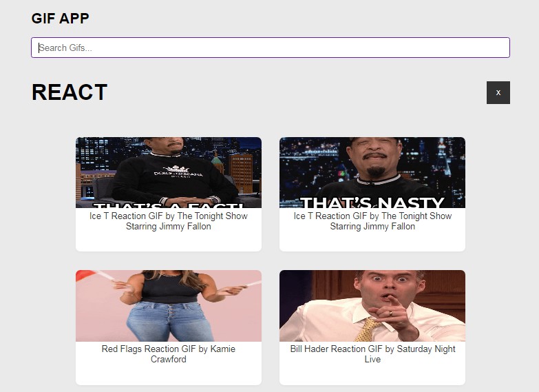
Gif Picker React | Live Demo


An Tenor GIF picker component for React applications that runs on Tenor API V2. This picker fits styling of emoji-picker-react and can be used next to it.
What to know before using
- In order to access Tenor API you are required to provide API key. This is a free and simple process that takes less than 60 seconds.
- Tenor requires attribution from products that use their API. This library comply with that rule by adding Search Tenor placeholder to the search bar.
Installation
npm install gif-picker-react
Obtaining Tenor API v2 key
In order to use GifPicker element you are required to provide Tenor API key via
tenorApiKey prop. To obtain this key please follow this simple guide:
- Login in to Google Cloud Console
- Create a new project
- In Google Cloud Marketplace navigate to Tenor API
- Click on
Enable - In navigation menu go to APIs and services tab and select Credentials
- Click
+ create credentialsand create API key, copy generated API key - Pass this key as prop to
tenorApiKey
Usage
import GifPicker from 'gif-picker-react';

function App() {
  return (
    <div>
      <GifPicker tenorApiKey={"YOUR_API_KEY"} />
    </div>
  );
}
Props
The following props are accepted by the picker:
| Prop | Type | Default | Description |
|---|---|---|---|
| tenorApiKey | string |
Reqired | Tenor v2 API key, obtained from Google Cloud Console |
| onGifClick | function |
Callback function that is called when an gif is clicked. The function receives the TenorImage object as a parameter. |
|
| autoFocusSearch | boolean |
true |
Controls the auto focus of the search input. |
| contentFilter | ContentFilter |
ContentFilter.OFF |
Controls the Tenor Content filtering options. If you are using Typescript you can use ContentFilter enum. Possible values are high, medium, low, off |
| clientKey | string |
gif-picker-react |
Name of your application. Used to differentiate multiple applications using same API key. |
| country | string |
US |
Specify the country of origin for the request. To do so, provide its two-letter ISO 3166-1 country code. |
| locale | string (xx_YY) |
en_US |
Specify the default language to interpret the search string. xx is the language’s ISO 639-1 language code, while the optional _YY value is the two-letter ISO 3166-1 country code. |
| width | number / string |
350 |
Controls the width of the picker. You can provide a number that will be treated as pixel size, or your any accepted css width as string. |
| height | number / string |
450 |
Controls the height of the picker. You can provide a number that will be treated as pixel size, or your any accepted css width as string. |
| categoryHeight | number / string |
100 |
Controls the height of the home page reaction category. You can provide a number that will be treated as pixel size, or your any accepted css width as string. |
TenorImage
This object is provided as an argument to callback specified in onGifClick:
| Property | Type | Description |
|---|---|---|
| id | string |
Tenor result identifier |
| tenorUrl | string |
The full URL to view the post on tenor.com |
| shortTenorUrl | string |
Short URL to view the post on tenor.com |
| description | string |
Textual description of the content. You can use this do populate image object alt attribute |
| createdAt | Date |
Date object that represents when this post was created. |
| tags | string[] |
Array of tags for the post |
| url | string |
Direct URL to the image source |
| height | number |
Height of the image in pixels |
| width | number |
Width of the image in pixels |
This is an example TenorImage object:
{
  id: "16596569648018104856",
  tenorUrl: "https://tenor.com/view/american-psycho-patrick-bateman-american-psycho-gif-7212093",
  shortTenorUrl: "https://tenor.com/Eqmf.gif",
  description: "American Psycho Patrick Bateman GIF",
  createdAt: Date,
  tags: [ "American Psycho", "Patrick Bateman", "American", "psycho"],
  url: "https://media.tenor.com/5lLcKZgmIhgAAAAC/american-psycho-patrick-bateman.gif",
  height: 240,
  width: 244
}
Customization
Custom Picker Width and Height
To customize the dimensions of the picker, use the height and width props. You can pass in a number that will be treated as pixel size, or your any accepted css width/height as string.
<GifPicker height={500} width={400} />
<GifPicker height="100%" width="15em" />
CSS Variables
The picker can be customized via CSS variables. The root selector for the picker is .GifPickerReact, when overriding, make sure to provide a more specific selector.
The list of possible variables is quite extensive, but the main ones you may want to override are:
--gpr-bg-color– Background color of the picker.--gpr-text-color– Font color on the picker.--gpr-highlight-color– Color on the hover on focus on some search bar, categories and gif.
You can find full list of all variables in GifPickerReact.css.
Contributing
Want to contribute to the project?
First of all, thanks! Check CONTRIBUTING.md for more details.