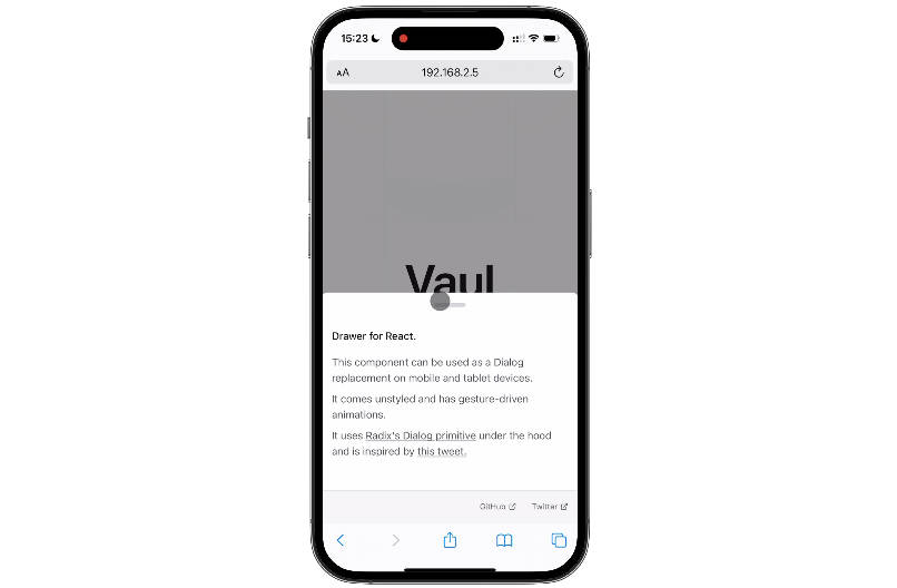

Vaul-Svelte is an unstyled drawer component for Svelte that can be used as a Dialog replacement on tablet and mobile devices. It uses Bits’ Dialog primitive under the hood and is inspired by this tweet.
This is a port of Vaul for React, which was created by Emil Kowalski.
Usage
To start using the library, install it in your project:
npm install vaul-svelte
Use the drawer in your app.
<script>
	import { Drawer } from 'vaul-svelte';
</script>

<Drawer.Root>
	<Drawer.Trigger>Open</Drawer.Trigger>
	<Drawer.Portal>
		<Drawer.Content>
			<p>Content</p>
		</Drawer.Content>
		<Drawer.Overlay />
	</Drawer.Portal>
</Drawer.Root>
Examples
Play around with the examples on StackBlitz:
- With scaled background
- Without scaled background
- With snap points
- Scrollable with inputs
- Nested drawers
- Non-dismissible
API Reference
Root
Contains all parts of a dialog. Use shouldScaleBackground to enable background scaling, it requires an element with [data-vaul-drawer-wrapper] data attribute to scale its background.
Can be controlled by binding to the open prop, or using theonOpenChange prop.
Additional props:
closeThreshold: Number between 0 and 1 that determines when the drawer should be closed. Example: threshold of 0.5 would close the drawer if the user swiped for 50% of the height of the drawer or more.
scrollLockTimeout: Duration for which the drawer is not draggable after scrolling content inside of the drawer. Defaults to 500ms
snapPoints: Array of numbers from 0 to 100 that corresponds to % of the screen a given snap point should take up. Should go from least visible. Example [0.2, 0.5, 0.8]. You can also use px values, which doesn’t take screen height into account.
fadeFromIndex: Index of a snapPoint from which the overlay fade should be applied. Defaults to the last snap point.
Trigger
The button that opens the dialog. Props.
Content
Content that should be rendered in the drawer. Props.
Overlay
A layer that covers the inert portion of the view when the dialog is open. Props.
Title
An accessible title to be announced when the dialog is opened. Props.
Description
An optional accessible description to be announced when the dialog is opened. Props.
Close
The button that closes the dialog. Props.
Portal
Portals your drawer into the body.