github.mp4
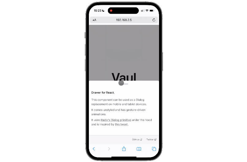
Vaul is an unstyled drawer component for React that can be used as a Dialog replacement on tablet and mobile devices. It uses Radix’s Dialog primitive under the hood and is inspired by this tweet.
Usage
To start using the library, install it in your project:
npm install vaul
Use the drawer in your app.
import { Drawer } from 'vaul';

function MyComponent() {
  return (
    <Drawer.Root>
      <Drawer.Trigger>Open</Drawer.Trigger>
      <Drawer.Portal>
        <Drawer.Content>
          <p>Content</p>
        </Drawer.Content>
        <Drawer.Overlay />
      </Drawer.Portal>
    </Drawer.Root>
  );
}
Examples
Play around with the examples on codesandbox:
API Reference
Root
Contains all parts of a dialog. Use shouldScaleBackground to enable background scaling, it requires an element with [vaul-drawer-wrapper] data attribute to scale its background.
Can be controlled with the value and onOpenChange props. Can be opened by default via defaultOpen prop.
Trigger
The button that opens the dialog. Props.
Content
Content that should be rendered in the drawer. Props.
Overlay
A layer that covers the inert portion of the view when the dialog is open. Props.
Title
An accessible title to be announced when the dialog is opened. Props.
Description
An optional accessible description to be announced when the dialog is opened. Props.
Close
The button that closes the dialog. Props.
Portal
Portals your drawer into the body.