react-collapse
Collapse component with CSS transition for elements with variable and dynamic height.
Component-wrapper for collapse animation with CSS for elements with variable and dynamic height.
Demo
CSS required
:warning: ️You need to specify the transition property or add a class selector with style (transition) in your own stylesheet to add animation. Here is an example.
.collapse-css-transition {
  transition: height 300ms cubic-bezier(0.4, 0, 0.2, 1);
  overflow: hidden;
}
Installation for React 16.3+
(about 6kb)
npm i -S @kunukn/react-collapse@^1
or
yarn add @kunukn/react-collapse@^1
Installation for React 16.8+
(about 4kb)
npm i -S @kunukn/react-collapse
or
yarn add @kunukn/react-collapse
import Collapse from '@kunukn/react-collapse';
// or with require syntax
const Collapse = require('@kunukn/react-collapse');

<Collapse isOpen={true || false}>
  <div>Random content</div>
</Collapse>;
Properties
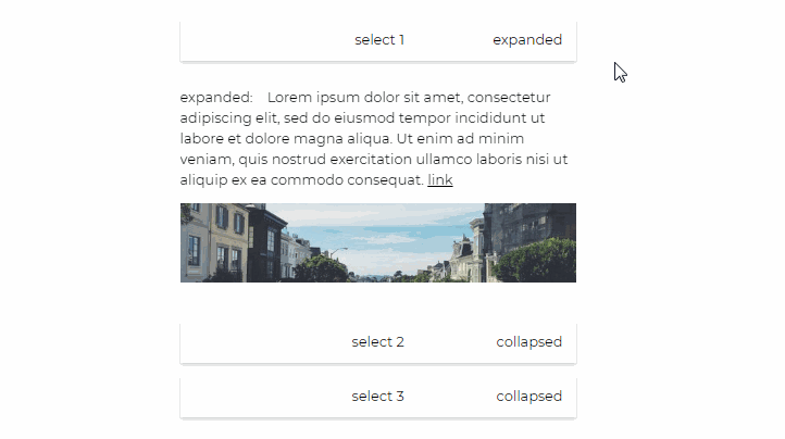
isOpen: PropTypes.boolean
Expands or collapses content.
children: PropTypes.node or render: PropTypes.func
One or multiple children with static, variable or dynamic height.
<Collapse isOpen={false || true}>
  <p>Paragraph of text</p>
  <p>Another paragraph is also OK</p>
  <p>Images and any other content are ok too</p>
  <img src="cutecat.gif" />
</Collapse>
or
<Collapse
  isOpen={ false || true }
  render={collapseState => (
    <div className="using-collapse-state-to-add-css-class " + collapseState>
      <p>I know the collapse state: {collapseState}</p>
      <p>Another paragraph is also OK</p>
      <p>Images and any other content are ok too</p>
      <img src="cutecat.gif" />
    </div>
  )}
/>
className: PropType.string
You can specify a className with your desired style and animation. By default collapse-css-transition will be added to the component.
transition: PropType.string
You can also specify a CSS transition in line by using the transition prop.
<Collapse transition="height 300ms cubic-bezier(.4, 0, .2, 1)">
  <p>Paragraph of text</p>
</Collapse>
elementType: PropType.string
You can specify the HTML element type for the collapse component. By default the element type is a div element.
<Collapse elementType="article">
  <p>Paragraph of text inside an article element</p>
</Collapse>
collapseHeight: PropType.string
You can specify the collapse height in CSS unit to partially show some content.
<Collapse collapseHeight="50px">
  <p>A long paragraph of text inside an article element</p>
</Collapse>
onChange = ({ collapseState, isMoving, hasReversed, collapseStyle }) => { /* your implementation */ }: PropTypes.func
Callback function for when your transition on height (specified in className) is started or finished. It can be used to trigger any function after transition is done.
onInit = ({ collapseState, collapseStyle }) => { /* your implementation */ }: PropTypes.func
Callback function for when the component has mounted.
ARIA and data attributes
Collapse transfers aria- and data- attributes to the component's rendered DOM element. For example this can be used to set the aria-hidden attribute:
<Collapse isOpen={isOpenState} aria-hidden={isOpenState ? 'false' : 'true'}>
  <p>Paragraph of text</p>
</Collapse>
Development and testing
To run development
npm start or yarn start
git clone [repo]
cd [repo]
npm i
npm start
open http://localhost:6007
or with yarn
git clone [repo]
cd [repo]
yarn
yarn start
open http://localhost:6007
To run example covering all features, use npm run storybook or yarn storybook.
CDN
https://unpkg.com/@kunukn/react-collapse/
<link rel="stylesheet" href="https://unpkg.com/@kunukn/react-collapse/dist/Collapse.css" />
<script src="https://unpkg.com/@kunukn/react-collapse/dist/Collapse.js"></script>

<script>
  var Collapse = window.Collapse;
</script>
Supported browsers
IE11 + Modern browsers
Supported React versions
- React version 16.3+ : use Collapse version 1
- React version 16.8+ : use Collapse version 2+
Used React 16.3 life-cycles
- render // uses the style states to invoke CSS transition
- componentDidMount // initial expanded or collapsed state
- getDerivedStateFromProps // detect if isOpen props has changed and apply a new collapse state
- componentDidUpdate // update style states from the four possible collapse states
Used React 16.8 life-cycles
- render
- useState
- useEffect
Design goals
- let the browser handle the animation using CSS transition
- minimalistic - only have a Collapse component which updates on isOpen props
- flexible - provide your own markup, styling and easing
- interruptible - can be reversed during movement
- simple api with onChange event hook
- inert - when collapsed you should tab over the collapsed component
- minimal in file size
- availability - from cdn or npm install