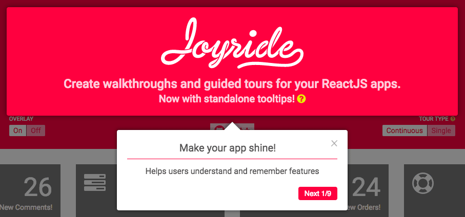
React Joyride
Create walkthroughs and guided tours for your ReactJS apps.Now with standalone tooltips!
Setup
npm install --save react-joyride
Styles
If you are using SCSS:
@import '~react-joyride/lib/react-joyride'
Or include this directly in your html:
<link rel="stylesheet" href="/path/to/react-joyride/lib/react-joyride-compiled.css" type="text/css">
Getting Started
Include Joyride in the parent component.
import Joyride from 'react-joyride';

export class App extends React.Component {
  render: function () {
    return (
      <div className="app">
      <Joyride
        ref="joyride"
        steps={[arrayOfSteps]}
        run={true} // or some other boolean for when you want to start it
        debug={true}
        callback={this.callback}
        ...
        />
        <YourComponents .../>
      </div>
    );
  }
}
Don't forget to pass a ref to the component.
Please refer to the source code of the demo if you need a practical example.
Props
You can change the initial options passing props to the component.
steps {array}: The tour's steps. Defaults to []
stepIndex {number}: The initial step index. Defaults to 0
run {bool}: Run/stop the tour. Defaults to false
autoStart {bool}: Open the tooltip automatically for the first step, without showing a beacon. Defaults to false
keyboardNavigation {bool}: Toggle keyboard navigation (esc, space bar, return). Defaults to true
locale {object}: The strings used in the tooltip. Defaults to { back: 'Back', close: 'Close', last: 'Last', next: 'Next', skip: 'Skip' }
resizeDebounce {bool}: Delay the reposition of the current step while the window is being resized. Defaults to false
resizeDebounceDelay {number}: The amount of delay for the resizeDebounce callback. Defaults to 200
holePadding {number}: The gap around the target inside the hole. Defaults to 5
scrollOffset {number}: The scrollTop offset used in scrollToSteps. Defaults to 20
scrollToSteps {bool}: Scroll the page to the next step if needed. Defaults to true
scrollToFirstStep {bool}: Scroll the page for the first step. Defaults to false
showBackButton {bool}: Display a back button. Defaults to true
showOverlay {bool}: Display an overlay with holes above your steps (for tours only). Defaults to true
allowClicksThruHole {bool}: Allow mouse and touch events within overlay hole, and prevent hole:click callback from being sent. Defaults to false
showSkipButton {bool}: Display a link to skip the tour. Defaults to false
showStepsProgress {bool}: Display the tour progress in the next button e.g. 2/5 in continuous tours. Defaults to false
tooltipOffset {number}: The tooltip offset from the target. Defaults to 30
type {string}: The type of your presentation. It can be continuous (played sequentially with the Next button) or single. Defaults to single
disableOverlay {bool}: Don't close the tooltip on clicking the overlay. Defaults to false
debug {bool}: Console.log Joyride's inner actions. Defaults to false
callback {function}: It will be called when the tour's state changes and returns a single parameter:
- entering a step
{ type: 'step:before', index: 0, step: {...} } - rendering the beacon
{ type: 'beacon:before', step: {...} } - triggering the beacon
{ type: 'beacon:trigger', step: {...} } - rendering the tooltip
{ type: 'tooltip:before', step: {...} } - closing a step
{ type: 'step:after', step: {...} } - clicking on the overlay (if not disabled)
{ type: 'overlay:click', step: {...} } - clicking on the hole
{ type: 'hole:click', step: {...} } - the target could not be found
{ type: 'error:target_not_found', step: {...} } - the tour ends.
{ type: 'finished', steps: [{...}], isTourSkipped: boolean }
The callback object also receives an action string ('start'|'next'|'back') and the step index.
Defaults to undefined
API
this.joyride.reset(restart)
Call this method to reset the tour iteration back to 0
restart{boolean} - Starts the tour again
this.joyride.next()
Call this method to programmatically advance to the next step.
this.joyride.back()
Call this method to programmatically return to the previous step.
this.joyride.addTooltip(data)
Add tooltips in your elements.
data{object} - A step object (check the syntax below)
this.joyride.getProgress()
Retrieve the current progress of your tour. The object returned looks like this:
{
  index: 2,
  percentageComplete: 50,
  step: {
    title: "...",
    text: "...",
    selector: "...",
    position: "...",
    ...
  }
}}
Please don't use the start and stop methods anymore. Instead use a combination of the props run and autoStart.
Step Syntax
There are some usable options but you can pass custom parameters.
title: The tooltip's title.text: The tooltip's content. It can be plain text, html or a React component.selector: The target DOM selector of your feature (required)position: Relative position of you beacon and tooltip. It can be one of these:top,top-left,top-right,bottom,bottom-left,bottom-right,rightandleft. This defaults totop.type: The event type that trigger the tooltip:clickorhover. Defaults toclickisFixed: Iftrue, the tooltip will remain in a fixed position within the viewport. Defaults tofalse.allowClicksThruHole: Set totrueto allow pointer-events (hover, clicks, etc) or touch events within overlay hole. Iftrue, thehole:clickcallback will not be sent. Defaults tofalse. Takes precedence over aallowClicksThruHoleprop provided to<Joyride />style: An object with stylesheet options.
Extra option for standalone tooltips
trigger: The DOM element that will trigger the tooltip
You can style the tooltip UI for each step with these options: backgroundColor, borderRadius, color, mainColor, textAlign and width.
You can also style header, main, footer, button, skip, back, close and hole independently using standard style options. Plus beacon offset, inner and outer colors and arrow visibility.
Example:
{
  title: 'First Step',
  text: 'Start using the <strong>joyride</strong>',
  selector: '.first-step',
  position: 'bottom-left',
  type: 'hover',
  isFixed: true,
  // optional styling
  style: {
    backgroundColor: 'rgba(0, 0, 0, 0.8)',
    borderRadius: '0',
    color: '#fff',
    mainColor: '#ff4456',
    textAlign: 'center',
    width: '29rem',
    arrow: {
      display: 'none'
    },
    beacon: {
      offsetX: 10,
      offsetY: 10,
      inner: '#000',
      outer: '#000'
    },
    header: {
      textAlign: 'right'
      // or any style attribute
    },
    main: {
      padding: '20px'
    },
    footer: {
      display: 'none'
    },
    skip: {
      color: '#f04'
    },
    hole: {
      backgroundColor: 'rgba(201, 23, 33, 0.2)',
    }
    ...
  },
  // custom params...
  name: 'my-first-step',
  parent: 'MyComponentName'
}
SCSS Options
Basic
$joyride-color: The base color. Defaults to#f04$joyride-zindex: Defaults to1500$joyride-overlay-color: Defaults torgba(#000, 0.5)$joyride-beacon-color: Defaults to$joyride-color$joyride-beacon-size: Defaults to36px$joyride-hole-border-radius: Defaults to4px$joyride-hole-shadow: Defaults to0 0 15px rgba(#000, 0.5)
Tooltip
$joyride-tooltip-arrow-size: You must use even numbers to avoid half-pixel inconsistencies. Defaults to28px$joyride-tooltip-bg-color: Defaults to#fff$joyride-tooltip-border-radius: Defaults to4px$joyride-tooltip-color: The header and text color. Defaults to#555$joyride-tooltip-font-size: Defaults to16px$joyride-tooltip-padding: Defaults to20px$joyride-tooltip-shadow: Sass list for drop-shadow. Defaults to(x: 1px, y: 2px, blur: 3px, color: rgba(#000, 0.3))$joyride-tooltip-width: Sass list of Mobile / Tablet / Desktop sizes. Defaults to(290px, 360px, 450px)$joyride-header-color: Defaults to$joyride-tooltip-header-color$joyride-header-font-size: Defaults to20px$joyride-header-border-color: Defaults to$joyride-color$joyride-header-border-width: Defaults to1px$joyride-button-bg-color: Defaults to$joyride-color$joyride-button-color: Defaults to#fff$joyride-button-border-radius: Defaults to4px$joyride-back-button-color: Defaults to$joyride-color$joyride-skip-button-color: Defaults to#ccc$joyride-close: Sass list for the close button: Defaults to(color: rgba($joyride-tooltip-color, 0.5), size: 12px, top: 10px, right: 10px)$joyride-close-visible: Default totrue;