Pony Props
Custom React hook for building an accessible Carousel component.
Build an accessible React Carousel component with usePony
We usually resort to external packages to add a Carousel component to our apps. However, I often found them lacking accessibility. Carousels should have a specific structure, with the correct HTML attributes to ensure our component is readable by screen-readers.
Install
npm i pony-props
yarn add pony-props
Pony Props surfaces a custom React Hook usePony.
usePony
This custom React hook helps you build an accessible Carousel component without having to worry about overriding existing styles (you do the styling!) simply spread the props across the required HTML elements, and you're good to go.
Example
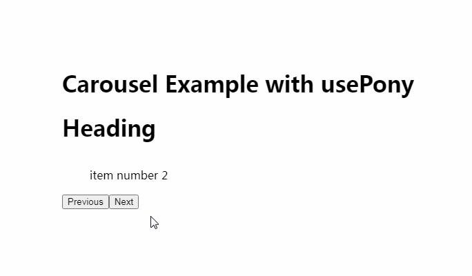
Your component would be strucutured like the following:
export const MyCarousel = () => {
  const items = new Array(10).fill(null).map((_, idx) => ({
    id: idx,
    name: `item number ${idx}`,
  }));
  const {
    getSectionProps,
    getHeadingProps,
    getCarouselWrapperProps,
    getCarouselProps,
    getCarouselItemProps,
    getButtonProps,
    getAnnouncerProps,
    state,
  } = usePony({ numItems: items.length });

  return (
    <div {...getSectionProps()}>
      <h1 {...getHeadingProps()}>Heading</h1>
      <div {...getCarouselWrapperProps()}>
        <ul {...getCarouselProps()}>
          {items.map((item, idx) => (
            <li key={idx} {...getCarouselItemProps(idx)}>
              {item.name}
            </li>
          ))}
        </ul>
      </div>
      <button {...getButtonProps(ActionKind.Previous)}>Previous</button>
      <button {...getButtonProps(ActionKind.Next)}>Next</button>
      <div {...getAnnouncerProps()}>
        <p>{`Item ${state.activeSlideIndex + 1} of ${items.length}`}</p>
      </div>
    </div>
  );
};