MigrationUI
MigrationUI is a dashboard that helps your team track progress when migrating from technology A to technology B. It represents visually what has changed and what is still pending at a glance, and also let’s you time travel to check that progress in time. Think of it as a TODO list but represented in a more graphical way and with a history.
How to update progress
The project follows a migrations approach where you will define which data has changed on a given date. Your migrations live in the migrations.ts file.
A migration consists of a date and an operation.
date: the date when the data was modified. It’s actually a string so it could be whatever suits you best, but we recommend using a valid Date format.operation: a function that receives a copy of the previous data state. You can make direct changes to that copy and the data will update accordingly (thanks to Immer.js which we use under the hood)
Data structure
You can visually map your project using two dimensions.
section: each layer or logical agroupation of Elements in your project or app.element: each individual project that can be tackled independently in your migration project.
Running the project
You can check your changes locally running the npm start command.
If you want to build it and publish somewhere else then run npm build instead and upload the output of the (build) folder to your favourite hosting.
How to use in your own project
- Fork this project
- Adjust your labels and colors modifying the (src/config.ts) file accordingly.
- Customize the
initialDataobject (src/initialData.ts) with your data structure. For example:
const initialData = {
  sections: {
    dashboard: {
      label: "Dashboard",
      elements: {
        insights: {
          label: "Insights",
          progress: Progress.notDone,
        },
        products: {
          label: "Products",
          progress: Progress.inProgress,
          elements: {
            list: {
              label: "Product list",
              progress: Progress.done,
            },
            edit: {
              label: "Edit modal",
              progress: Progress.notDone,
            },
          },
        },
      },
    },
    catalog: {
      label: "Catalog",
      elements: {
        product: {
          label: "Product detail",
          progress: Progress.notDone,
        },
      },
    },
  },
};
This will be the output with the initial state of your application:

- Start tracking your team progress with the migration! For that purpose you’ll need to edit the
migrationsobject (src/migrations.ts) as follows, in order to perform changes over theinitialDataobject.
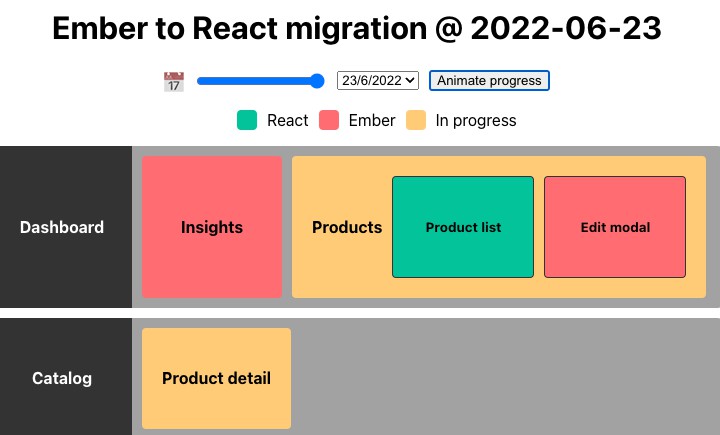
In this case, we’ll want to reflect that our team has started working on the Product detail of the Catalog.
const migrations: MigrationType[] = [
  // This is the date when your team started the migration process
  { date: "2022-06-14", operation: () => initialData },
  // ↓↓↓↓ Here below will go your progress ↓↓↓↓
  {
    date: "2022-06-23",
    operation: (prevData) => {
      prevData.sections.catalog.elements.product.progress = Progress.inProgress;
    },
  },
];
As you can see, now the Product detail box is yellow, cause it’s in progress or partially migrated:

- ? More progress! ?
const migrations: MigrationType[] = [
  // This is the date when your team started the migration process
  { date: "2022-06-14", operation: () => initialData },
  // ↓↓↓↓ Here below will go your progress ↓↓↓↓
  {
    date: "2022-06-23",
    operation: (prevData) => {
      prevData.sections.catalog.elements.product.progress = Progress.inProgress;
    },
  },
  {
    date: "2022-07-02",
    operation: (prevData) => {
      prevData.sections.catalog.elements.product.progress = Progress.inProgress;
    },
  },
  {
    date: "2022-07-02",
    operation: (prevData) => {
      prevData.sections.catalog.elements.product.progress = Progress.done;
      prevData.sections.dashboard.elements.products.elements.edit.progress =
        Progress.inProgress;
    },
  },
  {
    date: "2022-07-19",
    operation: (prevData) => {
      prevData.sections.dashboard.elements.products.elements.edit.progress =
        Progress.done;
      prevData.sections.dashboard.elements.products.progress = Progress.done;
    },
  },
  {
    date: "2022-07-21",
    operation: (prevData) => {
      prevData.sections.dashboard.elements.insights.progress =
        Progress.inProgress;
    },
  },
  {
    date: "2022-08-10",
    operation: (prevData) => {
      prevData.sections.dashboard.elements.insights.progress = Progress.done;
    },
  },
];
- And… ? ? Finally! ? ?

Customisation options
Here’s a list of all the attributes that you can easily style in this dashboard through the src/config.ts file:
| Attribute | Description |
|---|---|
title |
Page title. |
theme.background |
Background of the page, could be a color, an image, etc. |
theme.color |
Page text color. |
theme.boxBorder |
Border color of each box on the page. |
theme.sectionHeaderBackground |
Background of the section header. |
theme.sectionHeaderColor |
Text color of the section header. |
theme.sectionBodyBackground |
Background of the section body, which contains the element boxes. |
elementProgress.[progress].legendLabel |
Label used in the legend to represent the progress of each element. |
elementProgress.[progress].backgroundColor |
Background of the element box which is in this state. |
elementProgress.[progress].color |
Text color of the element box which is in this state. |
Check how we used this at Honeypot
| Ember to React | REST to GraphQL |
|---|---|
 |
 |
Migration UI Icon provided by Exchange icons created by Freepik – Flaticon