Palette
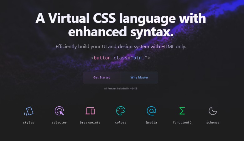
Design tokens framework with atomic classes for React and Master CSS.
Deliver a consistent visual identity across your apps with design tokens, with your brand identity as code (BIaC) – from colors, typography, spacing or logos with your guidelines.
Features
- Strongly typed end-to-end with TypeScript
- First class React and Master CSS support
- Minimal footprint: ~2KB with no dependencies
- Production ready
- Dynamic themes, switch on the fly
Usage
import { createPaletteContext } from '@foretag/palette';
import { FC } from 'react';

// Themes
const light = {
	colors: {
		primary: '#ffffff'
	},
	spacing: {
		xs: '4',
	}
};

const dark = {
	colors: {
		primary: '#000000'
	},
	// ... spacing
};

// Create a palette with the themes
const palette = createPalette([
	{
		name: 'light',
		tokens: {
			...light
		}
	},
	{
		name: 'dark',
		tokens: {
			...dark
		}
	}
]);

// App.tsx
const { PaletteProvider, usePalette } = createPaletteContext(palette);

const App = () => (
	<PaletteContext palette={palette} theme='light'>
		<App />
	</PaletteContext>
);

// Button.tsx
interface IButtonProps {
	disabled: boolean;
}

const Button: FC<IButtonProps> = (props) => {
	const { mix } = usePalette();

	const classes = mix<IButtonProps>((theme) => ({
		base: 'bg:white f:blue',
		variants: {
			disabled: `bg:red f:${theme.colors.primary}`,
		}
	}));

	return (
		<button
			className={classes(props)}
		>
			Button
		</button>
	);
}
Tests
Palette is built with TypeScript and Bun, to run tests you need to run: bun wiptest
Development
Palette is developed in TypeScript and is published on npm, it uses the Bun runtime for development and tests, but can be used in projects designed for other runtimes.