docusaurus-plugin-code-preview
Embed code samples from different frameworks with a live preview inside your existing Docusaurus pages.

Quick Installation
Install the package dependency into your docusaurus project:
npm i docusaurus-plugin-code-preview
It is recommended to create a wrapper component to contain all your project default configurations for code previews. For example, creating a Playground component to assign the base url automatically to the iframe source.
// src/components/Playground.tsx
import React from 'react';
import useBaseUrl from '@docusaurus/useBaseUrl';

import { CodePreview } from 'docusaurus-plugin-code-preview';

export default function Playground(props) {
  return <CodePreview {...props} source={useBaseUrl(props.source)} />;
}
You can now import this component within your existing markdown docs pages:
// docs/example.md
---
title: Example Docusaurus Page
---
import Playground from '@site/src/components/Playground';

<Playground />
This will render the simple frame for the code preview. You will still need to configure the behavior for which code snippets will display and which live examples to render. These details are outlined in the sections below.
Displaying Code Snippets
The output configuration allows the code preview to display different buttons for each framework or code-variant. To show code snippets for different frameworks, you can specify the supported output targets for the code preview:
export default function Playground(props) {
  return (
    <CodePreview
      output={{
        outputs: [
          {
            name: 'JavaScript',
            value: 'javascript',
          },
          {
            name: 'React',
            value: 'react',
          },
          {
            name: 'Angular',
            value: 'angular',
          },
          {
            name: 'Vue',
            value: 'vue',
          },
        ],
        // This is the default selected option in the rendered component
        defaultOutput: 'javascript',
      }}
      // Your existing options
    />
  );
}
Now when using your wrapper component, you can pass along these output target values:
import Playground from '@site/src/components/Playground';

import angular from './angular.md';
import react from './react.md';
import vue from './vue.md';
import javascript from './javascript.md';

<Playground code={{ react, angular, vue, javascript }} />;
The value key value in the output.outputs configuration is the key value you want to use for your code property.
This example will render buttons and code snippets for: “React”, “Angular”, “Vue” and “JavaScript”.
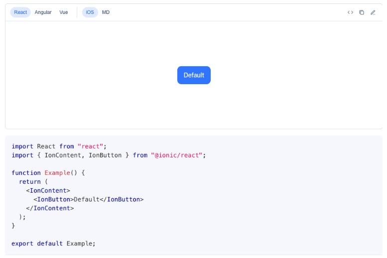
Displaying Live Preview
The live preview is an embedded iframe for your code preview. You can specify multiple viewports for the same live preview example. This is helpful in scenarios where you may want a code preview to show an example for iOS mode vs. MD mode, for example. You can also use this feature to show different previews for different screen sizes or any conditional rendering that can be detected and handled through query parameters passed along to the iframe.
export default function Playground(props) {
  return (
    <CodePreview
      viewport={{
        viewports: [
          {
            name: 'iOS',
            src: baseUrl => `${baseUrl}?ionic:mode=ios`,
          },
          {
            name: 'MD',
            src: baseUrl => `${baseUrl}?ionic:mode=md`,
          },
        ],
        // This is the default selected option and rendered iframe example
        defaultViewport: 'iOS',
      }}
      // Your existing options
    />
  );
}
Advanced
Stackblitz Examples
Add support to your code preview to open the selected output target (framework) in a live example within Stackblitz.
First, enable the controls.stackblitz option on your CodePreview component to enable rendering the Stackblitz button.
export default function Playground(props) {
  return (
    <CodePreview
      controls={{
        stackblitz: true,
      }}
      // Your existing options
    />
  );
}
Next, add a callback handler for when the Stackblitz button is selected:
export default function Playground(props) {
  return (
    <CodePreview
      controls={{
        stackblitz: true,
      }}
      onOpenOutputTarget={(output, codeBlock) => {
        switch (output) {
          case 'angular':
            break;
          case 'react':
            break;
          case 'vue':
            break;
          case 'javascript':
            break;
        }
      }}
      // Your existing options
    />
  );
}
You can now wire up each output target to launch a specific Stackblitz example using Stackblitz’s SDK: @stackblitz/sdk.
Adding Dark Mode Support
Add dark mode theme detection within your code preview live examples.
First, update your component to detect the current value of the docusaurus site that it is embedded in:
// src/components/Playground.tsx
import { useColorMode } from "@docusaurus/theme-common";

export default function Playground(props) {
  // `useColorMode()` was previous called `useThemeContext()` before beta.15.
  const { colorMode } = useColorMode();

  return (
    <CodePreview
      isDarkMode={colorMode === "dark"}>
  );
}
By specifying isDarkMode, the CodePreview component will dispatch a message on the iframe, that can be intercepted to make decisions based on the theme setting.
Next, create a common script file that will be included into each iframe example. This script will contain logic for handling the dark theme support in your live examples.
// static/usage/common.js
window.addEventListener('DOMContentLoaded', function() {
  window.addEventListener('message', function(ev) {
    const { data } = ev;
    if (data.darkMode) {
      // This logic will be specific to your live example needs.
      document.body.classList.add('dark');
    } else {
      document.body.classList.remove('dark');
    }
  });
});
You can now reference this common script file in your demo example:
<!DOCTYPE html>
<html lang="en">
  <head>
    <script src="../../common.js"></script>
  </head>
  <body>
    <!-- Your existing example -->
  </body>
</html>
Local Development
Building
npm build # or yarn build
npm pack
# Copy the .tgz to your docusaurus site folder
npm i docusaurus-plugin-code-preview-0.1.0.tgz # or yarn add
npm run clear # or yarn clear
npm run start # or yarn start
Jest
Jest tests are set up to run with npm test or yarn test.
Bundle analysis
Calculates the real cost of your library using size-limit with npm run size and visulize it with npm run analyze.