ReactFormElements
Simplify form and input element management.
Installation
The easiest way to use react-form-elements is to install it from NPM and include it in your own React build process (using Browserify, Webpack, etc).
You can also use the standalone build by including dist/react-form-elements.js in your page. If you use this, make sure you have already included React, and it is available as a global variable.
npm install react-form-elements --save
Usage
import React, { useState } from 'react'
import {
TextBox,
Checkbox,
Range,
DateTime,
Telephone,
DropDown,
Option,
OptionGroup,
Radio,
Form,
} from 'react-form-elements'
const App = () => {
const [values, setValues] = useState({})
return (
<div>
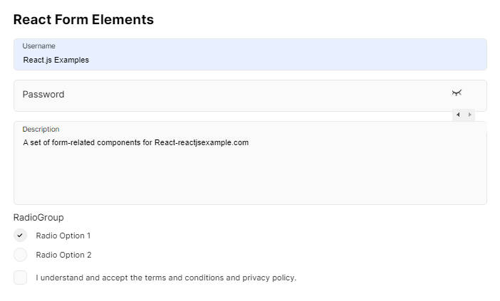
<h1>React Form Elements</h1>
<Form
name="testForm"
onSubmit={data => {
// data[form element name]
setValues(data)
// do something with values
}}
>
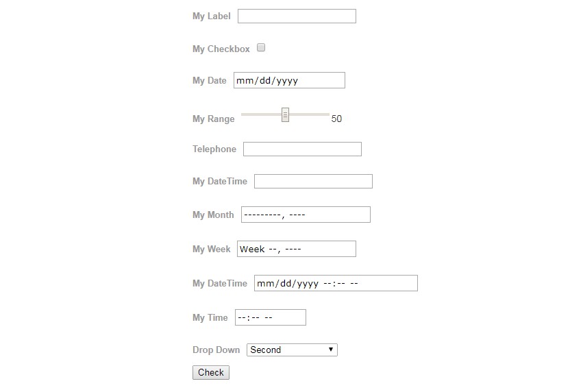
<TextBox label="My Label" name="myTextBox" />
<Checkbox
label="My Checkbox"
initialValue="The True"
checked={false}
name="myCheckBox"
/>
<Radio label="My Radio" name="myRadio" checked={false} />
<DateTime label="My Date" name="myDate" />
<Range label="My Range" name="myRange" />
<Telephone label="Telephone" name="myTelephone" />
<DateTime label="My DateTime" type="datetime" name="myDateTime" />
<DateTime label="My Month" type="month" name="myMonth" />
<DateTime label="My Week" type="week" name="myWeek" />
<DateTime
label="My DateTime"
type="datetime-local"
name="myDateTimeLocal"
/>
<DateTime label="My Time" type="time" name="myTime" />
<DropDown
label="My Drop Down"
initialValue="2"
data-testid="dd1"
name="myDropDown"
>
<OptionGroup label="First Group">
<Option initialValue="1">First</Option>
<Option initialValue="2">Second</Option>
<Option initialValue="3" label="Third" />
</OptionGroup>
<OptionGroup label="Second Group">
<Option initialValue="11">Second First</Option>
<Option initialValue="12">Second Second</Option>
<Option initialValue="13" label="Second Third" />
</OptionGroup>
<OptionGroup label="Third Group">
<Option initialValue="21">Third First</Option>
<Option initialValue="22">Third Second</Option>
<Option initialValue="23" label="Third Third" />
</OptionGroup>
</DropDown>
<button onClick={e => {}}>Save</button>
</Form>
<div data-testid="ref-out">
<ul>
<li>TextBox: {values.myTextBox}</li>
<li>Checkbox: {values.myCheckBox}</li>
<li>Range: {values.myRange}</li>
<li>Date: {values.myDate}</li>
<li>DateTime: {values.myDateTime}</li>
<li>DateMonth: {values.myMonth}</li>
<li>DateWeek: {values.myWeek}</li>
<li>DateTimeLocal: {values.myDateTimeLocal}</li>
<li>DropDown: {values.myDropDown}</li>
</ul>
</div>
</div>
)
}
export default App
Properties
- TextBox
- DropDown
- Option
- OptionGroup
- Range
- CheckBox
- Telephone
- Date
- DateTime
- Month
- Week
- Form
Notes
Still in Development
Demo & Examples local
To build the examples locally, run:
npm install
npm start
Then open localhost:8080 in a browser.
Development (src, lib and the build process)
NOTE: The source code for the component is in src. A transpiled CommonJS version (generated with Babel) is available in lib for use with node.js, browserify and webpack. A UMD bundle is also built to dist, which can be included without the need for any build system.
To build, watch and serve the examples (which will also watch the component source), run npm start. If you just want to watch changes to src and rebuild lib, run npm run watch (this is useful if you are working with npm link).