react-form-elements
This npm package provides a set of form-related components for React. You can use these components to build forms with ease. The package includes the following components:
Form The Form component is used for creating forms and can contain various input fields. It supports the following components:
Input: A text input field. PasswordInput: A password input field. RadioGroup: A group of radio buttons. TextArea: A multi-line text input field. Checkbox: A checkbox input field.
Table of Contents
Installation
To install, you can use npm or yarn:
$ npm install --save @start-base/react-form-elements
$ yarn add @start-base/react-form-elements
Documentation
Make sure to add css file to your app root file
import '@start-base/react-form-elements/dist/lib/index.css';
Nextjs example can show all features how to use.
layout.js;

import { Inter } from 'next/font/google'
import './globals.css'
import '@start-base/react-form-elements/dist/lib/index.css';

const inter = Inter({ subsets: ['latin'] })

export const metadata = {
  title: 'React Form Elements',
  description: 'React Form Elements Examples',
}

export default function RootLayout({ children }) {
  return (
    <html lang="en">
      <body className={inter.className}>{children}</body>
    </html>
  )
}
Examples
Here’s an example of using the form elements in a React component:
'use client'
import React, { useState } from 'react';
import { Input, PasswordInput, RadioGroup, Checkbox, Form, TextArea } from '@start-base/react-form-elements';
export default function FormElements() {
const [inputs, setInputs] = useState({});
const onChange = (e) => {
const { name, value, type } = e.target;
setInputs((prevState) => ({
...prevState,
[name]: type === 'checkbox' ? !prevState[name] : value,
}));
};
return (
<>
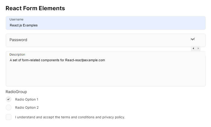
<h2>React Form Elements</h2>
<Form>
<Input
label="Username"
name="username"
value={inputs.username}
onChange={onChange}
/>
<PasswordInput
label="Password"
name="password"
value={inputs.password}
onChange={onChange}
/>
<TextArea
name="textarea"
onChange={onChange}
label="Description"
value={inputs.textarea}
/>
<RadioGroup
label="RadioGroup"
value={inputs.country}
name="country"
onChange={onChange}
options={[
{ label: 'Radio Option 1', value: 'default1' },
{ label: 'Radio Option 2', value: 'default2' },
]}
/>
<Checkbox
checked={inputs.agree}
label="I understand and accept the terms and conditions and privacy policy."
name="agree"
onChange={onChange}
/>
</Form></>
)
}
Demos
For live demos of these components in action, please visit our CodeSandbox and Storybook demo pages.