Fylo Landing Page
A Frontend Mentor Challenge,This design has some nice layout challenges in it. A perfect training ground to practice your Flexbox and/or Grid skills.
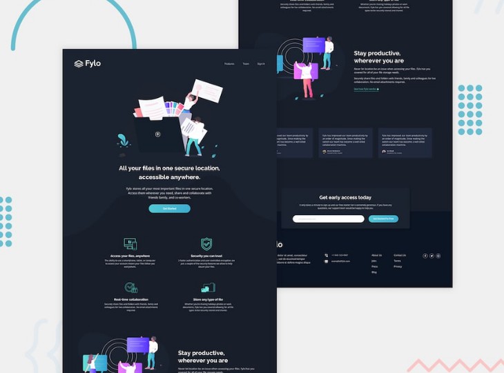
This is a solution for a Frontend Mentor challenge that consists on building a landing page that looks as close to the given design as possible. The goal is to improve my web layout skills by building a realistic project.
Overview ?
The challenge
Users should be able to:
- View the optimal layout for the site depending on their device's screen size
- See hover states for all interactive elements on the page

You can checkout the challenge details in the Frontend Mentor page.
How to run the project:
I chose to use the Adalab Starter Kit to work on this project, created using Node and Gulp. So first of all it is neccesary to have Node JS installed in order to run it.
- Open the terminal in the root folder of the repo.
- Install the local dependencies using the following command in the terminal:
npm install
- Start running the project using the following command that will open a browser window that shows a live version of the page.
npm start
Links
- Live Site URL: https://leireomadina.github.io/fylo-dark-theme-landing-page/
- Solution URL: coming soon
My process
Built with
- Semantic HTML5 markup
- HTML templating system
- CSS3 custom properties
- Flexbox
- CSS Grid
- SASS with BEM methodology
- Gulp
- Responsive design with mobile-first workflow
What I learned
- Use @for to create loops in SCSS: in this case I wanted to select only the second and third card of the testimonial section.
.card {
  @for $i from 2 through 3 {
    &-#{$i} {
      margin-top: 1.8rem;
      @media all and (min-width: 768px) {
        margin-top: 0;
      }
    }
  }
}
- Use and manage svg files: use the viewBox attribute to modify its position and dimension, add title and desc tag to improve accessibility, inline and CSS styling, customize colors using fill or stroke...
- Use ARIA roles to improve web accessibilty: for example, take a look at these navigation menu roles.
<nav class="header-menu" role="navigation">
  <ul class="header-menu__list" role="list">
    <li class="header-menu__list-item" role="list-item">
      <a class="header-menu__link" href="#" role="link">
        Features
      <a>
    </li>
    ...
  </ul>
</nav>
Useful resources
- How to use @for to Create a Sass Loop: https://www.youtube.com/watch?v=6CbsNFXMYgs. You can also take a look at the official SASS documentation.
- List of ARIA roles, states and properties (MDN): https://developer.mozilla.org/en-US/docs/Web/Accessibility/ARIA/Roles
- Inline SVG styling: https://www.youtube.com/watch?v=af4ZQJ14yu8&t=844s
- More resources coming soon..
Author
- LinkedIn: leire-ordeñana-madina
- Twitter: @risingdana
- Email: [email protected]
- Behance: leireomadina
- Codepen: leireomadina
- Frontend Mentor: @leireomadina
Thank you for your time ?