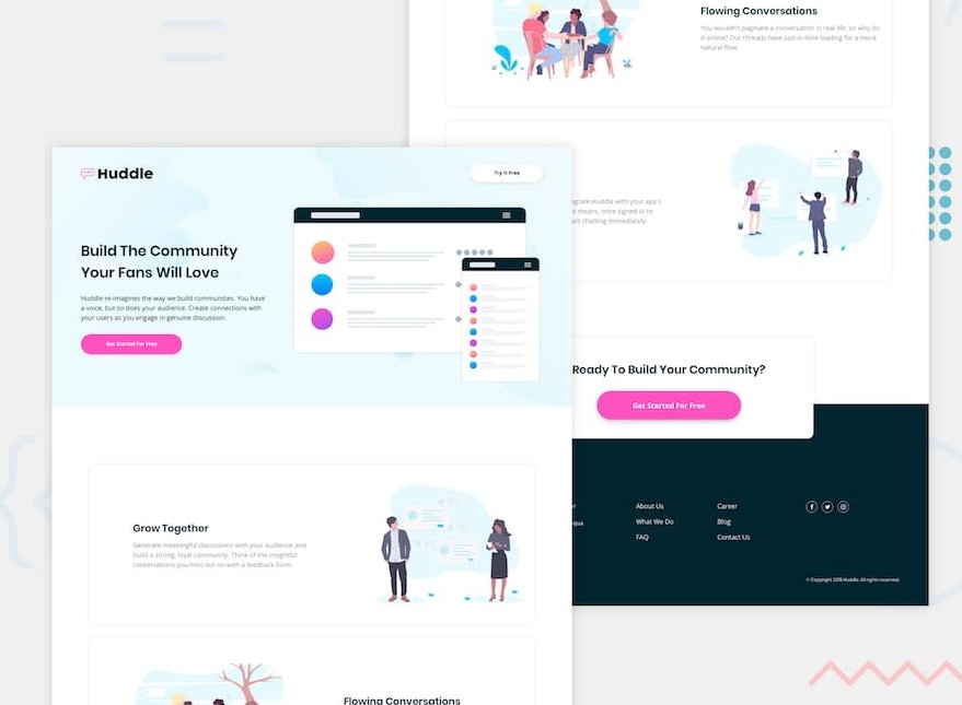
Frontend Mentor – Huddle landing page with alternating feature blocks solution
This is a solution to the
Huddle landing page with alternating feature blocks challenge on Frontend Mentor.
Frontend Mentor challenges help you improve your coding skills by building
realistic projects.
Overview
The challenge
Users should be able to:
- View the optimal layout for the site depending on their device’s screen size
- See hover states for all interactive elements on the page
Links
- Solution URL: Add solution URL here
- Live Site URL:
Add live site URL here
My process
Built with
- Semantic HTML5 markup
- CSS custom properties
- Flexbox
- CSS Grid
- Mobile-first workflow
- React – JS library
- Styled Components – For styles
What I learned
- Using this project I learnt how to use styled components
instead of regular css… still needs some practice for faster workflow. - I realised when working with such layouts, its best to use grid for
sections that easily change their layout per different screen-sizes. - Its also worth noting that the use of grids can allow for easy
responsiveness without having to use any media queries
See example below
<div className="container">
  <div className="item"></div>
  <div className="item"></div>
  <div className="item"></div>
  <div className="item"></div>
</div>
.container {
  display: grid;
  grid-template-columns: repeat(auto-fit, minmax(250px, 1fr));
}
Useful resources
- react-icons – This helped me for
easily add svgs icons to my page. I really liked this pattern and will use it
going forward.