material-icons-react
Google material icons implementation for React.
NOTE: Version 1.0.1 release
- Spelling mistakes corrected
- Proptypes added
- Unwanted dependencies for production is removed from
dependencies
Introduction
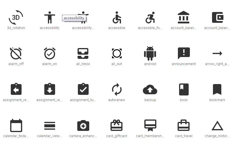
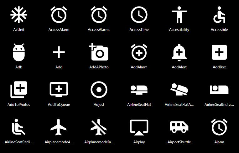
This package provides a convenient react component for using Google's Material Icons in your react application.
Features
- Follows Material design guidelines
- Highly customizable
- Supports Material UI color palette off the shelf.
Usage
Import module using the following statement.
import MaterialIcon, {colorPalette} from 'material-icons-react';
- Rendering an icon is straightforward.
<MaterialIcon icon="dashboard" />
<MaterialIcon icon="alarm_on" />
- Change the icon size by using the
sizeproperty.
<MaterialIcon icon="dashboard" size='large' />
<MaterialIcon icon="dashboard" size={100} />
- Invert the icon by using the invert property.
<MaterialIcon icon="dashboard" invert />
- Make the icon inactivate by using the
inactiveproperty.
<MaterialIcon icon="dashboard" inactive />
- Change the color of an icon.
- Using Material UI color palette.
<MaterialIcon icon="dashboard" color={colorPalette.amber._200} />
<MaterialIcon icon="dashboard" color={colorPalette.amber.A700} />
- Using a custom color.
<MaterialIcon icon="dashboard" color='#7bb92f' />
Icon size matrix
| Alias | Size |
|---|---|
| tiny | 18px |
| small | 24px |
| medium | 36px |
| large | 48px |
