grommet-icons
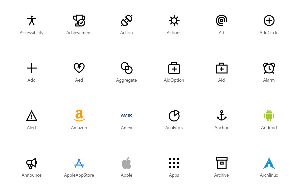
Iconography for Grommet and React.js.
Install
npm install grommet-icons grommet-styles --save
or
yarn add grommet-icons grommet-styles
Usage
import { Facebook } from 'grommet-icons';

<Facebook />
<Facebook color='plain' />
<Facebook size='large' />
<Facebook size='xlarge' />
Customize
The theme for the icon supports different colors and sizes. The default definition is:
  global: {
    colors: {
      icon: '#666666',
    },
    icon: {
      size: {
        small: '12px',
        medium: '24px',
        large: '48px',
        xlarge: '96px',
      },
      extend: undefined,
    },
  }
You can customize sizing and/or colors by specifying your own theme.
The colors property allows you to use color names. For
instance: colors: { brand: '#ff0000' } would allow you to use
<ZoomOut color='brand' />.
  import { ThemeProvider } from 'styled-components';
  import { base, deepMerge } from 'grommet-icons';
  const theme = deepMerge(base, {
    global: {
      colors: {
        brand: '#ff0000',
      },
    },
  });
  return (
    <ThemeContext.Provider theme={theme}>
      <ZoomOut color='brand' />
    </ThemeContext.Provider>
  );
Build
To build this library, execute the following commands:
- Install NPM modules
$ npm install (or yarn install)
- Run pack
$ npm run build
- Test and run linters:
$ npm run lint
- Generate React icons:
$ npm run generate-icons