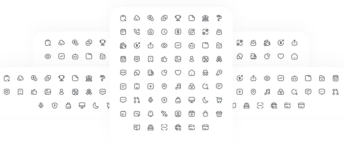
React Native Iconsax


Iconsax is Perfectly balanced, 24px grid-based open source icons for React Native, Perfect for buttons, logos and nav/tab bars. Easy to extend, style and integrate into your project.
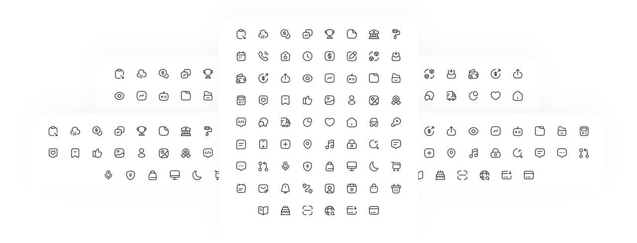
Icons converted from iconsax svg files into React native components and compatible with react-native-svg package.
Icons list available at iconsax.
Installation
- Make sure your have installed
react-native-svg. npm i react-native-iconsax
Usage
import { ShoppingBag } from "react-native-iconsax";

const App = () => {
  return <ShoppingBag />;
};
Whole package can be included as below:
import * as Icon from "react-native-iconsax";

const App = () => {
  return <Icon.ShoppingBag />;
};
Icons can be customized by svg props:
<ShoppingBag stroke="#292D32" strokeWidth={1.5} width={24} height={24} />
Props
All Svg property and the following props supported:
| Prop | Description | Default |
|---|---|---|
width |
Width of the icon. | 24 |
height |
Height of the icon. | 24 |
stroke |
The stroke prop refers to the color. | "#292D32" |
strokeWidth |
The strokeWidth prop specifies the width of the outline on the icon. | 1.5 |
strokeLinecap |
StrokeLinecap defines different types of endings to an open path. | "round" |
strokeLinejoin |
Paths should appear at the point where two lines are joined together. | "round" |
fill |
The fill prop refers to the color inside the icon. | "none" |
viewBox |
Defines the position and dimension, in user space, of an SVG viewport. | "0 0 24 24" |
Authors

License
This project is licenced under the MIT License.
All bundled icons are copyright to their respective author iconsax and mostly under MIT.