@textea/json-viewer

@textea/json-viewer is a React component for displaying and editing JavaScript/TypeScript arrays and JSON
objects.
This component provides a responsive interface for displaying arrays or JSON in a web browser.
Usage
# npm
npm install @textea/json-viewer
# yarn
yarn add @textea/json-viewer
# pnpm
pnpm add @textea/json-viewer
import ReactJson from '@textea/json-viewer'

const json = { /* my json object */ }
const Component = () => (<ReactJson src={json}/>)
Props
| Name | Type | Default | Description |
|---|---|---|---|
src |
JSON Object |
None | This property contains your input JSON |
name |
string or false |
“root” | Contains the name of your root node. Use null or false for no name. |
theme |
string |
“rjv-default” | RJV supports base-16 themes. Check out the list of supported themes in the demo. A custom “rjv-default” theme applies by default. |
className |
string |
undefined |
Additional className string to append to the className of react-json-view’s container. |
style |
object |
{} |
Style attributes for react-json-view container. Explicit style attributes will override attributes provided by a theme. |
iconStyle |
string |
“circle” | Style of expand/collapse icons. Accepted values are “circle”, triangle” or “square”. |
indentWidth |
integer |
4 | Set the indent-width for nested objects |
collapsed |
boolean or integer |
false |
When set to true, all nodes will be collapsed by default. Use an integer value to collapse at a particular depth. |
collapseStringsAfterLength |
integer |
false |
When an integer value is assigned, strings will be cut off at that length. Collapsed strings are followed by an ellipsis. String content can be expanded and collapsed by clicking on the string value. |
shouldCollapse |
(field)=>{} |
false |
Callback function to provide control over what objects and arrays should be collapsed by default. An object is passed to the callback containing name, src, type (“array” or “object”) and namespace. |
groupArraysAfterLength |
integer |
100 |
When an integer value is assigned, arrays will be displayed in groups by count of the value. Groups are displayed with bracket notation and can be expanded and collapsed by clicking on the brackets. |
enableClipboard |
boolean or (copy)=>{} |
true |
When prop is not false, the user can copy objects and arrays to clipboard by clicking on the clipboard icon. Copy callbacks are supported. |
displayObjectSize |
boolean |
true |
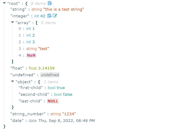
When set to true, objects and arrays are labeled with size |
displayDataTypes |
boolean |
true |
When set to true, data type labels prefix values |
onEdit |
(edit)=>{} |
false |
When a callback function is passed in, edit functionality is enabled. The callback is invoked before edits are completed. Returning false from onEdit will prevent the change from being made. see: onEdit docs |
onAdd |
(add)=>{} |
false |
When a callback function is passed in, add functionality is enabled. The callback is invoked before additions are completed. Returning false from onAdd will prevent the change from being made. see: onAdd docs |
defaultValue |
`string \ | number \ | boolean \ |
onDelete |
(delete)=>{} |
false |
When a callback function is passed in, delete functionality is enabled. The callback is invoked before deletions are completed. Returning false from onDelete will prevent the change from being made. see: onDelete docs |
onSelect |
(select)=>{} |
false |
When a function is passed in, clicking a value triggers the onSelect method to be called. |
sortKeys |
boolean |
false |
set to true to sort object keys |
quotesOnKeys |
boolean |
true |
set to false to remove quotes from keys (eg. "name": vs. name:) |
validationMessage |
string |
“Validation Error” | Custom message for validation failures to onEdit, onAdd, or onDelete callbacks |
displayArrayKey |
boolean |
true |
When set to true, the index of the elements prefix values |
Features
- Support
Next.jsSSR -
onEdit,onAddandonDeleteprops allow users to edit thesrcvariable - Object, array, string and function values can be collapsed and expanded
- Object and array nodes display length
- Object and array nodes support a “Copy to Clipboard” feature
- String values can be truncated after a specified length
- Arrays can be subgrouped after a specified length
- When
onEditis enabled:Ctrl/Cmd+ClickEdit ModeCtrl/Cmd+EnterSubmit
Acknowledge
This package is originally based on mac-s-g/react-json-view
LICENSE
This project is licensed under the terms of the MIT license.