react-multi-select-component
Simple and lightweight multiple selection dropdown component with checkboxes, search and select-all.
✨ Features
- ? Lightweight (~4KB)
- ? Themeable
- ✌ Written w/ TypeScript
? Installation
npm i react-multi-select-component    # npm
yarn add react-multi-select-component # yarn
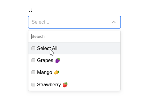
? Example
import React, { useState } from "react";
import MultiSelect from "react-multi-select-component";
const Example: React.FC = () => {
const options = [
{ label: "Grapes ?", value: "grapes" },
{ label: "Mango ?", value: "mango" },
{ label: "Strawberry ?", value: "strawberry" },
];
const [selected, setSelected] = useState([]);
return (
<div>
<h1>Select Fruits</h1>
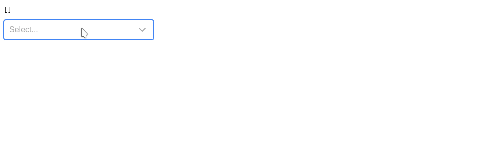
<pre>{JSON.stringify(selected)}</pre>
<MultiSelect
options={options}
value={selected}
onChange={setSelected}
labelledBy={"Select"}
/>
</div>
);
};
export default Example;
? Props
| Prop | Description | Type | Default |
|---|---|---|---|
labelledBy |
value for aria-labelledby |
string |
|
options |
options for dropdown | [{label, value}] |
|
value |
pre-selected rows | [{label, value}] |
[] |
focusSearchOnOpen |
focus on search input when opening | boolean |
true |
hasSelectAll |
toggle 'Select All' option | boolean |
true |
isLoading |
show spinner on select | boolean |
false |
shouldToggleOnHover |
toggle dropdown on hover option | boolean |
false |
overrideStrings |
Override default strings for i18n | object |
|
onChange |
onChange callback | function |
|
disabled |
disable dropdown | boolean |
false |
selectAllLabel |
select all label | string |
|
disableSearch |
hide search textbox | boolean |
false |
filterOptions |
custom filter options | function |
Fuzzy Search |
className |
class name for parent component | string |
multi-select |
? Custom filter logic
By default this component uses fuzzy search algorithm to filter options but also allows you to opt-out and use your own logic if you want to below is the example doing just case insensitive search
export function filterOptions(options, filter) {
  if (!filter) {
    return options;
  }
  const re = new RegExp(filter, "i");
  return options.filter(({ value }) => value && value.match(re));
}
Internationalization
You can override the strings to be whatever you want, including translations for your languages.
{
  "selectSomeItems": "Select...",
  "allItemsAreSelected": "All items are selected.",
  "selectAll": "Select All",
  "search": "Search"
}
? Themeing
You can override css variables to customize appearance
.multi-select {
  --rmsc-primary: #4285f4;
  --rmsc-hover: #f1f3f5;
  --rmsc-selected: #e2e6ea;
  --rmsc-border: #ccc;
  --rmsc-gray: #aaa;
  --rmsc-background: #fff;
  --rmsc-spacing: 10px;
  --rmsc-border-radius: 4px;
  --rmsc-height: 38px;
}