react-functional-select
Micro-sized & micro-optimized select component for ReactJS.
This project was inspired by react-select. If you need some features not provided, I suggest checking that package out.
Install
# npm
npm i react-window styled-components react-functional-select

# Yarn
yarn add react-window styled-components react-functional-select
Overview
Essentially, this is a subset of react-select's API, engineered for ultimate performance and minimal footprint. It is built entirely using React Hooks and FunctionComponents. In addition, most of the code I was able to roll myself, so there are minimal peer dependencies to worry about:
react-windowleveraged for integrated data virtualization/windowing (easily handles data-sets numbering in the tens of thousands with minimal-to-no impact on normally resource-intensive actions like keying and searching).styled-componentsto handle dynamic, extensible styling via CSS-in-JS (there is also the option to generateclassNameattributes for legacy stylesheets as a fall-back option).
While still a work in progress, its current state should be suitable for many use-cases. Please feel free to contribute and/or make suggestions - specificaly, in the following areas:
- Additional flexibility to the styling system. Currently handles simple-to-mid level complexity scenarios via
styled-component's overrideableThemeProvider. As a fallback, you generate staticclassNameattributes on container nodes. - The ability to handle complex, multi-select scenarios (while keeping with the theme of optimal performance in as few lines of code as possible).
Usage
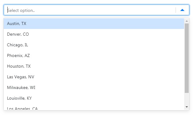
Condensed BasicProps.story.tsx
import { Select } from 'react-functional-select';
import { Card, CardHeader, CardBody, Container, SelectContainer } from './helpers/styled';

type CityOption = {
  readonly id: number;
  readonly city: string;
  readonly state: string;
};

const _options: CityOption[] = [
  { id: 1, city: 'Austin', state: 'TX' },
  { id: 2, city: 'Denver', state: 'CO' },
  { id: 3, city: 'Chicago', state: 'IL' },
  { id: 4, city: 'Phoenix', state: 'AZ' },
  { id: 5, city: 'Houston', state: 'TX' },
];

const BasicProps: React.FC = () => {
  const [isInvalid, setIsInvalid] = useState<boolean>(false);
  const [isDisabled, setIsDisabled] = useState<boolean>(false);
  const [isClearable, setIsClearable] = useState<boolean>(true);
  const [selectedOption, setSelectedOption] = useState<CityOption | null>(null);

  const onOptionChange = useCallback((option: CityOption | null): void => {
    setSelectedOption(option);
  }, []);

  const getOptionValue = useCallback((option: CityOption): number => (option.id), []);
  const getOptionLabel = useCallback((option: CityOption): string => (`${option.city}, ${option.state}`), []);

  useEffect(() => {
    isDisabled && setIsInvalid(false);
  }, [isDisabled]);

  return (
    <Container>
      <Card>
        <CardHeader>
          {JSON.stringify(selectedOption || {})}
        </CardHeader>
        <CardBody>
          <SelectContainer>
            <Select
              options={_options}
              isInvalid={isInvalid}
              isDisabled={isDisabled}
              isClearable={isClearable}
              onOptionChange={onOptionChange}
              getOptionValue={getOptionValue}
              getOptionLabel={getOptionLabel}
            />
          </SelectContainer>
        </CardBody>
      </Card>
    </Container>
  );
};
Properties
All properties are technically optional (with a few having default values). Very similar with react-select API.
| Property | Type | Default | Description |
|---|---|---|---|
inputId |
string | undefined |
The id of the autosize search input |
selectId |
string | undefined |
The id of the parent div |
idSuffix |
string | undefined |
GUID that gets appended to inputId and selectId - when specified, generates ids for each individual option |
ariaLabel |
string | undefined |
Aria label (for assistive tech) |
isLoading |
bool | false |
Is the select in a state of loading - shows loading dots animation |
isInvalid |
bool | false |
Is the current value invalid - control recieves invalid styling |
inputDelay |
number | undefined |
The debounce delay in for the input search (milliseconds) |
isDisabled |
bool | false |
Is the select control disabled - recieves disabled styling |
placeholder |
string | Select option.. |
Placeholder text for the select value |
menuWidth |
React.ReactText | 100% |
Width of the menu |
menuItemSize |
number | 35 |
The height of each option in the menu (px) |
isClearable |
bool | false |
Is the select value clearable |
noOptionsMsg |
string | No options |
The text displayed in the menu when there are no options available |
clearIcon |
React.ReactNode | undefined |
Custom clear icon |
caretIcon |
React.ReactNode | undefined |
Custom caret icon |
options |
array | [] |
The menu options |
isSearchable |
bool | true |
Whether to enable search functionality or not |
menuMaxHeight |
number | 300 |
Max height of the menu element - this effects how many options react-window will render. |
addClassNames |
bool | false |
Should static classNames be generated for container elements (enable if styling using CSS stylesheets) |
ariaLabelledBy |
string | undefined |
HTML ID of an element that should be used as the label (for assistive tech) |
openMenuOnFocus |
bool | false |
Open the menu when the select control recieves focus |
initialValue |
any | undefined |
Initial select value |
menuOverscanCount |
number | 1 |
correlates to react-window property overscanCount: The number of items (options) to render outside of the visible area. Increasing the number can impact performance, but is useful if the option label is complex and the renderOptionLabel prop is defined |
tabSelectsOption |
bool | true |
Select the currently focused option when the user presses tab |
blurInputOnSelect |
bool | true IF device is touch-enabled ELSE false |
Remove focus from the input when the user selects an option (useful for dismissing the keyboard on touch devices) |
closeMenuOnSelect |
bool | true |
Close the select menu when the user selects an option |
isAriaLiveEnabled |
bool | false |
Enables visually hidden div that reports stateful information (for assistive tech) |
scrollMenuIntoView |
bool | true |
Performs animated scroll to show menu in view when menu is opened (if there is room to do so) |
backspaceClearsValue |
bool | true |
Remove the currently focused option when the user presses backspace |
filterIsCaseSensitive |
bool | false |
Search input takes case of option labels into account |
onMenuOpen |
(...args: any[]) => void | undefined |
Callback function executed after the menu is opened |
onMenuClose |
(...args: any[]) => void | undefined |
Callback function executed after the menu is closed |
onOptionChange |
(data: any) => void | undefined |
Callback function executed after a new option is selected |
onKeyDown |
React.KeyboardEventHandler<HTMLDivElement> | undefined |
Callback function executed onKeyDown event |
getOptionLabel |
(data: any) => React.ReactText | undefined |
Resolves option data to React.ReactText to be displayed as the label by components (by default will use option.label) |
getOptionValue |
(data: any) => React.ReactText | undefined |
Resolves option data to React.ReactText to compare option values (by default will use option.value) |
onInputBlur |
React.FocusEventHandler<HTMLInputElement> | undefined |
Handle blur events on the search input |
onInputFocus |
React.FocusEventHandler<HTMLInputElement> | undefined |
Handle focus events on the search input |
renderOptionLabel |
(data: any) => React.ReactNode | undefined |
Formats option labels in the menu and control as JSX.Elements or React Components (by default will use getOptionLabel) |
getIsOptionDisabled |
(data: any) => boolean | undefined |
When defined will evaluate each option to determine whether it is disabled or not (if not specified, each option will be evaluated as to whether or not it contains a property of isDisabled with a value of true) |
getFilterOptionString |
(option: any) => string | undefined |
When defined will take each option and generate a string used in the filtering process (by default, will use option.label) |
themeConfig |
Partial<DefaultTheme> | undefined |
Object that takes specified property key-value pairs and merges them into the theme object |
