React Accordion Component
Minimal UI Accordion Component Written In React.
Installation
$ npm install react-accordion-component
Usage
To get the basic style of the component, link in your index.html the CSS file for the Accordion:
<link rel="stylesheet" href=/path/to/accordion.css>
(normally located under your node_modules directory)
After that just require the component in the desired place of use:
var Accordion = require('react-accordion-component');
The Accordion accepts an array of objects, where each of them may have:
title: title for an accordion element (string)onClick: callback function triggered when an accordion element is clicked (function)content: content for an accordion element (string)
Example
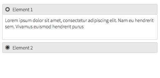
var elements = [];
elements.push({
    title: 'Element 1',
    onClick: function() {
      alert('Hello World!')
    },
    content: 'Lorem Ipsum...'
  });

elements.push({
  title: 'Element 2',
  onClick: function() {
  },
  content: 'Lorem Ipsum...'
});
When rendering (using jsx):
React.render(<Accordion elements={elements} />, document.getElementById('accordion-example'));