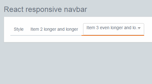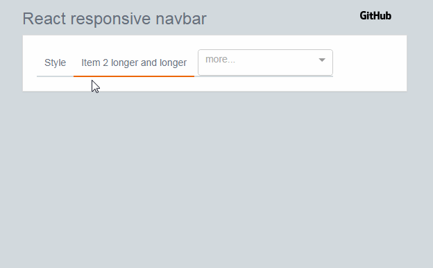
react-responsive-navbar
Navbar component that moves the navbar items to a dropdown, if they do not fit in the content area.
Installation
npm install @opuscapita/react-responsive-navbar
Builds
UMD
The default build with compiled styles in the .js file. Also minified version available in the lib/umd directory.
CommonJS/ES Module
You need to configure your module loader to use cjs or es fields of the package.json to use these module types.
Also you need to configure sass loader, since all the styles are in sass format.
- With webpack use resolve.mainFields to configure the module type.
- Add SASS loader to support importing of SASS styles.
API
| Prop name | Type | Default | Description |
|---|---|---|---|
| activeKey | number | required | Navbar item to be active initially |
| list | list [{id: id, name: name, href: href}] | required | |
| showNavItemBorder | boolean | false | show bottom-border below navbar items |
| showNavItemTooltip | boolean | true | enables tooltips for nav items |
| tooltipDelay | number | 2000 | delay before tooltip becomes visible |
| fontSize | string | 'inherit' | override for fontSize |
| fontWeight | string | 'inherit' | override for fontWeight |
| placeholder | string | 'more...' | override for placeholder text |
| height | string | 40px | override for height |
| Function | Parameters | Returns | Description |
|---|---|---|---|
| onSelect | href: string | Callback fired when the active item changes |
Code example
import ResponsiveNavbar from '@opuscapita/react-responsive-navbar';

const ResponsiveNavbarView = (props) => {
  const list = [
    { name: 'Item 1', href: '/item1' },
    { name: 'Item 2', href: '/item2' },
  ];

  const activeKey = 2;

  return (
    <ResponsiveNavbar
      activeKey={activeKey}
      list={list}
      onSelect={(href) => { props.router.push(href); }}
    />
  );
};

export default withRouter(ResponsiveNavbarView);