react-textarea-autocomplete
Enhanced textarea to achieve autocomplete functionality.
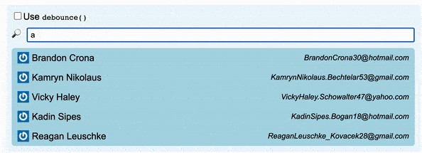
React component implements configurable GitHub's like textarea autocomplete.
This package provides React Component to achieve GitHub's like functionality in comments regarding the textarea autocomplete. It can be used for example for emoji autocomplete or for @mentions. The render function (for displaying text enhanced by this textarea) is beyond the scope of this package and it should be solved separately.
Installation
This module is distributed via [npm][npm] and should be installed as one of your project's dependencies:
yarn add @webscopeio/react-textarea-autocomplete
or there is UMD build available. Check out this pen as example.
This package also depends on
reactandprop-types. Please make sure you have
those installed as well.
Props
Note: Every other props than the mentioned below will be propagated to textarea itself
| Props | Type | Description |
|---|---|---|
| trigger* | Object: Trigger type | Define triggers and their corresponding behavior |
| loadingComponent* | React Component | Gets data props which is already fetched (and displayed) suggestion |
| minChar | Number | Number of characters that user should type for trigger a suggestion. Defaults to 1. |
| onCaretPositionChange | Function: (number) => void | Listener called every time the textarea's caret position is changed. The listener is called with one attribute - caret position denoted by an integer number. |
| closeOnClickOutside | boolean | When it's true autocomplete will close when use click outside. Defaults to false. |
| movePopupAsYouType | boolean | When it's true the textarea will move along with a caret as a user continues to type. Defaults to false. |
| style | Style Object | Style's of textarea |
| listStyle | Style Object | Styles of list's wrapper |
| itemStyle | Style Object | Styles of item's wrapper |
| loaderStyle | Style Object | Styles of loader's wrapper |
| containerStyle | Style Object | Styles of textarea's container |
| dropdownStyle | Style Object | Styles of dropdown's wrapper |
| className | string | ClassNames of the textarea |
| containerClassName | string | ClassNames of the textarea's container |
| listClassName | string | ClassNames of list's wrapper |
| itemClassName | string | ClassNames of item's wrapper |
| loaderClassName | string | ClassNames of loader's wrapper |
| dropdownClassName | string | ClassNames of dropdown's wrapper |
*are mandatory
Methods
The methods below can be called on the React component's ref (see: React Docs)
| Methods | Description |
|---|---|
| getCaretPosition() : number | Gets the current caret position in the textarea |
| setCaretPosition(position : number) : void | Sets the caret position to the integer value passed as the argument |
| getSelectionPosition(): {selectionStart: number, selectionEnd: number} | Returns selectionStart and selectionEnd of the textarea |
| getSelectedText(): ?string | Returns currently selected word |
Example:
import React, { Component } from "react";
import ReactTextareaAutocomplete from "@webscopeio/react-textarea-autocomplete";

class App extends Component {
  onCaretPositionChange = (position) => {
    console.log(`Caret position is equal to ${position}`);
  }

  resetCaretPosition = () => {
    this.textarea.setCaretPosition(0);
  }

  printCurrentCaretPosition = () => {
    const caretPosition = this.textarea.getCaretPosition();
    console.log(`Caret position is equal to ${caretPosition}`);
  }

  render() {
    return (
      <div className="app">
        <div className="controls">
            <button onClick={this.resetCaretPosition}>Reset caret position</button>
            <button onClick={this.printCurrentCaretPosition}>Print current caret position to the console</button>
        </div>
        <ReactTextareaAutocomplete
          className="my-textarea"
          loadingComponent={() => <span>Loading</span>}
          trigger={{ ... }}
          ref={(textarea) => { this.textarea = textarea; } }
          onCaretPositionChange={this.onCaretPositionChange}
        />
      </div>
    );
  }
}

export default App;
Trigger type
{
    [triggerChar: string]: {|
      output?: (
        item: Object | string,
        trigger?: string
      ) =>
        | {|
            key?: ?string,
            text: string,
            caretPosition: "start" | "end" | "next" | number
          |}
        | string,
      dataProvider: (
        token: string
      ) => Promise<Array<Object | string>> | Array<Object | string>,
      allowWhitespace?: boolean,
      afterWhitespace?: boolean,
      component: ReactClass<*>
    |},
}
-
dataProvider is called after each keystroke to get data what the suggestion list should display (array or promise resolving array)
-
component is the component for render the item in suggestion list. It has
selectedandentityprops provided by React Textarea Autocomplete -
allowWhitespace (Optional; defaults to false) Set this to true if you want to provide autocomplete for words (tokens) containing whitespace
-
afterWhitespace (Optional; defaults to false) Show autocomplete only if it's preceded by whitespace. Cannot be combined with allowWhitespace
-
output (Optional for string based item. If the item is an object this method is required) This function defines text which will be placed into textarea after the user makes a selection.
You can also specify the behavior of caret if you return object
{text: "item", caretPosition: "start"}the caret will be before the word once the user confirms his selection. Other possible value are "next", "end" and number, which is absolute number in contex of textarea (0 is equal position before the first char). Defaults to "next" which is space after the injected word.Default behavior for string based item is string:
<TRIGGER><ITEM><TRIGGER>). This method should always return a unique string, otherwise you have to use object notation and specify your ownkey.
Example of usage
create-react-app example && cd example && yarn add @jukben/emoji-search @webscopeio/react-textarea-autocomplete
There is also UMD build available, check this CodePen for a proof.?
App.js
import React, { Component } from "react";
import ReactTextareaAutocomplete from "@webscopeio/react-textarea-autocomplete";
import emoji from "@jukben/emoji-search";

import logo from "./logo.svg";
import "./App.css";
import "@webscopeio/react-textarea-autocomplete/style.css";

const Item = ({ entity: { name, char } }) => <div>{`${name}: ${char}`}</div>;
const Loading = ({ data }) => <div>Loading</div>;

class App extends Component {
  render() {
    return (
      <div className="App">
        <div className="App-header">
          <img src={logo} className="App-logo" alt="logo" />
          <h2>Welcome to React</h2>
        </div>

        <ReactTextareaAutocomplete
          className="my-textarea"
          loadingComponent={Loading}
          style={{
            fontSize: "18px",
            lineHeight: "20px",
            padding: 5
          }}
          containerStyle={{
            marginTop: 20,
            width: 400,
            height: 100,
            margin: "20px auto"
          }}
          minChar={0}
          trigger={{
            ":": {
              dataProvider: token => {
                return emoji(token)
                  .slice(0, 10)
                  .map(({ name, char }) => ({ name, char }));
              },
              component: Item,
              output: (item, trigger) => item.char
            }
          }}
        />
      </div>
    );
  }
}

export default App;
Development
Run yarn to fetch dependencies.
Run yarn lint check [ESlint][eslint] check (yarn lint:fix for quick fix)
Run yarn flow for flow check
Run yarn test to run unit-tests powered by [Jest][jest]
Dev playground (recommended)
Run yarn dev and open http://localhost:8080 for the playground
Run yarn cypress:open for open [Cypress][cypress] for E2E testing
Build and link
Run yarn build and yarn link then in your project folder (you have to use the same version of React e.g 15.6.1) yarn link react-textarea-autocomplete to link together.
Your PR's are welcomed! ❤️