React Component Library Template
This project is part of a blog & video tutorial on how to create and publish your own component library.
You can use this repo to fork as a template for your own React library projects.
Available Scripts
Build the library
npm run rollup
Publish the library
npm publish
Run tests
npm run test
Run storybook locally
npm run storybook
Build storybook
npm run build-storybook
Tutorial
- Introduction
- Prerequisites and Setup
- Creating Components
- Adding Typescript
- Adding Rollup
- Building Your Library
- Publishing Your Library
- Using Your Library
- Adding CSS
- Optimizing
- Adding Tests
- Adding Storybook
- Adding SCSS
- Wrapping Up
Introduction
This tutorial will take you through the process of creating and publishing your own custom React component library and hosting it on Github.
At the end of this tutorial you will have the ability to the following in all of your future React projects:
npm install @my-github-account/my-cool-component-library
import MyCustomComponent from '@my-github-account/my-cool-component-library';

const MyApp = () => {
  return (
    <div>
      <MyCustomComponent />
    </div>
  )
}
Prerequisites and Setup
This project assumes you are familiar with and have installed:
- Code editor / IDE (this tutorial uses VS Code but any IDE will work)
- NPM (NPM is installed when you install Node.js on your machine)
- Installing packages (presume you know how to add packages to a Javascript project with
npm install) - Bash terminal (or another terminal you are comfortable with for running commands)
- Git (we will be creating a git repository on our machine and publishing it to Github, though all instructions will be provided on how to follow along)
- React (how to create simple components using JSX)
- Typescript (how to create an object interface with simple properties)
First we will initialize our project.
npm init
You can take the defaults for all the values, we’ll edit them later in the tutorial.
Next we will add add the tools necessary to create our components.
npm install react typescript @types/react --save-dev
Creating Components
Now we can create our first component. Because we are creating a library, we are going to create index files for each tier, and export our components from each one to make it as easy as possible for the people using our library to import them.
Within the root of your project, create the following file structure:
.
├── src
│   ├── components
|   │   ├── Button
|   |   │   ├── Button.tsx
|   |   │   └── index.ts
|   │   └── index.ts
│   └── index.ts
├── package.json
└── package-lock.json
Make sure to double check your structure. You should have three index.ts files, and a Button.tsx file inside of a Button directory. If you have a preferred way of structuring React components within a project you are of course welcome to do it however you like, but this is the structure we will follow for this tutorial.
Begin by creating Button.tsx:
src/components/Button/Button.tsx
import React from "react";

export interface ButtonProps {
  label: string;
}

const Button = (props: ButtonProps) => {
  return <button>{props.label}</button>;
};

export default Button;
To keep things simple we will just export a button that takes a single prop called label. We can add more complexity and styles to our components once we have confirmed that our basic template is setup correctly.
After our button, we update the index file inside our Button directory:
src/components/Button/index.ts
export { default } from "./Button";
Then we export that button from the components directory:
src/components/index.ts
export { default as Button } from "./Button";
And finally, we will export all of our components from the base src directory:
src/index.ts
export * from './components';
Adding Typescript
Up until now, we haven’t yet initialized Typescript in our project. Although you technically don’t need a configuration file to use Typescript, for the complexity of building a library we are definitely going to need one.
You can initialize a default configuration by running the following command:
npx tsc --init
That will create a tsconfig.json file for us in the root of our project that contains all the default configuration options for Typescript.
If you would like to learn more about the many options in a tsconfig.json file, modern versions of TS will automatically create descriptive comments for each value. In addition you can find full documentation on the configuration here.
You may notice depending on your IDE that immediately after initializing you begin to get errors in your project. There are two reasons for that: the first is that Typescript isn’t configuration to understand React by default, and the second is that we haven’t defined our method for handling modules yet: so it may not understand how to manage all of our exports.
To fix this we are going to add the following values to tsconfig.json:
{
  "compilerOptions": {
    // Default
    "target": "es5",
    "esModuleInterop": true,
    "forceConsistentCasingInFileNames": true,
    "strict": true,
    "skipLibCheck": true,

    // Added
    "jsx": "react",
    "module": "ESNext",
    "declaration": true,
    "declarationDir": "types",
    "sourceMap": true,
    "outDir": "dist",
    "moduleResolution": "node",
    "allowSyntheticDefaultImports": true,
    "emitDeclarationOnly": true,
  }
}
I have separated these values into a couple different sections based on the default tsconfig.json created using the most recent version of Typescript as of this writing (4.4). The values commented default should already be set for you by default (you will want to double check and make sure however).
The values marked added are new values that we need for our project. We’ll briefly outline why we need them:
- “jsx”: “react” — Transform JSX into React code
- “module”: “ESNext” — Generate modern JS modules for our library
- “declaration”: true — Output a
.d.tsfile for our library types - “declarationDir”: “types” — Where to place the
.d.tsfiles - “sourceMap”: true — Mapping JS code back to its TS file origins for debugging
- “outDir”: “dist” — Directory where the project will be generated
- “moduleResolution”: “node” — Follow node.js rules for finding modules
- “allowSyntheticDefaultImports”: true — Assumes default exports if none are created manually
- “emitDeclarationOnly”: true — Don’t generate JS (rollup will do that) only export type declarations
One you add those values to your TS configuration file you should see the errors in Button.tsx and other files immediately disappear.
Adding Rollup
Next we will add rollup to our project. If you’ve never used rollup before, it’s very similar to webpack in that it is a tool for bundling individual Javascript modules into a single source that a browser is better able to understand.
Though both tools can accomplish the same goal depending on configuration, typically webpack is used for bundling applications while rollup is particularly suited for bundling libraries (like ours). That’s why we’ve chosen rollup.
Also similar to webpack, rollup uses a plugin ecosystem. By design rollup does not know how to do everything, it relies on plugins installed individually to add the functionality that you need.
We are going to rely on four plugins for the initial configuration of our library (more will be added later):
- @rollup/plugin-node-resolve – Uses the node resolution algorithm for modules
- @rollup/plugin-typescript – Teaches rollup how to process Typescript files
- @rollup/plugin-commonjs – Converts commonjs modules to ES6 modules
- rollup-plugin-dts – rollup your
.d.tsfiles
So with that said, let’s go ahead and install rollup and our plugins:
npm install rollup @rollup/plugin-node-resolve @rollup/plugin-typescript @rollup/plugin-commonjs rollup-plugin-dts --save-dev
To configure how rollup is going to bundle our library we need to create a configuration file in the root of our project:
rollup.config.js
import resolve from "@rollup/plugin-node-resolve";
import commonjs from "@rollup/plugin-commonjs";
import typescript from "@rollup/plugin-typescript";
import dts from "rollup-plugin-dts";

const packageJson = require("./package.json");

export default [
  {
    input: "src/index.ts",
    output: [
      {
        file: packageJson.main,
        format: "cjs",
        sourcemap: true,
      },
      {
        file: packageJson.module,
        format: "esm",
        sourcemap: true,
      },
    ],
    plugins: [
      resolve(),
      commonjs(),
      typescript({ tsconfig: "./tsconfig.json" }),
    ],
  },
  {
    input: "dist/esm/types/index.d.ts",
    output: [{ file: "dist/index.d.ts", format: "esm" }],
    plugins: [dts()],
  },
];
In this file we import our four plugins that we installed. We also import our package.json file as a commonJS module int oa variable called packageJson. We use this variable to refer to the main and module values that we will define in the next section.
The entrypoint for our library (input) is the index.ts file in the src directory which exports all of our components. We will be distributing both ES6 and commonJS modules so the consumers of our library can choose which type work best for them. We also invoke three of our four plugins on the first of two configuration objects on the exported array. This first configuration defines how the actual Javascript code of our library is generated.
The second configuration object defines how our libraries types are distributed and uses the dts plugin to do so.
The final step before we can run our first rollup is to define the values of “main” and “module” in our package.json file:
package.json
{
  "name": "template-react-component-library",
  "version": "0.0.1",
  "description": "A simple template for a custom React component library",
  "scripts": {
    "rollup": "rollup -c"
  },
  "author": "Alex Eagleson",
  "license": "ISC",
  "devDependencies": {
    "@rollup/plugin-commonjs": "^21.0.1",
    "@rollup/plugin-node-resolve": "^13.0.6",
    "@rollup/plugin-typescript": "^8.3.0",
    "@types/react": "^17.0.34",
    "react": "^17.0.2",
    "rollup": "^2.60.0",
    "rollup-plugin-dts": "^4.0.1",
    "typescript": "^4.4.4"
  },
  "main": "dist/cjs/index.js",
  "module": "dist/esm/index.js",
  "files": [
    "dist"
  ],
  "types": "dist/index.d.ts"
}
Here is the sample of the package.json file we are using for this tutorial. Obviously your author name can be different, and the specific version of each of your libraries might be different as well.
The most important changes are as follows:
- “main” — We have defined the output path for commonjs modules
- “module” — We have defined the output path for es6 modules
- “files” — We have defined the output directory for our entire library
- “types” — We have defined the location for our library’s types
- “scripts” — We have defined a new script called rollup. This will run the rollup package with the -c flag which means “use the rollup configuration file”. If you’re not familiar with script in a
package.jsonfile, these are simply shorthand commands you can run by name withnpm run {SCRIPTNAME}. So to run this one will benpm run rollup.
Building your library
With these configurations in place you are now ready to run rollup for the first time and make sure your basic configuration is correct. Your project structure should look like this before you run:
.
├── src
│   ├── components
|   │   ├── Button
|   |   │   ├── Button.tsx
|   |   │   └── index.ts
|   │   └── index.ts
│   └── index.ts
├── package.json
├── package-lock.json
├── tsconfig.json
└── rollup.config.js
The contents of each file should be as described above. Once you have confirmed this, run the following command:
npm run rollup
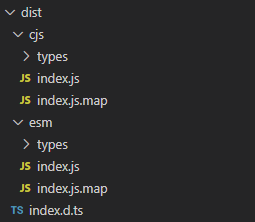
If everything has been configured correctly rollup will run without error and you will see a dist directory created in the root of your project with a structure that looks like:
(If you received an error make sure to read it closely to try and identify the issue. Double check that each of your files follows exactly the structure of the examples. Depending on the amount of time passed since the publishing of this tutorial, new major versions of libraries could potentially be published with breaking changes. All versions of libraries numbers are visible above in the package.json example in the event you need to specify a specific version)
Publishing your library
Now that we’ve created our component library, we need a way to allow ourselves (or others) to download and install it. We will be publishing our library via NPM through hosting on Github. First before anything else we need to create a repository for our library.
Create a new repository on Github. I have titled mine template-react-component-library. Then follow the steps to initialize your project as a git project, and push to your new repository.
Log into Github and create a new repository called whatever you like. For this example I’ve titled it template-react-component-library and it will be available for everyone to clone and use publicly. You can choose to make your library private if you like, methods described in this tutorial will work for private packages as well (in case you are making a library for your company for example).
Once the repository is created we need to initialize git within our project locally. Run the following command:
git init
Next create a .gitignore file in the root of the directory (make particular note of the leading period, that signifies this is a hidden file):
.gitignore
dist
node_modules
In our .gitignore file we are adding the dist and node_modules directories. The reason being that both of these are auto-generated directories that we create using commands, so there is no need to include them in our repository.
Now follow the instructions on Github shown in your new repository for committing your code.
This repository that you have created is the one you will clone & edit when you want to make changes and updates to your component library. This is not the package itself that your (as a user) would install and use. To configure within our project where our package needs to be published to, next we need to update package.json with that information:
package.json
{
  "name": "@YOUR_GITHUB_USERNAME/YOUR_REPOSITORY_NAME",
  "publishConfig": {
    "registry": "https://npm.pkg.github.com/YOUR_GITHUB_USERNAME"
  },
  ...
}
You will be updating the field “name” value and adding a new field called “publishConfig”. Note the values above in caps are meant to be replaced with your own values. For example my “name” field value would be @alexeagleson/template-react-component-library. Notice the “packageConfig” also has your Github account name in it as well, but that value does not lead with the @ symbol.
Now that we have configured out project, we need to configure our local install of NPM itself to be authorized to publish to your Github account. To do this we use a .npmrc file.
This file is NOT PART OF OUR PROJECT. This is a global file in a central location. For Mac/Linux users it goes in your home directory ~/.npmrc.
For Windows users it goes in your home directory as well, though the syntax will be different. Something along the lines of C:\Users\{YOUR_WINDOWS_USERNAME}
For more information about this configuration file read this.
Once you have created the file, edit it to include the following information:
~/.npmrc
registry=https://registry.npmjs.org/
@YOUR_GITHUB_USERNAME:registry=https://npm.pkg.github.com/
//npm.pkg.github.com/:_authToken=YOUR_AUTH_TOKEN
There are two values in caps to replace in the example above. The first is YOUR_GITHUB_USERNAME. Make sure to include the leading @ symbol.
The second is YOUR_AUTH_TOKEN which we haven’t created yet. Back to Github!
Go to your Github profile: Settings -> Developer Settings -> Personal access tokens. Or just click this link
Click Generate new token. Give it a name that suits the project you are building. Give it an expiry date (Github recommends you don’t create tokens with an infinite lifespan for security reasons, but that’s up to you).
The most important thing is to click the write:packages access value. This will give your token permission to read & write packages to your Github account, which is wht we need.
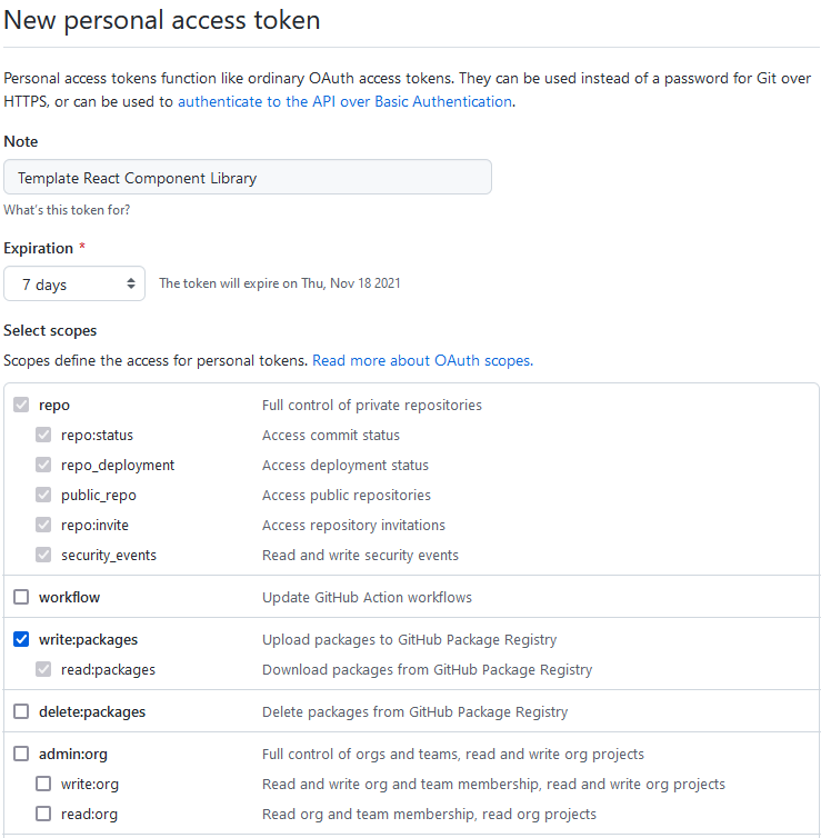
Once you are done you can click to create the token. Github will ONLY SHOW YOU THE TOKEN ONCE. When you close/refresh the page it will be gone, so make sure to copy it to a secure location (perhaps a password manager if you use one).
The main location you need to place this token is in the ~/.npmrc file that you created replacing the YOUR_AUTH_TOKEN value from the example above.
Before you continue, do one more sanity check to be sure you didn’t create the .npmrc file in the root directory of your actual library project. This is technically an option, however the reason you need to be careful is that you could accidentally commit it to your Github repository with the rest of your library code and expose your token to the public. If your .npmrc file is in your home directory the risk of this is minimized.
At this point, once you ~/.npmrc file has both your Github username and access token added, go back to your project directory and run the following command:
npm publish
(If you get prompted for login credentials, the username is your Github username and your password is the access token you generated)
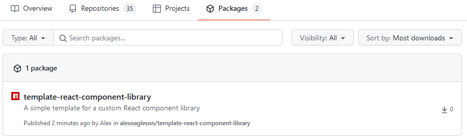
Congratulations! You have now published version 0.0.1 of your React component library! You can view it on your Github account by going to your main account dashboard and clicking “packages” along the top to the right of “repositories”::
Using Your Library
Now that your library is live, you’ll want to use it!
Note that the instructions for using your library are slightly different if you published to a private repository. Everyone (aside from your own machine) who tries to import it is going to get a 404 Not Found error if they are not authorized.
Those users also need to add a ~/.npmrc file with the same information. To be more secure however you can provide those users with an access token that has only read privileges, not write.
(From this point onward we will presume you have completed that step, or are working with a public repository.)
Since we have created a component library using React and Typescript, we are presuming that the consumers of our library will be using those tools as well. Technically all of our type files (.d.ts) are supplemental: meaning they are simply ignored if working with standard Javascript, so it’s not necessary to use Typescript to use our library. The types are simply there if desired.
For our example we will use it however so that we can confirm that they are working properly. We will initialize a React app using one of the most popular and simple methods: Create React App.
Run the following command in a new directory:
(Remember we are simulating other users downloading and installing our library, so this project should be completely separate from the library itself)
npx create-react-app my-app --template typescript
Open the new my-app directory that is created and run:
npm run start
Confirm that you are able to open and load the default application screen on localhost:3000 (or whatever port it opens on).
Now comes the test for our library. From the root directory of your new my-app project, run the following command:
npm install @YOUR_GITHUB_USERNAME/YOUR_REPOSITORY_NAME
So for my project for example its: npm install @alexeagleson/template-react-component-library
Presuming your tokens and configuration are set up properly, everything will install correctly (if there are any issues, revisit the example for the ~/.npmrc config.)
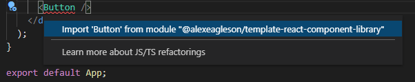
Now open the my-app project in your IDE of choice (VS Code for example) and navigate to the src/App.tsx file.
When you go to add a <Button /> component, if your editor supports import auto complete (ctrl/cmd + . for VS Code) then you will see it automatically recognize thanks to Typescript that our library exports that button.
Lets add it! The simplest example to update src/App.tsx is:
src/App.tsx
import React from "react";
import { Button } from "@alexeagleson/template-react-component-library";

function App() {
  return <Button label="Hello world!"/>;
}

export default App;
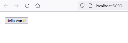
And when we run npm run start again, there tucked up in the corner is our Hello world! button.
And that’s it! Congratulations! You now have all the tools you need to create and distribute a React component library using Typescript! At this point you end the tutorial and continue on your own if you wish.
If you choose to continue, we will look at how to expand our component library to include a number of extremely useful features such as:
- CSS: For exporting components with style
- Storybook: For testing our components within the library itself as we design them
- React Testing Library & Jest: For testing our components
Adding CSS
Before we do any additional configuration, we’ll begin by creating a CSS file that will apply some styles to our Button. Inside of the Button directory where our component lives, we’ll create a file called: Button.css:
src/components/Button/Button.css
button {
  font-size: 60px;
}
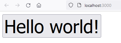
This will turn our regular Hello world! button into a REALLY BIG button.
Next we will indicate that these styles are meant to be applied on our button component. We’ll be using special syntax that isn’t native to Javascript, but thanks to rollup and the appropriate plugins, we are able to use it. Update our Button.tsx file with the following:
src/components/Button/Button.tsx
import React from "react";
import "./Button.css";

export interface ButtonProps {
  label: string;
}

const Button = (props: ButtonProps) => {
  return <button>{props.label}</button>;
};

export default Button;
Notice the import './Button.css' that has been added.
Now we need to tell rollup how to process that syntax. To do that we use a plugin called rollup-plugin-postcss. Run the following command:
npm install rollup-plugin-postcss --save-dev
Next we need to update our rollup config:
rollup.config.js
import resolve from "@rollup/plugin-node-resolve";
import commonjs from "@rollup/plugin-commonjs";
import typescript from "@rollup/plugin-typescript";
import dts from "rollup-plugin-dts";

// NEW
import postcss from "rollup-plugin-postcss";

const packageJson = require("./package.json");

export default [
  {
    input: "src/index.ts",
    output: [
      {
        file: packageJson.main,
        format: "cjs",
        sourcemap: true,
      },
      {
        file: packageJson.module,
        format: "esm",
        sourcemap: true,
      },
    ],
    plugins: [
      resolve(),
      commonjs(),
      typescript({ tsconfig: "./tsconfig.json" }),

      // NEW
      postcss(),
    ],
  },
  {
    input: "dist/esm/types/index.d.ts",
    output: [{ file: "dist/index.d.ts", format: "esm" }],
    plugins: [dts()],

    // NEW
    external: [/\.(css|less|scss)$/],
  },
];
Note the three new lines indicated with the NEW comments. In the dts config we need to specify that .css modules are external and should not be processed as part of our type definitions (otherwise we will get an error).
Finally we need to update the version number in our package.json file. Remember we are publishing a package so when we make changes, we need to ensure we don’t impact users of previous versions of our library. Every time we publish we should increment the version number:
package.json
{
  "version": "0.0.2",
  ...
}
Now run these commands:
npm run rollup
npm publish
On the library consuming side (my-app React app from our tutorial) we also need to update to get the latest version of the package. The easiest way is to increment the version number in the package.json file of my-app. It should show ^0.0.1. Increment that to ^0.0.2 and then you can update with the npm install command:
npm install
npm run start
And you’ll be treated to a giant button component from our library that now supports bundling CSS!
Optimizing
There are a couple of easy optimizations we can make with this setup. The first is to add a plugin called terser that will minify our bundle and reduce the overall file size.
The other is to update some of our dependencies to peerDependencies. With rollup’s peer dependencies plugin we can tell the projects that are using our libraries which dependencies are required (like React) but won’t actually bundle a copy of React with the library itself. If the consumer already has React in their project it will use that, otherwise it will get installed when they run npm install.
First we will install these two plugins:
npm install rollup-plugin-peer-deps-external rollup-plugin-terser --save-dev
Then we will update our rollup config:
rollup.config.js
import resolve from "@rollup/plugin-node-resolve";
import commonjs from "@rollup/plugin-commonjs";
import typescript from "@rollup/plugin-typescript";
import postcss from "rollup-plugin-postcss";
import dts from "rollup-plugin-dts";

//NEW
import { terser } from "rollup-plugin-terser";
import peerDepsExternal from 'rollup-plugin-peer-deps-external';

const packageJson = require("./package.json");

export default [
  {
    input: "src/index.ts",
    output: [
      {
        file: packageJson.main,
        format: "cjs",
        sourcemap: true,
      },
      {
        file: packageJson.module,
        format: "esm",
        sourcemap: true,
      },
    ],
    plugins: [
      // NEW
      peerDepsExternal(),

      resolve(),
      commonjs(),
      typescript({ tsconfig: "./tsconfig.json" }),
      postcss(),

      // NEW
      terser(),
    ],
  },
  {
    input: "dist/esm/types/index.d.ts",
    output: [{ file: "dist/index.d.ts", format: "esm" }],
    plugins: [dts()],
    external: [/\.css$/],
  },
];
Then we move React from devDependencies to peerDependencies in our package.json file:
package.json
{
  "devDependencies": {
    "@rollup/plugin-commonjs": "^21.0.1",
    "@rollup/plugin-node-resolve": "^13.0.6",
    "@rollup/plugin-typescript": "^8.3.0",
    "@types/react": "^17.0.34",
    "rollup": "^2.60.0",
    "rollup-plugin-dts": "^4.0.1",
    "rollup-plugin-peer-deps-external": "^2.2.4",
    "rollup-plugin-postcss": "^4.0.1",
    "rollup-plugin-terser": "^7.0.2",
    "typescript": "^4.4.4"
  },
  "peerDependencies": {
    "react": "^17.0.2"
  },
  ...
Adding Tests
To add tests for our components we are going to install React Testing Library, and to run those tests we will install Jest.
npm install @testing-library/react jest @types/jest --save-dev
Inside of our Button directory, create a new file called Button.test.tsx
src/components/Button/Button.test.tsx
import React from "react";
import { render } from "@testing-library/react";

import Button from "./Button";

describe("Button", () => {
  test("renders the Button component", () => {
    render(<Button label="Hello world!" />);
  });
});
What this will do is render our button on a non-browser DOM implementation and make sure that it mounts properly. This is a very simple test, but it serves as a good example of the syntax you can use to get started. To go deeper in depth read further in the React Testing Library documentation.
Before we can run the tests we need to configure jest, and create a test runner script in our package.json. We’ll start with the configuration, create a jest.config.js file in the root of the project:
jest.config.js
module.exports = {
  testEnvironment: "jsdom",
};
This tells Jest to use jsdom as our DOM implementation.
Next update your package.json file:
package.json
{
  "scripts": {
    "rollup": "rollup -c",
    "test": "jest"
  },
  ...
}
Now we can run our tests with:
npm run test
Unfortunately we are going to get an error! The error is when our JSX code is encountered. If you recall we used Typescript to handle JSX with our rollup config, and a Typescript plugin for rollup to teach it how to do that. We have no such setup in place for Jest unfortunately.
We are going to need to install Babel to handle our JSX transformations. We will also need to install a Jest plugin called babel-jest that tells Jest to use Babel! Let’s install them now, along with Babel plugins to handle our Typescript and React code. The total collection of all of them looks like:
npm install @babel/core @babel/preset-env @babel/preset-react @babel/preset-typescript babel-jest --save-dev
Now we create our Babel configuration file in the root of our project, which tells Babel to use all these plugins we’ve just installed:
babel.config.js
module.exports = {
  presets: [
    "@babel/preset-env",
    "@babel/preset-react",
    "@babel/preset-typescript",
  ],
};
Now we should be able to run our tests with npm run test… but… there is one more problem!
You’ll get an error saying the import of the .css file isn’t understood. That makes sense because, again, we configured a postcss plugin for rollup to handle that, but we did no such thing for Jest.
The final step will be to install a package called identity-obj-proxy. What this does is allow you to configure Jest to treat any type of imports as just generic objects. So we’ll do that with CSS files so we don’t get an error.
npm install identity-obj-proxy --save-dev
We need to update our Jest config tp include the moduleNameMapper property. We’ve also added less and scss in there for good measure in case you want to expand your project later to use those:
jest.config.js
module.exports = {
  testEnvironment: "jsdom",
  moduleNameMapper: {
    ".(css|less|scss)$": "identity-obj-proxy",
  },
};
Now finally if you’ve followed up step up to this point, you can run:
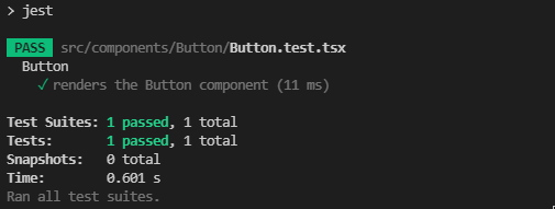
npm run test
And you will be treated to a successful test!
Adding Storybook
Storybook is a a tool for visualizing UI components outside of your site / application. It’s fantastic for prototyping and testing different visual states of components to ensure they work the way they are designed to, without the extra overhead of having other unrelated components on the screen.
It also gives you an easy way to see and use your components while working on them in your library project, without having to build an unnecessary testing page just to display them.
Initializing Storybook is very easy. To set it up and configure it automatically we just run the following command:
npx sb init --builder webpack5
(Note as of this writing Storybook still defaults to using webpack 4 which is why we have added the extra builder flag. Presumably 5 will be the default soon so it may be unnecessary in the future)
Unlike some of the other tools we have added so far, Storybook much more of a “batteries included” kind of package that handles most of the initial setup for you. It will even add the scripts to run it into your package.json file automatically.
You will also notice that it creates a stories directory in your src directory. This directory is full of pre-built templates for you to use as an example of how to create your own stories. I recommend you don’t delete these until you become familiar with Storybook and how to write your own stories, having them close by will be very handy.
Now let’s create a simple story for our button. Create a new file in the Button directory called Button.stories.tsx:
src/components/Button/Button.stories.tsx
import React from "react";
import { ComponentStory, ComponentMeta } from "@storybook/react";
import Button from "./Button";

// More on default export: https://storybook.js.org/docs/react/writing-stories/introduction#default-export
export default {
  title: "ReactComponentLibrary/Button",
  component: Button,
} as ComponentMeta<typeof Button>;

// More on component templates: https://storybook.js.org/docs/react/writing-stories/introduction#using-args
const Template: ComponentStory<typeof Button> = (args) => <Button {...args} />;

export const HelloWorld = Template.bind({});
// More on args: https://storybook.js.org/docs/react/writing-stories/args
HelloWorld.args = {
  label: "Hello world!",
};

export const ClickMe = Template.bind({});
ClickMe.args = {
  label: "Click me!",
};
This might be a little overwhelming at first, but when you go through it piece by piece you should see it’s fairly straightforward.
-
The default export defines where the button will appear in the Storybook. I’ve chosen ReactComponentLibrary as a simple name to group our custom components together separately from the examples.
-
The Template determines which component is actually being rendered, and which default args/props to apply to it.
-
The Template.bind objects are instances or example states of the component. So in a real project you might have something like “LargeButton” and “SmallButton”. Since our button is always big I’ve just used an example of testing the button with two different labels.
If you look at your package.json file you’ll see that Storybook has already added a storybook and storybook-build script. The first will host the Storybook application locally for quick and easy testing. The second one will build a static HTML/JS bundle that can easily be hosted on a remote server, so all members of your team can try your components.
For now let’s just run:
npm run storybook
Edit: It’s possible you may encounter errors due to missing dependencies. If this occurs there are a few solutions.
The first is to install those dependencies manually. For example react-dom. This is not ideal as your project itself should not depend on these libraries, so it should not be necessary to include them as they are included with Storybook’s peer dependencies, as example here.
If you simply run a fresh npm install command it will install all the peerDependencies of the libraries you are using. Before running this you may need to delete your package-lock.json and node_modules directory. They will be regenerated automatically after your fresh install.
It can be tricky to troubleshoot issues related to both overlapping and missing dependencies between libraries. Stay patient and make sure to read your error messages!)
There is plenty more to learn about Storybook, make sure to read through the documentation.
Adding SCSS
Thanks to rollup-plugin-postcss you should already be able to simply rename your .css file to .scss and then import 'Button.scss and be on your way. Running num run rollup will compile it all just fine with the current configuration.
To get it running with Storybook is a different matter however. Note that this is the main reason we used the --builder webpack5 flag when installing in the previous section, you will likely encounter a lot of errors trying to configure Storybook to support SCSS with webpack 4. With version 5 it’s fairly simple using the SCSS preset.
(If you followed an earlier version of this tutorial you may have initialized Storybook with the default webpack 4. You can remove anything related to Storybook from your package.json file. Next delete your package-lock.json and /node_modules/ directory and initialize Storybook again with the --builder webpack5 flag).
npm install @storybook/preset-scss css-loader sass sass-loader style-loader --save-dev
(If you’d like to understand more about the difference between what these different loaders do, here is a great answer on Stack Overflow)
Then all you need to do is add @storybook/preset-scss to your main Storybook config:
.storybook/main.js
module.exports = {
  "stories": [
    "../src/**/*.stories.mdx",
    "../src/**/*.stories.@(js|jsx|ts|tsx)"
  ],
  "addons": [
    "@storybook/addon-links",
    "@storybook/addon-essentials",
    "@storybook/preset-scss"
  ],
  "core": {
    "builder": "webpack5"
  }
}
Now you will be able to run npm run storybook and see all your SCSS styles.
To read more on different kinds of CSS support and Storybook click here.
Wrapping Up
You should now have a good understanding about how to create your own React component library. Doing so can not only teach you a lot about how the Javascript package management ecosystem works, but it can be a great way to make code that you use across multiple projects easily available with a simple command.
Please check some of my other learning tutorials. Feel free to leave a comment or question and share with others if you find any of them helpful:
<script async src=”https://platform.twitter.com/widgets.js” charset=”utf-8″></script> on Twitter