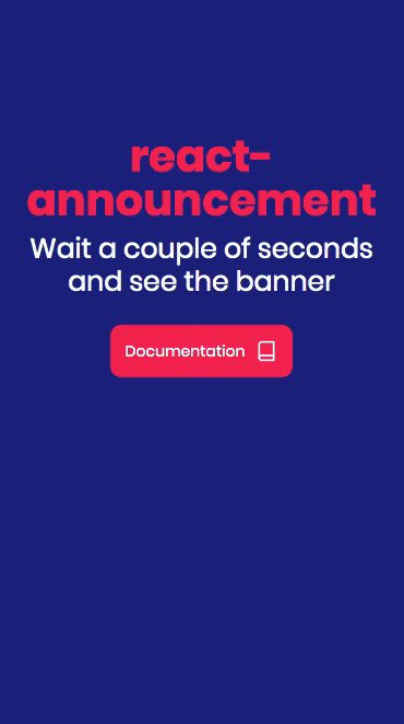
react-announcement
This simple and modern component makes it easier for you to engage with your visitors in a non-intrusive way. The component is fully responsive and will render perfectly on desktop, tablets and mobile.

Install
npm install --save react-announcement
Usage
import * as React from 'react'
import Logo from './logo.svg'
import Announcement from 'react-announcement'

class Example extends React.Component {
  render () {
    return (
      <Announcement
          title="Here is your component"
          subtitle="The best announcement component for React is finally here. Install it in all your projects."
          link="https://github.com/kristofferandreasen/react-announcement"
          imageSource={Logo}
      />
    )
  }
}
Usage with optional properties
This example includes the optional properties in the component.
The daysToLive property changes to cookie created by the component.
This way you can control how many days you want to wait before you show the announcement to the same user.
The secondsBeforeBannerShows property changes the amount of seconds a user wait before the announcement is presented.
The closeIconSize is to allow you to change to size of the icon in the top right corner.
import * as React from 'react'
import Logo from './logo.svg'
import Announcement from 'react-announcement'

class Example extends React.Component {
  render () {
    return (
      <Announcement
          title="Here is your component"
          subtitle="The best announcement component for React is finally here. Install it in all your projects."
          link="https://github.com/kristofferandreasen/react-announcement"
          imageSource={Logo}
          daysToLive={3}
          secondsBeforeBannerShows={20}
          closeIconSize={30}
      />
    )
  }
}
Properties
| Property | Type | Required | Default value | Description |
|---|---|---|---|---|
title |
string | yes | The title of the announcement | |
subtitle |
string | yes | The general card text on the announcement | |
imageSource |
string | yes | The image source string used on the left side of the image. Use a square image for the best results. Dimensions are 68x68 pixels. | |
link |
string | yes | The link used when the announcement is clicked. | |
daysToLive |
number | no | 7 | An optional property specifying the number of days the cookie will live before the announcement is shown again to a user. |
secondsBeforeBannerShows |
number | no | 5 | The number of seconds a user has to keep the page open before the announcement is shown. |
closeIconSize |
number | no | 30 | The size of the close icon shown in the top right corner of the announcement. |
Responsive
The announcement is shown in the left side of the screen on desktop and centered at the bottom on mobile.