Material-UI Rating
Rate something with material ui style.
Installation
Stable channel
npm install material-ui-rating
Usage
import { Rating } from 'material-ui-rating'
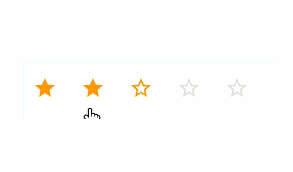
<Rating
value={3}
max={5}
onChange={(value) => console.log(`Rated with value ${value}`)}
/>
Material Rating Properties
| Name | Type | Default | Description |
|---|---|---|---|
| classes* | object |
Useful to extend the style applied to components. The accepted keys are listed below. | |
| disabled | bool |
false |
Disables the rating and gray it out if set to true. |
| iconFilled | node |
This is the icon to be used as an icon in value range. | |
| iconFilledRenderer | func |
Overrides filled icon renderer. | |
| iconHoveredRenderer | func |
Overrides hovered icon renderer. | |
| iconHovered | node |
This is the icon to be used as an hovered icon. | |
| iconNormal | node |
This is the icon to be used as an normal icon. | |
| iconNormalRenderer | func |
Overrides normal icon renderer. | |
| max | number |
5 |
The max value of the rating bar. |
| onChange | func |
Fired when a value is clicked. | |
| readOnly | bool |
false |
Don't allow input if set to true. |
| value | number |
0 |
The value of the rating bar. |
* required property
CSS API
You can override all the class names injected by Material-UI-Rating thanks to the classes property. This property accepts the following keys:
root- Applied to the rootdivelementiconButton- Applied to the IconButton componenticon- Applied to the SvgIcon componentdisabled- Applied to the IconButton component when disabled prop istruereadOnly- Applied to the IconButton component when readOnly prop istrue