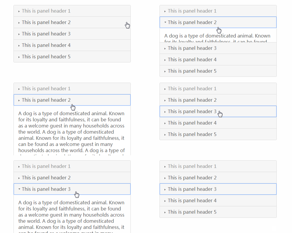
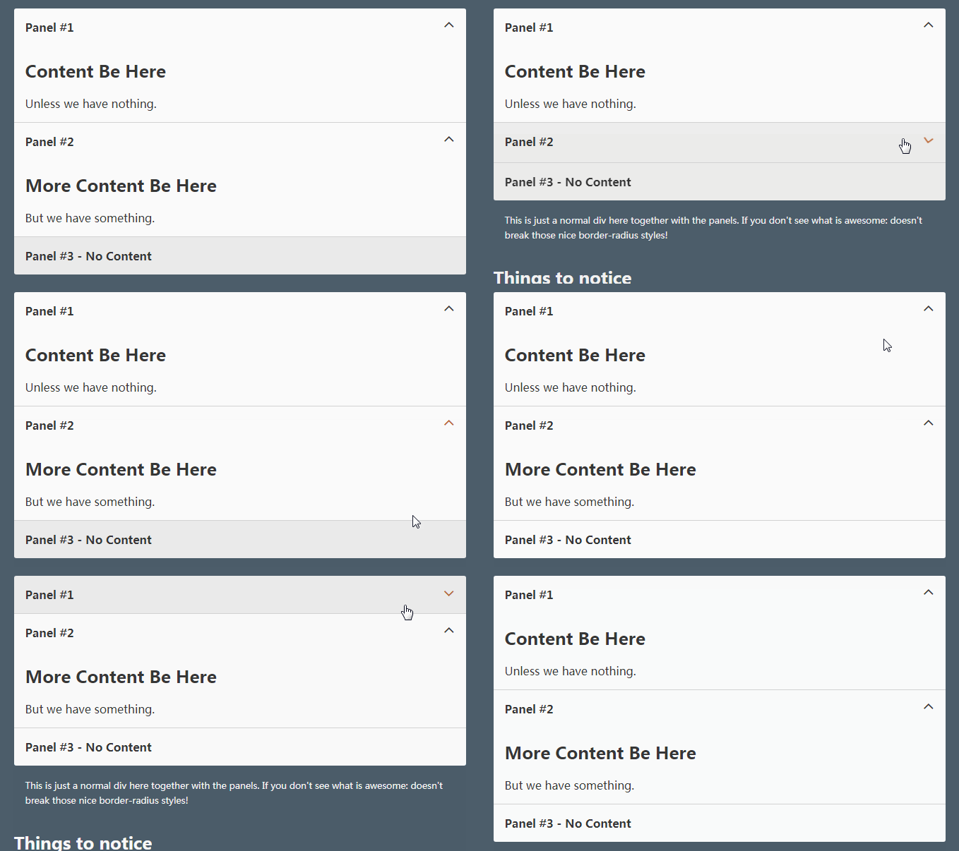
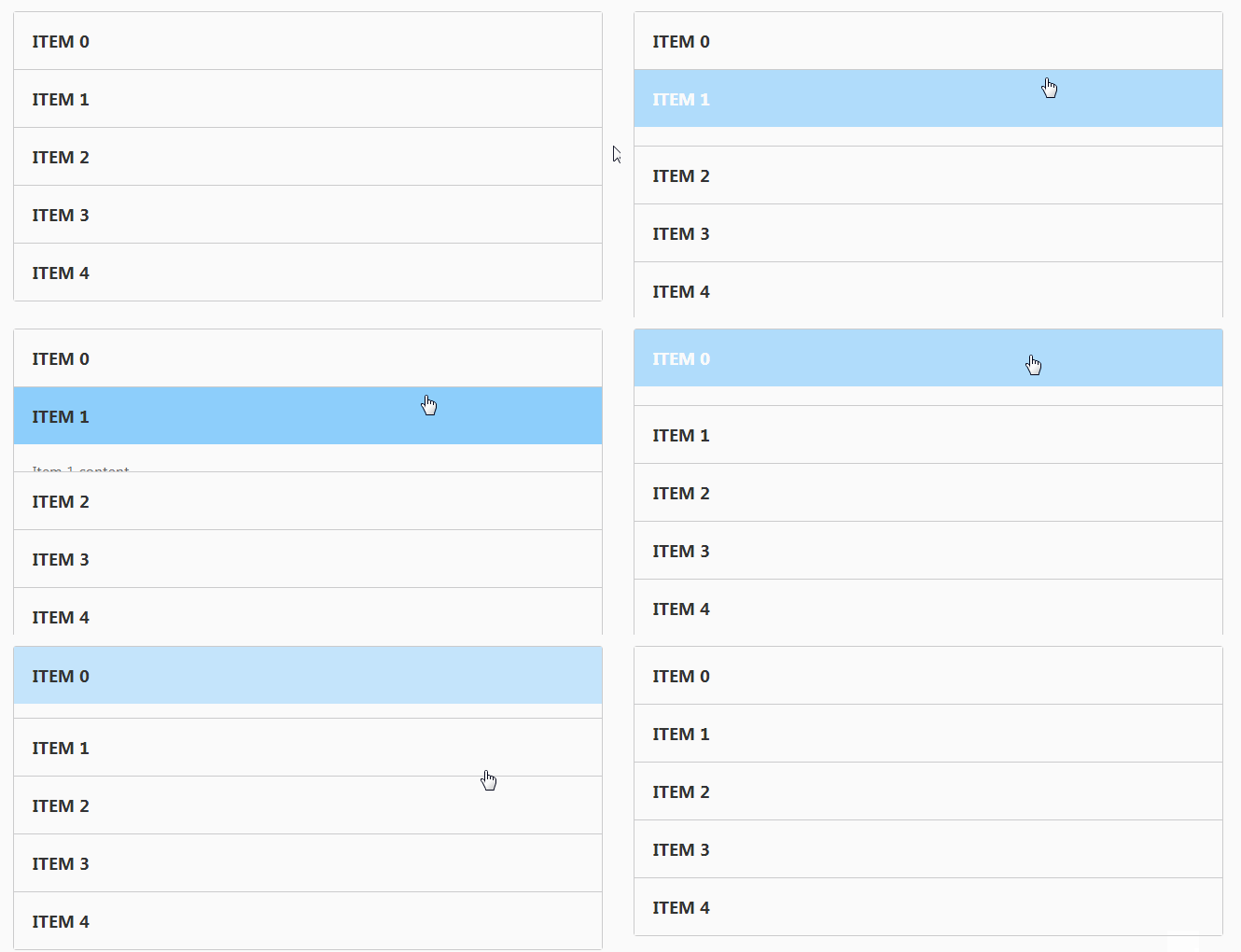
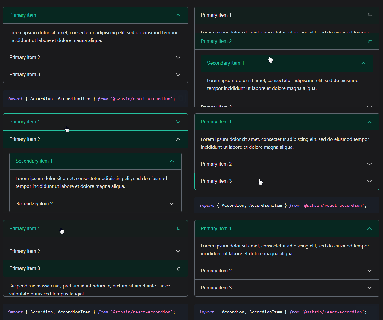
collapse
rc-collapse ui component for react
Development
npm install
npm start
Example
http://localhost:8000/examples/

online example: http://react-component.github.io/collapse/
Features
- support ie8,ie8+,chrome,firefox,safari
Install
Usage
var Collapse = require('rc-collapse');
var Panel = Collapse.Panel;
var React = require('react');
var ReactDOM = require('react-dom');
require('rc-collapse/assets/index.css');

var collapse = (
  <Collapse accordion={true}>
    <Panel header="hello" headerClass="my-header-class">this is panel content</Panel>
    <Panel header="title2">this is panel content2 or other</Panel>
  </Collapse>
);
ReactDOM.render(collapse, container);
API
Collapse
props:
| name | type | default | description |
|---|---|---|---|
| activeKey | String|Array |
The first panel key | current active Panel key |
| className | String or object | custom className to apply | |
| defaultActiveKey | String|Array |
null | default active key |
| destroyInactivePanel | Boolean | false | If destroy the panel which not active, default false. |
| accordion | Boolean | false | accordion mode, default is null, is collapse mode |
| onChange | Function(key) | noop | called when collapse Panel is changed |
If accordion is null or false, every panel can open. Opening another panel will not close any of the other panels.
activeKey should be an string, if passing an array (the first item in the array will be used).
If accordion is true, only one panel can be open. Opening another panel will cause the previously opened panel to close.
activeKey should be an string, if passing an array (the first item in the array will be used).
Collapse.Panel
props
| name | type | default | description |
|---|---|---|---|
| header | String or node | header content of Panel | |
| headerClass | String | ' ' | custom className to apply to header |
| showArrow | boolean | true | show arrow beside header |
| className | String or object | custom className to apply | |
| style | object | custom style | |
| openAnimation | object | set the animation of open behavior, [more](https://github.com/react-component/animate#animation-format) | |
| disabled | boolean | false | whether the panel is collapsible |
| forceRender | boolean | false | forced render of content in panel, not lazy render after clicking on header |
key
If key is not provided, the panel's index will be used instead.
Test Case
npm test
npm run chrome-test
Coverage
npm run coverage
open coverage/ dir
