React Bootstrap Table Control
This component facilitates the control and display of tables.
Install
npm install react-bootstrap-table-control
Usage
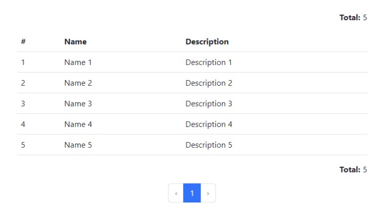
Component usage example.
import 'bootstrap/dist/css/bootstrap.min.css';

import React, { useState, useEffect } from 'react';
import { TableControl } from 'react-bootstrap-table-control';

export default () => {
  return <TableControl
    header={[
      { key: "id", name: "#" },
      { key: "name", name: "Name" },
      { key: "description", name: "Description" }
    ]}
    itens={[
      { id: 1, name: "Name 1", description: "Description 1" },
      { id: 2, name: "Name 2", description: "Description 2" },
      { id: 3, name: "Name 3", description: "Description 3" },
      { id: 4, name: "Name 4", description: "Description 4" },
      { id: 5, name: "Name 5", description: "Description 5" }
    ]}
  />
}
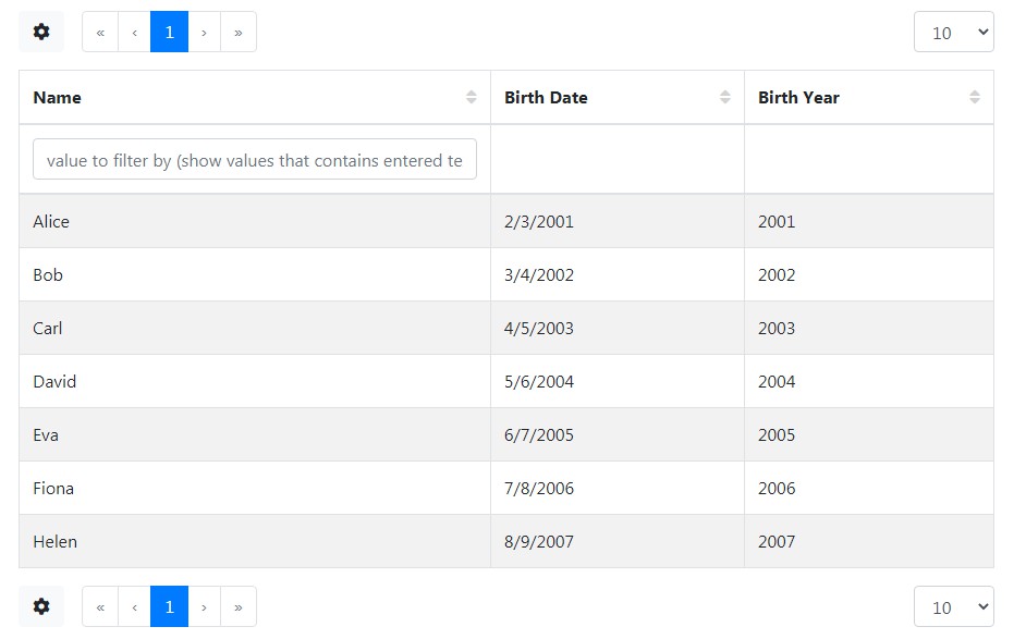
You can see a interative component in Storybook.
Props
TableControl
| Name | Type | Default | Description |
|---|---|---|---|
| header | Header[] |
– | Required. List of header values |
| sortable | boolean | false | Enable sort action |
| onClickHeader | Sort => any |
sort => console.log(sort) | Header click function |
| sort | Sort |
{ column: ‘id’, direction: “ASC” } | Sort direction |
| itens | Item[] |
– | Required. List of itens displayed in table |
| emptyMessage | JSX.Element | string | “No results” | Message displayed when items equals zero |
| clikcable | boolean | false | Show clickable action |
| onClickItem | Item => any |
item => console.log(item) | Item click function |
| total | number | 0 | Total of itens |
| totalPosition | “both” | “top” | “bottom” | “none” | “both” | Total itens number |
| pagination | boolean | true | Show pagination |
| page | number | 1 | Active page |
| limit | number | 25 | Max itens per page, it’s minimum value is itens length |
| between | number | 4 | Max itens in left and right when page is in center, it’s minimum value is 1 |
| ellipsis | number | 1 | Number itens after ellipsis, its maximum value is equal (between – 2) |
| next | boolean | true | Control if prev and next actions will be displayed |
| last | boolean | false | Control if fist and last actions will be displayed |
| onClickPage | number => any | page => console.log(page) | Pagination click function |
| isLoading | boolean | false | Loading status |
| tableProps | object | {} | table properties |
| theadProps | object | {} | thead properties |
| tbodyProps | object | {} | tbody properties |
Types
Sort
| Name | Type | Default | Description |
|---|---|---|---|
| column | string | – | Required. Colum name sort |
| direction | “ASC” | “DESC” | – | Sort direction |
Header
| Name | Type | Default | Description |
|---|---|---|---|
| name | string | – | Required. Header name |
| key | string | – | Required. Key name |
| sort | boolean | – | Sortable column |
| thProps | object | – | th properties |
Item
| Name | Type | Default | Description |
|---|---|---|---|
| type | “default” | “blocked” | “clickable” | When used into TableControl, this value is “default” if clickable is false, and “clickable” if clickable is true |
Type of item action |
| trProps | object | – | tr properties |
License
MIT